Card Hover Effect Using HTML and CSS
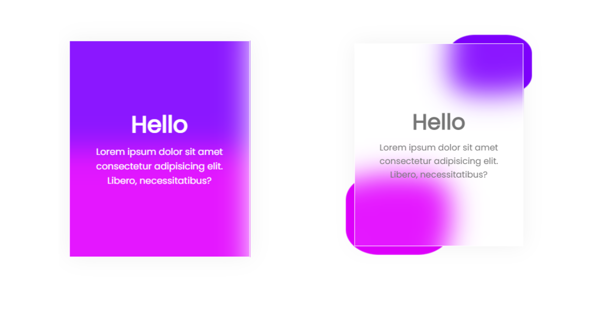
Welcome to the Codewithrandom blog. In this blog, We learn how to create a Card Hover Effect Using HTML and CSS. In this Card Hover Effect when you hover on a card, the Card background color change, and in a corner, a shape appears and it’s a fully animated hover effect card using only Html and Css.

A CSS hover effect takes place when a user hovers over an element, and the element responds with transition effects. It is used to mark the key items on the web page and it’s an effective way to enhance the user experience.
Syntax for hover property is:
HTML element:hover{
/* Css property change written here /*
}
I hope you enjoy our blog so let’s start with a basic HTML Structure for creating Card.
| Code by | N/A |
| Project Download | N/A |
| Language used | HTML and CSS |
| External link / Dependencies | No |
| Responsive | Yes |
Card Hover Effect Table
HTML Code For Card Hover Effect
<!DOCTYPE html>
<html lang="en">
<head>
<meta charset="UTF-8">
<meta http-equiv="X-UA-Compatible" content="IE=edge">
<meta name="viewport" content="width=device-width, initial-scale=1.0">
<title>Card With Hover Effect</title>
<link rel="stylesheet" href="style.css">
</head>
<body>
<div class="card">
<div class="content">
<h1>Hello</h1>
<p>Lorem ipsum dolor sit amet consectetur adipisicing elit. Libero, necessitatibus?</p>
</div>
</div>
</body>
</html>
In order to add a framework for our card hover effect, we must include a few critical links within our html files. We must connect to CSS in our HTML because it is used independently in this project; their link must be added inside the head tag.
<link rel="stylesheet" href="style.css" />
Now inside our body, we will add the structure for our CSS card hover effect. Using the div tag, we will create the main container for our card, and then using the h1> tag, we will add a heading to our card. Also, using the p> tag, we will add the paragraph in order to add the content inside our card.
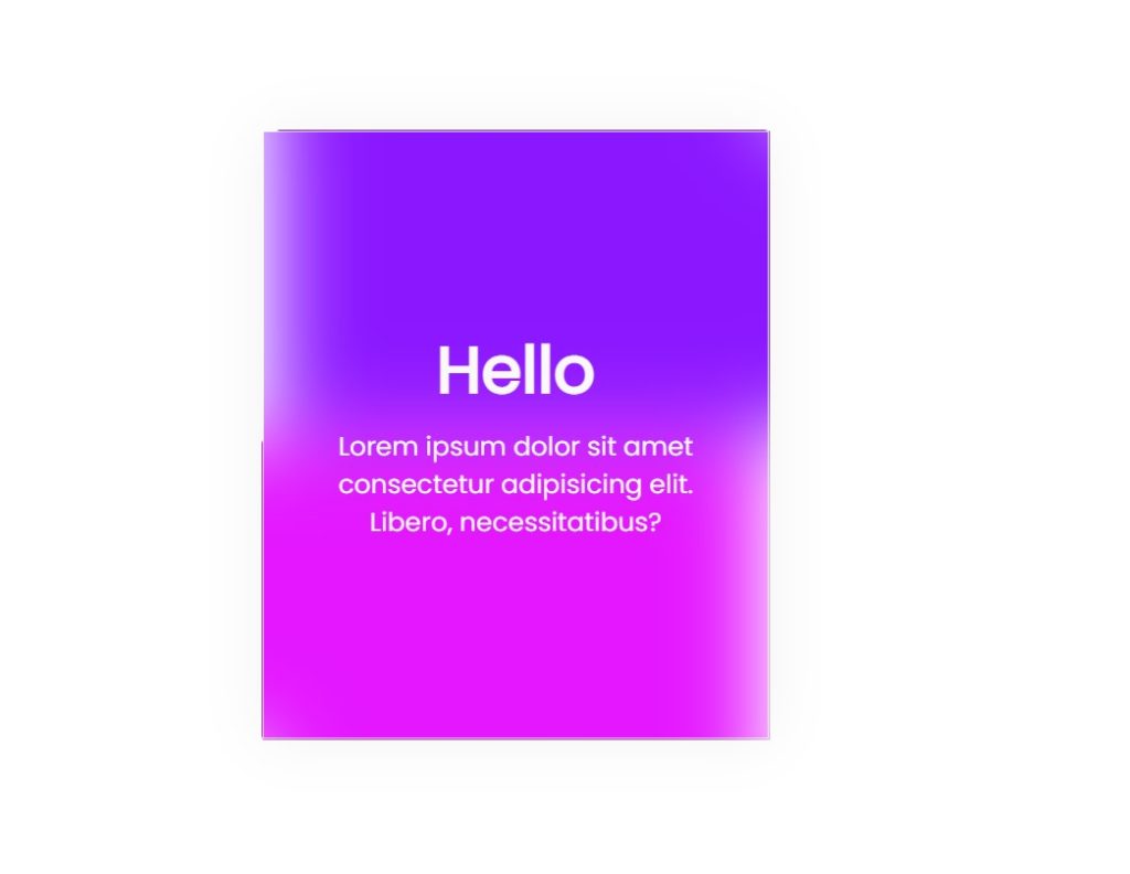
There is all the Html Code for the Card Hover Effect. Now, you can see output without Css, then we write Css for our Card hover effect.
Portfolio Website using HTML and CSS (Source Code)
Html Output

CSS Code For Card Hover Effect
ADVERTISEMENT
 @import url('https://fonts.googleapis.com/css2?family=Poppins&display=swap');
*{
margin: 0;
padding: 0;
box-sizing: border-box;
font-family: 'Poppins', sans-serif;
}
body{
display: flex;
justify-content: center;
align-items: center;
height: 100vh;
}
.card{
width: 250px;
height: 300px;
position: relative;
cursor: pointer;
}
.card .content{
width: 100%;
height: 100%;
background: rgba(255, 255, 255, 0.089);
backdrop-filter: blur(20px);
border: 1px solid white;
color: white;
display: flex;
justify-content: center;
align-items: center;
flex-direction: column;
box-shadow: 0 0 30px rgba(0, 0, 0, 0.055);
transition: all .4s;
}
.card .content p{
font-size: 0.8em;
padding: 0.3em 1.5em;
text-align: center;
}
.card:hover .content{
color: rgb(36, 36, 36);
}
.card::before,
.card::after{
content: '';
position: absolute;
width: 100%;
height: 50%;
background: #7F00FF;
z-index: -20;
transition: all .4s;
}
.card::before{
top: 0;
right: 0;
}
.card::after{
bottom: 0;
left: 0;
background: #E100FF;
}
.card:hover::before{
width: 50px;
height: 50px;
transform: translate(20px, -20px);
border-radius: 50%;
}
.card:hover::after{
width: 100px;
height: 100px;
transform: translate(-20px, 20px);
border-radius: 50%;
}
ADVERTISEMENT
Step1:Using the universal element selector (*), padding and margin will be set to “zero,” and the box sizing attribute will be used to set the box-sizing to “border-box.” We will change the font family to “Poppins” by using the font-family property.
ADVERTISEMENT
Rock Paper Scissors Game Using Html,Css and JavaScript With Source Code
ADVERTISEMENT
Now, using the body tag selector, we will style our body, we will set the display as “flex” and using the justify-content property, we will align the content to the middle, and the height is set as “100vh”.
ADVERTISEMENT
@import url('https://fonts.googleapis.com/css2?family=Poppins&display=swap');
* {
    margin: 0;
    padding: 0;
    box-sizing: border-box;
    font-family: 'Poppins', sans-serif;
}

body {
    display: flex;
    justify-content: center;
    align-items: center;
    height: 100vh;
}Step2:Now, we will assign the width and height using the class selector to 250 and 300 pixels, respectively, and the position property to “relative.”
Now that we’ve added the styling to our card, we’ll set the width and height of the text to “100%” and use the background property to add a dark blue backdrop. The presentation of our material is flexible. Using the transition property, we will add a transition to each and every class.
.card {
    width: 250px;
    height: 300px;
    position: relative;
    cursor: pointer;
}

.card .content {
    width: 100%;
    height: 100%;
    background: rgba(255, 255, 255, 0.089);
    backdrop-filter: blur(20px);
    border: 1px solid white;
    color: white;
    display: flex;
    justify-content: center;
    align-items: center;
    flex-direction: column;
    box-shadow: 0 0 30px rgba(0, 0, 0, 0.055);
    transition: all .4s;
}

.card .content p {
    font-size: 0.8em;
    padding: 0.3em 1.5em;
    text-align: center;
}Step3:The hover property will now be used to set the text color to white, the position property to “absolute,” and the width and height properties to “100%” and “50%,” respectively. We will alter the background to “purple,” the width and height to “50 px,” and the border-radius to “50%” using the border-radius property.
Gym Website Using HTML and CSS With Source Code
.card:hover .content {
    color: rgb(36, 36, 36);
}

.card::before,
.card::after {
    content: '';
    position: absolute;
    width: 100%;
    height: 50%;
    background: #7F00FF;
    z-index: -20;
    transition: all .4s;
}

.card::before {
    top: 0;
    right: 0;
}

.card::after {
    bottom: 0;
    left: 0;
    background: #E100FF;
}

.card:hover::before {
    width: 50px;
    height: 50px;
    transform: translate(20px, -20px);
    border-radius: 50%;
}

.card:hover::after {
    width: 100px;
    height: 100px;
    transform: translate(-20px, 20px);
    border-radius: 50%;
}
CSS Output:

Build Multi-Step Form with Progress Bar using HTML & jQuery
Now we have completed our Card Hover Effect Using HTML and CSS.
Video Output
Codepen Preview Of Card Hover Effect:
100+ JavaScript Projects With Source Code ( Beginners to Advanced)
Now we have completed our Card Hover Effect. Hope you like Card With Hover Effect, you can see the output video and project screenshots. See our other blogs and gain knowledge in front-end development.
Thank you!
In this post, we learn how to create a Card Hover Effect Using HTML and CSS. If we made a mistake or any confusion, please drop a comment to reply or help you learn easily.
Written by – Code With Random/Anki
Code by – Dm for Credit
Which code editor do you use for this Card Hover Effect coding?
I personally recommend using VS Code Studio, it’s straightforward and easy to use.
What is the hover effect?
A CSS hover effect takes place when a user hovers over an element, and the element responds with transition effects. It is used to mark the key items on the web page and it’s an effective way to enhance the user experience.
Which CSS property is used to make the hover effect?
Any element can have a hover effect added by using the hover property, which applies the property specified inside the hover selection as the user moves their cursor over the element.
For Example:
a: hover{
background: white;
}


Bro how to do this of background color of body is different(pink in my case)