
Create Clock With Animation Using CSS and JavaScript
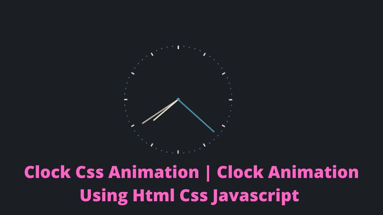.png "Clock Css Animation | Clock Animation Using Html Css Javascript")

| Code by | Kyle Wetton |
| Project Download | Link Available Below |
| Language used | HTML ,CSS and JavaScript |
| External link / Dependencies | No |
| Responsive | Yes |
We had already learned how to make a digital watch. If you want to make a digital watch first, then check our digital watch blog you will get there. Our digital watch blog.
Live Preview Of Clock:-
Before moving forward to the code first of all we will see the live server of the code so you can see how it is working by clicking the button.
HTML Code For Clock:-
Inside the body tag of HTML we have inserted are dev whose has the class name clock and inside that clock. We have inserted 4 more divs, one for clock second, Clock minute, clock hour, and clock axis.
Restaurant Website Using HTML and CSS
The clock_second class is used for representing the second hand of the clock. The clock_minute Class is used for representing the minute hand of the clock.
<!DOCTYPE html>
<html lang="en">
<head>
<meta charset="UTF-8">
<meta http-equiv="X-UA-Compatible" content="IE=edge">
<meta name="viewport" content="width=device-width, initial-scale=1.0">
<title>Clock using Css and JavaScript</title>
</head>
<body>
<div class="clock">
<div class="clock__second"></div>
<div class="clock__minute"></div>
<div class="clock__hour"></div>
<div class="clock__axis"></div>
<section class="clock__indicator"></section>
<section class="clock__indicator"></section>
<section class="clock__indicator"></section>
<section class="clock__indicator"></section>
<section class="clock__indicator"></section>
<section class="clock__indicator"></section>
<section class="clock__indicator"></section>
<section class="clock__indicator"></section>
<section class="clock__indicator"></section>
<section class="clock__indicator"></section>
<section class="clock__indicator"></section>
<section class="clock__indicator"></section>
<section class="clock__indicator"></section>
<section class="clock__indicator"></section>
<section class="clock__indicator"></section>
<section class="clock__indicator"></section>
<section class="clock__indicator"></section>
<section class="clock__indicator"></section>
<section class="clock__indicator"></section>
<section class="clock__indicator"></section>
<section class="clock__indicator"></section>
<section class="clock__indicator"></section>
<section class="clock__indicator"></section>
<section class="clock__indicator"></section>
<section class="clock__indicator"></section>
<section class="clock__indicator"></section>
<section class="clock__indicator"></section>
<section class="clock__indicator"></section>
<section class="clock__indicator"></section>
<section class="clock__indicator"></section>
<section class="clock__indicator"></section>
<section class="clock__indicator"></section>
<section class="clock__indicator"></section>
<section class="clock__indicator"></section>
<section class="clock__indicator"></section>
<section class="clock__indicator"></section>
<section class="clock__indicator"></section>
<section class="clock__indicator"></section>
<section class="clock__indicator"></section>
<section class="clock__indicator"></section>
<section class="clock__indicator"></section>
<section class="clock__indicator"></section>
<section class="clock__indicator"></section>
<section class="clock__indicator"></section>
<section class="clock__indicator"></section>
<section class="clock__indicator"></section>
<section class="clock__indicator"></section>
<section class="clock__indicator"></section>
<section class="clock__indicator"></section>
<section class="clock__indicator"></section>
<section class="clock__indicator"></section>
<section class="clock__indicator"></section>
<section class="clock__indicator"></section>
<section class="clock__indicator"></section>
<section class="clock__indicator"></section>
<section class="clock__indicator"></section>
<section class="clock__indicator"></section>
<section class="clock__indicator"></section>
<section class="clock__indicator"></section>
<section class="clock__indicator"></section>
</div>
</body>
</html>
Ecommerce Website Using HTML, CSS, & JavaScript (Source Code)
this is all the Html Code for the Clock Basic structure also you can Link CSS and JavaScript in Html Code
CSS Code For Clock:-
html,
body {
  height: 100%;
}

body {
  background: #1b1e23;
  display: flex;
  flex-direction: column;
  justify-content: center;
  align-items: center;
  font-family: sans-serif;
  color: white;
}

p {
  color: #f4eed7;
  font-size: 0.8em;
  opacity: 0.75;
}

.clock {
  height: 200px;
  width: 200px;
  border-radius: 100px;
  display: flex;
  justify-content: center;
  position: relative;
}
.clock__second, .clock__minute, .clock__hour, .clock__indicator {
  position: absolute;
  left: calc(50% - 1px);
  width: 2px;
  background: #f4eed7;
  transform-origin: bottom center;
  z-index: 2;
  border-radius: 1px;
}
.clock__second {
  height: 90px;
  margin-top: 10px;
  background: #4b9aaa;
  -webkit-animation: time 60s infinite steps(60);
          animation: time 60s infinite steps(60);
  z-index: 3;
}
.clock__minute {
  height: 80px;
  margin-top: 20px;
  opacity: 0.75;
  -webkit-animation: time 3600s linear infinite;
          animation: time 3600s linear infinite;
}
.clock__hour {
  height: 60px;
  margin-top: 40px;
  -webkit-animation: time 43200s linear infinite;
          animation: time 43200s linear infinite;
}
.clock__indicator {
  height: 98px;
  border-top: 2px solid #4b9aaa;
  background: none;
}
.clock__indicator:nth-of-type(5n) {
  opacity: 1;
  height: 93px;
  border-top: 7px solid #f4eed7;
}
.clock__axis {
  background: #4b9aaa;
  width: 5px;
  height: 5px;
  border-radius: 3px;
  position: absolute;
  z-index: 4;
  top: 97px;
}

section:nth-of-type(1) {
  transform: rotateZ(calc(6deg * 1));
}

section:nth-of-type(2) {
  transform: rotateZ(calc(6deg * 2));
}

section:nth-of-type(3) {
  transform: rotateZ(calc(6deg * 3));
}

section:nth-of-type(4) {
  transform: rotateZ(calc(6deg * 4));
}

section:nth-of-type(5) {
  transform: rotateZ(calc(6deg * 5));
}

section:nth-of-type(6) {
  transform: rotateZ(calc(6deg * 6));
}

section:nth-of-type(7) {
  transform: rotateZ(calc(6deg * 7));
}

section:nth-of-type(8) {
  transform: rotateZ(calc(6deg * 8));
}

section:nth-of-type(9) {
  transform: rotateZ(calc(6deg * 9));
}

section:nth-of-type(10) {
  transform: rotateZ(calc(6deg * 10));
}

section:nth-of-type(11) {
  transform: rotateZ(calc(6deg * 11));
}

section:nth-of-type(12) {
  transform: rotateZ(calc(6deg * 12));
}

section:nth-of-type(13) {
  transform: rotateZ(calc(6deg * 13));
}

section:nth-of-type(14) {
  transform: rotateZ(calc(6deg * 14));
}

section:nth-of-type(15) {
  transform: rotateZ(calc(6deg * 15));
}

section:nth-of-type(16) {
  transform: rotateZ(calc(6deg * 16));
}

section:nth-of-type(17) {
  transform: rotateZ(calc(6deg * 17));
}

section:nth-of-type(18) {
  transform: rotateZ(calc(6deg * 18));
}

section:nth-of-type(19) {
  transform: rotateZ(calc(6deg * 19));
}

section:nth-of-type(20) {
  transform: rotateZ(calc(6deg * 20));
}

section:nth-of-type(21) {
  transform: rotateZ(calc(6deg * 21));
}

section:nth-of-type(22) {
  transform: rotateZ(calc(6deg * 22));
}

section:nth-of-type(23) {
  transform: rotateZ(calc(6deg * 23));
}

section:nth-of-type(24) {
  transform: rotateZ(calc(6deg * 24));
}

section:nth-of-type(25) {
  transform: rotateZ(calc(6deg * 25));
}

section:nth-of-type(26) {
  transform: rotateZ(calc(6deg * 26));
}

section:nth-of-type(27) {
  transform: rotateZ(calc(6deg * 27));
}

section:nth-of-type(28) {
  transform: rotateZ(calc(6deg * 28));
}

section:nth-of-type(29) {
  transform: rotateZ(calc(6deg * 29));
}

section:nth-of-type(30) {
  transform: rotateZ(calc(6deg * 30));
}

section:nth-of-type(31) {
  transform: rotateZ(calc(6deg * 31));
}

section:nth-of-type(32) {
  transform: rotateZ(calc(6deg * 32));
}

section:nth-of-type(33) {
  transform: rotateZ(calc(6deg * 33));
}

section:nth-of-type(34) {
  transform: rotateZ(calc(6deg * 34));
}

section:nth-of-type(35) {
  transform: rotateZ(calc(6deg * 35));
}

section:nth-of-type(36) {
  transform: rotateZ(calc(6deg * 36));
}

section:nth-of-type(37) {
  transform: rotateZ(calc(6deg * 37));
}

section:nth-of-type(38) {
  transform: rotateZ(calc(6deg * 38));
}

section:nth-of-type(39) {
  transform: rotateZ(calc(6deg * 39));
}

section:nth-of-type(40) {
  transform: rotateZ(calc(6deg * 40));
}

section:nth-of-type(41) {
  transform: rotateZ(calc(6deg * 41));
}

section:nth-of-type(42) {
  transform: rotateZ(calc(6deg * 42));
}

section:nth-of-type(43) {
  transform: rotateZ(calc(6deg * 43));
}

section:nth-of-type(44) {
  transform: rotateZ(calc(6deg * 44));
}

section:nth-of-type(45) {
  transform: rotateZ(calc(6deg * 45));
}

section:nth-of-type(46) {
  transform: rotateZ(calc(6deg * 46));
}

section:nth-of-type(47) {
  transform: rotateZ(calc(6deg * 47));
}

section:nth-of-type(48) {
  transform: rotateZ(calc(6deg * 48));
}

section:nth-of-type(49) {
  transform: rotateZ(calc(6deg * 49));
}

section:nth-of-type(50) {
  transform: rotateZ(calc(6deg * 50));
}

section:nth-of-type(51) {
  transform: rotateZ(calc(6deg * 51));
}

section:nth-of-type(52) {
  transform: rotateZ(calc(6deg * 52));
}

section:nth-of-type(53) {
  transform: rotateZ(calc(6deg * 53));
}

section:nth-of-type(54) {
  transform: rotateZ(calc(6deg * 54));
}

section:nth-of-type(55) {
  transform: rotateZ(calc(6deg * 55));
}

section:nth-of-type(56) {
  transform: rotateZ(calc(6deg * 56));
}

section:nth-of-type(57) {
  transform: rotateZ(calc(6deg * 57));
}

section:nth-of-type(58) {
  transform: rotateZ(calc(6deg * 58));
}

section:nth-of-type(59) {
  transform: rotateZ(calc(6deg * 59));
}

section:nth-of-type(60) {
  transform: rotateZ(calc(6deg * 60));
}

@-webkit-keyframes time {
  to {
    transform: rotateZ(360deg);
  }
}

@keyframes time {
  to {
    transform: rotateZ(360deg);
  }
}
Create Alarm Clock Using HTML ,CSS & JavaScript
Now our Clock Structure and Designing are done. Now time to write JavaScript Code and make a working Clock.
JavaScript Code For Clock:-
var currentSec = getSecondsToday();
var seconds = (currentSec / 60) % 1;
var minutes = (currentSec / 3600) % 1;
var hours = (currentSec / 43200) % 1;
setTime(60 * seconds, "second");
setTime(3600 * minutes, "minute");
setTime(43200 * hours, "hour");
function setTime(left, hand) {
$(".clock__" + hand).css("animation-delay", "" + left * -1 + "s");
}
function getSecondsToday() {
let now = new Date();
let today = new Date(now.getFullYear(), now.getMonth(), now.getDate());
let diff = now - today;
return Math.round(diff
I hope hoped loved this blog and learned many things at the place please let us know your review in the comment section if you liked it please comment below as it will give us the motivation to create more blogs.
100+ JavaScript Projects With Source Code ( Beginners to Advanced)
If you faced any difficulty feel free to comment down your problems and If you really liked it, please show your love in the comment section this really motivates a blogger to provide more such content.
You can follow me on Instagram.
Written by @Himanshu Singh.
Which code editor do you use for this Clock Animation coding?
I personally recommend using VS Code Studio, it’s straightforward and easy to use.
is this project responsive or not?
Yes! this is a responsive project
Do you use any external links to create this project?
No!

