Gradient Border Using HTML And CSS
Learners, In this article we are going to look at a very interesting property of using HTML and CSS which is how can generate or add a Gradient Border to the box, container, or button wherever we just need to make it more beautiful.
In this blog, you are going to get Buy one get one free, isn’t it a happier feeling for you all along with the Gradient border we are going to look at the animated border as well.
So, without making it lengthier let’s jump into the project.
Hey learners..!
Welcome to our today’s blog with code with random. In this blog, we gonna learn how we can design a Gradient border on a box, especially Using HTML and CSS.
I hope you must have got an idea about the project.
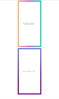
Let’s have a look at our project.
Here both border seems similar to each other but things are quite different from each other as last one has animated behavior along with gradient property.
HTML SECTION For Gradient Border
Here I’m not going to add a structure to the HTML file from scratch, I will just paste the body part, it is so because the body is the main part of our designing a browser.
We have the following part in the HTML section.
In the project preview, you must have got an idea as we have two containers only so we also need 2 div here as well.
So here our first div is available with a glass container demo and the second one is available with a container demo animated.
Go through the below code and run it in your IDE or where you used to design just HTML without CSS styling.
<div class="container demo"> Gradient border </div>
<br />
<div class="container demo animated"> ANIMATED </div>
HOW TO MAKE A SLIDING TOGGLE SWITCH BUTTON IN CSS
CSS SECTION For Gradient Border
By CSS only our main task is going to perform so let’s have an understanding of what we are doing in the code part.
We will place both containers in the center with the help of the display flex property.
we are designing both containers with the same aspect as the text will be in uppercase, and font size will be this like many other properties as well.
With the help of the demo class in both div, we are placing gradient property over the box.
The Below code will analyze you more. So just add in your HTML half-complete file and wait to watch some magic.
body {
display: flex;
flex-flow: column;
}
.container {
margin: auto;
width: 40vw;
height: 40vh;
/*outline: 1px solid red;*/
border: 20px solid transparent;
box-sizing: border-box;
text-transform: uppercase;
font-weight: 900;
font-family: "Open Sans","Source Sans Pro",Helvetica,sans-serif;
font-size: 1em;
letter-spacing: 1em;
padding: 1rem;
display:flex;
justify-content: center;
align-items: center;
}
.demo {
/*background-image:
linear-gradient(white, white),
linear-gradient(180deg, cornflowerblue, purple);*/
background-image:
linear-gradient(white, white),
linear-gradient(270deg, #00D7B9, #B95DD7 50%, #FFB367 100%);
background-repeat: no-repeat;
background-origin: padding-box, border-box;
text-align: center;
}
.animated {
background-image:
linear-gradient(white, white),
linear-gradient(180deg, cornflowerblue, purple 50%, cornflowerblue);
background-repeat: no-repeat;
background-size: 100% 100%, 100% 200%;
background-position: 0 0, 0 100%;
background-origin: padding-box, border-box;
animation: highlight 1s infinite alternate;
}
@keyframes highlight {
100% {
background-position: 0 0, 0 0;
}
}
For a live preview refer to this attached codepen link:-
Create Scroll Zoom Using HTML, CSS, &JavaScript
By this blog… We have learned how we can design a Gradient border property Using HTML CSS.
Now I’m looking for your reviews.
So, How was the blog, Learners?
If you want a more crisp blog like this then please check our Blogs sites CodewithRandom. keep tuned with us because every day you will learn something new here.
ADVERTISEMENT
I hope that I’m able to make you understand this topic and that you have learned something new from this blog. If you faced any difficulty feel free to drop a comment down your problems and if you liked it, please show your love in the comment section. This fills bloggers’ hearts with enthusiasm for writing more new blogs.
ADVERTISEMENT
Thank You And Keep Learning!!!
ADVERTISEMENT
Written by @Ankit kumar
ADVERTISEMENT
Code by bibby0912
ADVERTISEMENT
.png)


