Responsive Pricing Card Design Using HTML and CSS
Hello Coders, today in this blog I’m going to create a Responsive Pricing Table using HTML & CSS Simply, pricing tables are the flat card designs of a particular product with products of different value and offer for the buyers. The pricing table can be various products like mobile phones, television, hosting, and others. Basically, it is used maximum in the e-commerce website.
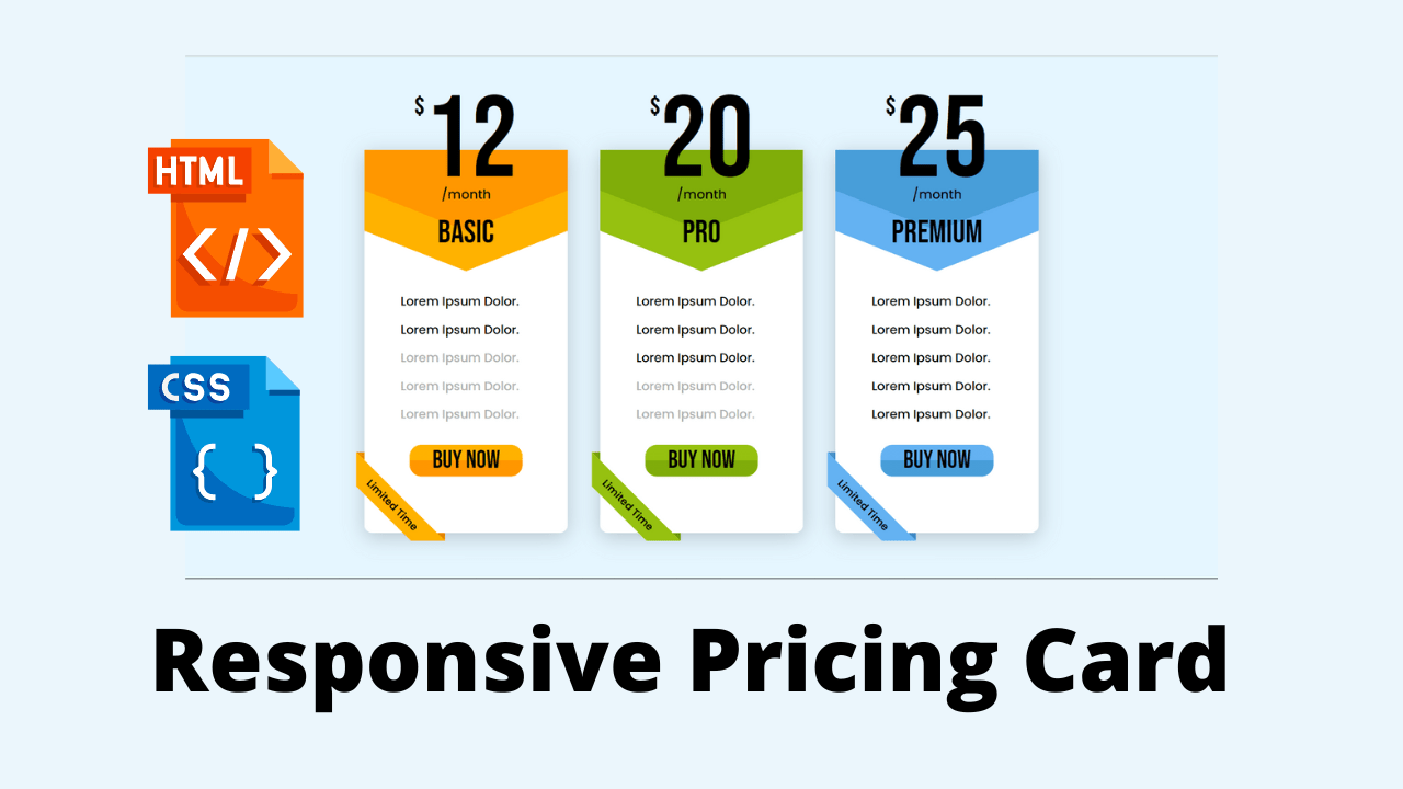
As you can see on the given image of this design [Responsive Pricing Tables], on the webpage. There are three cards on the price list with different colors, offers, and prices. Actually, this is the pricing table of the hosting.
Portfolio Website using HTML and CSS (Source Code)
| Code by | ninja_webtech |
| Project Download | Link Available Below |
| Language used | HTML and CSS |
| External link / Dependencies | Yes |
| Responsive | Yes |
In detail in the top cards, there is the price of this product, the bottom of the price some major information for each value, the bottom of the information there are all offers which is given to users in different price segments. These all cards are responsive and also I have added some hover effects on the button.
HTML Code For Pricing Card
<!DOCTYPE html>
<html lang="en" dir="ltr">

<head>
    <meta charset="utf-8">
    <meta name="viewport" content="width=device-width, initial-scale=1.0">
    <title>Responsive Flat Pricing Card List Design - Using HTML & CSS</title>
    <link rel="stylesheet" href="style.css">
    <link rel="stylesheet" href="https://unicons.iconscout.com/release/v4.0.0/css/line.css">
</head>

<body>
    <section class="main-container">
        <div class="card-container">
            <div class="pricing-card card-01">
                <div class="pricing">
                    <div class="price">
                        <sup> lt;/sup> <span>12</span>
                    </div>
                    <p>/month</p> <span class="type">Basic</span>
                </div>
                <div class="card-body">
                    <div class="top-shape"></div>
                    <div class="card-content">
                        <ul>
                            <li class="active">Lorem Ipsum Dolor. <i class="uil uil-check-circle"></i></li>
                            <li class="active">Lorem Ipsum Dolor. <i class="uil uil-check-circle"></i></li>
                            <li class="disabled">Lorem Ipsum Dolor. <i class="uil uil-times-circle"></i></li>
                            <li class="disabled">Lorem Ipsum Dolor. <i class="uil uil-times-circle"></i></li>
                            <li class="disabled">Lorem Ipsum Dolor. <i class="uil uil-times-circle"></i></li>
                        </ul> <button class="buy-btn">Buy Now</button>
                    </div>
                </div>
                <div class="ribbon"></div>
            </div>
            <div class="pricing-card card-02">
                <div class="pricing">
                    <div class="price"> <sup> lt;/sup> <span>20</span> </div>
                    <p>/month</p> <span class="type">Pro</span>
                </div>
                <div class="card-body">
                    <div class="top-shape"></div>
                    <div class="card-content">
                        <ul>
                            <li class="active">Lorem Ipsum Dolor. <i class="uil uil-check-circle"></i></li>
                            <li class="active">Lorem Ipsum Dolor. <i class="uil uil-check-circle"></i></li>
                            <li class="active">Lorem Ipsum Dolor. <i class="uil uil-check-circle"></i></li>
                            <li class="disabled">Lorem Ipsum Dolor. <i class="uil uil-times-circle"></i></li>
                            <li class="disabled">Lorem Ipsum Dolor. <i class="uil uil-times-circle"></i></li>
                        </ul> <button class="buy-btn">Buy Now</button>
                    </div>
                </div>
                <div class="ribbon"></div>
            </div>
            <div class="pricing-card card-03">
                <div class="pricing">
                    <div class="price"> <sup> lt;/sup> <span>25</span> </div>
                    <p>/month</p> <span class="type">Premium</span>
                </div>
                <div class="card-body">
                    <div class="top-shape"></div>
                    <div class="card-content">
                        <ul>
                            <li class="active">Lorem Ipsum Dolor. <i class="uil uil-check-circle"></i></li>
                            <li class="active">Lorem Ipsum Dolor. <i class="uil uil-check-circle"></i></li>
                            <li class="active">Lorem Ipsum Dolor. <i class="uil uil-check-circle"></i></li>
                            <li class="active">Lorem Ipsum Dolor. <i class="uil uil-check-circle"></i></li>
                            <li class="active">Lorem Ipsum Dolor. <i class="uil uil-check-circle"></i></li>
                        </ul> <button class="buy-btn">Buy Now</button>
                    </div>
                </div>
                <div class="ribbon"></div>
            </div>
        </div>
    </section>
</body>

</html>
10+ HTML CSS Projects For Beginners (Source Code)
- The code is a responsive flat pricing card list design.
- The code is made up of HTML and CSS.
- The first thing the code does is to set the viewport width to device-width, which means that it will be as wide as possible on any screen size.
- This makes sure that all users can see everything without having to scroll horizontally or vertically.
- Next, it sets the initial scale of 1.0 so that when you resize your browser window, everything stays at 100% zoom level and doesn’t change its size relative to other elements in the page (elements are scaled proportionally).
- Then it includes a meta tag with name=”viewport” and content=”width=device-width, initial-scale=1.0″.
- This tells browsers what kind of viewport they should use for this website’s layout: one where width equals device-width and height equals initial-scale*100%.
- It also includes a link tag with rel=”stylesheet” href=”https://unicons.iconscout.com/release/v4.0.0/css/line.”
- Line is an icon font designed by IconScout Inc., which has been used in this project because icons are easier for people who don’t know how to
- The code is a basic HTML document with a CSS file and an icon font.
- The 4th item has an active class, which means it will be highlighted when you hover over it.
- The second item has a disabled class, meaning it won’t be highlighted when you hover over it but still visible on screen.
- The 5th item doesn’t have any classes applied to it because there’s no need to highlight anything about that particular card.
- Then comes the text describing what type of plan they are: Pro or Premium (again depending on what type of plan you’re buying).
Gym Website Using HTML and CSS With Source Code
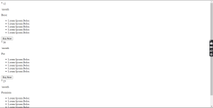
Only HTML Code Output
50+ Html ,Css & Javascript Projects With Source Code
CSS Code For Pricing Card
/*============ Google fonts ============*/
@import url('https://fonts.googleapis.com/css2?family=Poppins:wght@400;500;600&display=swap');
@import url('https://fonts.googleapis.com/css2?family=Bebas+Neue&display=swap');

:root{
  /*===== Colors =====*/
  --card-01-color-01: #ffb200;
  --card-01-color-02: #ff9700;
  --card-02-color-01: #96c110;
  --card-02-color-02: #80ad0a;
  --card-03-color-01: #64b2f2;
  --card-03-color-02: #489ed9;
  --card-body-bg-color: #fff;
  --text-disabled-color: #b2b2b2;
  --icon-disabled-color: #ff0404;
  --body-bg-color: #e5f6ff;

  /*===== Fonts =====*/
  --poppins-font: 'Poppins', sans-serif;
  --bebas-font: 'Bebas Neue', cursive;
}

*{
  margin: 0;
  padding: 0;
  box-sizing: border-box;
}

body{
  background: var(--body-bg-color);
}

.main-container{
  position: relative;
  max-width: 900px;
  min-height: 100vh;
  margin-left: auto;
  margin-right: auto;
  padding: 0 2rem;
  display: flex;
  justify-content: center;
  align-items: center;
}

.card-container{
  display: grid;
  width: 100%;
  grid-template-columns: repeat(auto-fill, minmax(230px, 1fr));
  gap: 40px;
  margin: 50px 0;
}

.pricing-card{
  position: relative;
}

.card-body{
  position: relative;
  width: 100%;
  background: var(--card-body-bg-color);
  border-radius: 0 0 10px 10px;
  box-shadow: 0 5px 25px rgb(0 0 0 / 20%);
  margin-top: 60px;
}

.card-body .top-shape{
  clip-path: polygon(0 0, 100% 0%, 100% 50%, 50% 75%, 0 50%);
  height: 200px;
}

.card-01 .card-body .top-shape{
  background: var(--card-01-color-01);
}

.card-02 .card-body .top-shape{
  background: var(--card-02-color-01);
}

.card-03 .card-body .top-shape{
  background: var(--card-03-color-01);
}

.card-body .top-shape:before{
  content: '';
  position: absolute;
  clip-path: polygon(0 0, 100% 0%, 100% 25%, 50% 50%, 0 25%);
  width: 100%;
  height: 200px;
}

.card-01 .card-body .top-shape:before{
  background: var(--card-01-color-02);
}

.card-02 .card-body .top-shape:before{
  background: var(--card-02-color-02);
}

.card-03 .card-body .top-shape:before{
  background: var(--card-03-color-02);
}

.pricing{
  z-index: 999;
  font-family: var(--bebas-font);
  text-align: center;
  position: absolute;
  width: 100%;
}

.price{
  display: flex;
  justify-content: center;
  margin-bottom: 3px;
}

.price span{
  font-size: 9em;
  line-height: 100px;
}

.price sup{
  font-size: 2em;
  transform: translateY(-15px);
}

.pricing p{
  font-family: var(--poppins-font);
  font-weight: 500;
  margin-bottom: 10px;
}

.pricing .type{
  text-transform: uppercase;
  font-size: 2.5em;
}

.card-body .card-content{
  display: flex;
  justify-content: center;
  align-items: center;
  flex-direction: column;
  transform: translateY(-30px);
}

.card-body .card-content ul{
  width: 100%;
  font-family: var(--poppins-font);
  text-align: center;
  margin-bottom: 20px;
  padding: 0 20px;
}

.card-body .card-content ul li{
  list-style: none;
  font-size: 0.95em;
  font-weight: 500;
  display: flex;
  justify-content: center;
  align-items: center;
  line-height: 35px;
  white-space: nowrap;
}

.card-body .card-content ul li i{
  font-size: 1.9em;
  margin-left: 15px;
}

.card-01 .card-body .card-content ul .active i{
  color: var(--card-01-color-01);
}

.card-02 .card-body .card-content ul .active i{
  color: var(--card-02-color-01);
}

.card-03 .card-body .card-content ul .active i{
  color: var(--card-03-color-01);
}

.card-body .card-content ul .disabled{
  color: var(--text-disabled-color);
}

.card-body .card-content ul .disabled i{
  color: var(--icon-disabled-color);
}

.card-content .buy-btn{
  font-family: var(--bebas-font);
  border: none;
  outline: none;
  padding: 0 28px;
  border-radius: 15px;
  text-transform: uppercase;
  font-size: 1.9em;
  cursor: pointer;
  margin-bottom: 40px;
}

.card-01 .card-content .buy-btn{
  background: linear-gradient(var(--card-01-color-01) 50%, var(--card-01-color-02) 50%);
}

.card-02 .card-content .buy-btn{
  background: linear-gradient(var(--card-02-color-01) 50%, var(--card-02-color-02) 50%);
}

.card-03 .card-content .buy-btn{
  background: linear-gradient(var(--card-03-color-01) 50%, var(--card-03-color-02) 50%);
}

.card-01 .card-content .buy-btn:hover{
  background: linear-gradient(var(--card-01-color-02) 50%, var(--card-01-color-01) 50%);
}

.card-02 .card-content .buy-btn:hover{
  background: linear-gradient(var(--card-02-color-02) 50%, var(--card-02-color-01) 50%);
}

.card-03 .card-content .buy-btn:hover{
  background: linear-gradient(var(--card-03-color-02) 50%, var(--card-03-color-01) 50%);
}

.ribbon{
  width: 110px;
  height: 110px;
  position: absolute;
  bottom: -10px;
  left: -10px;
  display: flex;
  justify-content: center;
  align-items: center;
  overflow: hidden;
}

.ribbon:before{
  content: 'Limited Time';
  display: flex;
  justify-content: center;
  align-items: center;
  font-family: var(--poppins-font);
  font-size: 0.8em;
  font-weight: 600;
  position: absolute;
  width: 150%;
  height: 30px;
  transform: rotate(45deg) translateY(15px);
}

.card-01 .ribbon:before{
  background: var(--card-01-color-01);
}

.card-02 .ribbon:before{
  background: var(--card-02-color-01);
}

.card-03 .ribbon:before{
  background: var(--card-03-color-01);
}

.ribbon:after{
  z-index: -1;
  content: '';
  position: absolute;
  width: 150%;
  height: 30px;
  transform: rotate(225deg) translateY(15px);
}

.card-01 .ribbon:after{
  background: var(--card-01-color-02);
}

.card-02 .ribbon:after{
  background: var(--card-02-color-02);
}

.card-03 .ribbon:after{
  background: var(--card-03-color-02);
}

@media screen and (max-width: 845px){
  .main-container{
    max-width: 680px;
  }

  .pricing-card{
    margin: 20px 0;
  }
}

@media screen and (max-width: 575px){
  .main-container{
    max-width: 350px;
  }
}
You Might Like This:
- Quiz Project Using Javascript
- 3D Card Rotate On Mouseover
- Indian Flag Source Code Html And CSS
- Flip Card Responsive Css
- The code starts with a body tag, which sets the background color of the page to be var(–body-bg-color).
- The next line is an empty div that will be used as a container for all other content.
- The following lines set up some basic styles for the container.
- It has a max width of 900px and min height of 100vh (100% viewport height), it’s positioned relative to its parent, and it has margin on both sides so that there is space between each item in the list.
- This code also uses display: flex; because this is going to be a flexible layout where items can flow around one another.
- Finally, this code aligns all items in center by using justify-content: center;
- The code attempts to make the container on which the content will be displayed, as large as possible.
- The code above aligns the content in center and sets a width of 900px for it.
- The first card has a width of 100% and the second one is 230px wide.
- There are gaps between each card, which are 40px wide in this case.
- The third card has a height of 200px because it’s the top shape on that particular row.
- The .card-01 class sets the background color to var(–card-01-color-01) and .card-02 does the same for var(–card-02-color-01).
- The code is a CSS grid layout that has been applied to the card-container.
- The grid-template-columns property is used to define the number of columns in the grid, and the gap property defines how much space should be between each column.
- The .card-body element has a background color defined with var() notation, which allows for different colors on each card.
- The clip-path property is used to create a shape that can be seen on top of all cards; this shape will appear as a rectangle when viewed from above.
- The code is a CSS rule that sets the background color of the top shape to be different for each card.
- The first two cards have a blue background, and the last three cards have a green background.
- The code will create a triangle shape with the bottom point at the center of the card.
- The clip-path property is used to define the polygonal shape that will be applied to the card’s top-shape property.
- The code starts with a z-index of 999. This is because the pricing table will be placed on top of everything else in the document.
- The font-family property is set to var(–bebas-font).
- This means that all text within this element will use the same font as specified by –bebas-font, which is Bebas Neue.
- The code then sets up a simple pricing table with three columns and two rows.
- Each row has an image for each price point (a dollar sign) and each column has a span tag that contains text about what it represents (e.g., “1 Dollar”).
- Finally, there are two spans at the bottom of each row: one for displaying prices in dollars and another for displaying prices in cents.
- The code attempts to create a pricing table with the price of each item in a different font.
- The code starts with a div that is set to display: flex;.
- This will allow the content of this card to be flexible and stretch out across the width of the browser window.
- Next, it sets justify-content: center; so that all items in this card are centered horizontally.
- It then aligns all items in this card by setting them to align-items: center; and finally transforms each item by setting transform: translateY(-30px); so that they move down 30 pixels from their original position on screen.
- The code starts with a div that is set to display: flex; which allows for flexibility in how much space there is between cards as well as allowing for more than one card per line when using multiple lines of text.
- Next, it sets justify-content: center so that everything within this container has equal spacing vertically and horizontally while also centering everything within its container (the .card-body).
- Then, it aligns all items in this container by setting them to align-items: center which centers them horizontally but does not affect their vertical positioning at all because they were already centered before alignment was applied.
- Finally, transform each item by setting transform: translateY(-30px) so they move down 30 pixels from
- The code is meant to create a card with a title, body and content.
- The card will have the following layout: The code is meant to create a card with a title, body and content.
- The card will have the following layout: flex-direction: column; transform: translateY(-30px);
- The first ribbon is for the card with the number 01, the second ribbon is for the card with number 02, and finally, the third ribbon is for card 03.
- The code starts by declaring a variable called “ribbon” which will be used to create each of these ribbons.
- Next it declares an empty div element called “card-01 .ribbon:before”.
- This div element has two properties: background and transform.
- It also has a width of 150% and height of 30px.
- The background property sets up this div as being transparent so you can see through it while still having some color behind it (var(–card-01-color-02)).
- The transform property rotates this div 45 degrees on its x axis then translates 15 pixels down on its y axis (rotate(-45deg) translateY(15px)).
- Finally, there’s an after pseudo selector which sets up this div as being invisible when another element comes in front of it (z-index:-1; content: ”; position: absolute; width: 150%; height: 30px; transform: rotate(225deg) translateY(15px)).
- The code is to show the difference between a card that has been purchased and one that has not.
- The code above shows how the ribbon changes colors depending on whether or not the card has been purchased.
Final Output Of Pricing Card Using Html and Css
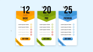
Hope you like this project, If simplicity is your go then this set of 3 pricing tables can quite come in handy in your design projects. Basic to Premium formats for pricing plans is available in this CSS template and we can see a fluid flip animation while doing that. This template is responsive and will be a asset to your collection.
If you enjoyed this article, share it with your friends and colleagues! If you need any more project-related frontend. Visit our homepage and you get 100+ projects💝.
If you have any queries please do not hesitate to contact us
written by – ninja_webtech
