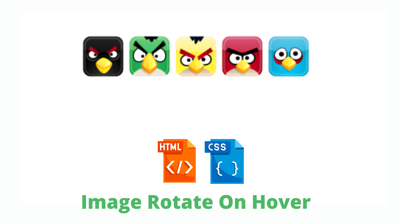
Image Rotate On Hover Using HTML And CSS Code Only
Hey Guys, Welcome To Our Blog, In Today’s Blog We Are Going To See How To Create An Image Rotation On Hover Using HTML and CSS Only.
This Image Rotate on hover will make the images to rotate of 360deg when we hover on it using the hover property. Simply we have to move the cursor to image then the image will start rotate. This is what the image rotate on hover is.
So, Let’s Begin Our Image Rotate On Hover Project By Adding The Source Codes. For That, First, We Are Using The Html Code.
HTML CODE For Image Rotate Hover
<div id="rotate">
  <img src="http://icons.iconarchive.com/icons/fasticon/angry-birds/64/black-bird-icon.png" class="image" />
  <img src="http://icons.iconarchive.com/icons/fasticon/angry-birds/64/green-bird-icon.png" class="image" />
  <img src="http://icons.iconarchive.com/icons/fasticon/angry-birds/64/yellow-bird-icon.png" class="image" />
  <img src="http://icons.iconarchive.com/icons/fasticon/angry-birds/64/red-bird-icon.png" class="image" />
  <img src="http://icons.iconarchive.com/icons/fasticon/angry-birds/64/blue-bird-icon.png" class="image" />
</div>
Here The HTML Code is straight forward… We just created a div class with a name rotate and placed all five images inside of the div class using IMG tag with class name image. Then We add CSS to make it rotate when we hover on it.
50+ Front-end Projects With Source Code | Front-end Projects With Source Code
So let’s see it below.
CSS CODE For Image Rotate Hover
body {
   background: url('http://www.noqta.it/dromoscopio/img/pattern_39.gif');
}
#rotate {
    margin: 50px auto 0;
    width: 500px;
}
.transition-duration(@time) {
    -webkit-transition-duration: @time;
    -moz-transition-duration: @time;
    -o-transition-duration: @time;
    transition-duration: @time;
}
.transform(@angle) {
    -webkit-transform:rotate(@angle);
    -moz-transform:rotate(@angle);
    -o-transform:rotate(@angle);
    transform: rotate(@angle);
}
.image {
    .transition-duration(1s);
    -webkit-transition-property: -webkit-transform;
    -moz-transition-property: -moz-transform;
    -o-transition-property: -o-transform;
    transition-property: transform;
        &:hover {
    .transform(360deg);
    }
}
First, In the body section, We are fixing the background and then we call out the div class rotate and fix the margin and width. Now we fixing the time for animation to perform using some CSS properties.
The properties were web kit transition duration, Moz transition duration, o transition etc… in this, we have to specify values for performing correct animation with timing.
Second, We now fixing out the properties to make it rotate by mentioning the angle as well. So That’s why we have declared it has transform(@angle). Inside of it we repeat the same properties has the transition contains.
Lastly , we calling out the image class and make the image to perform 360deg rotate for that we were fixing the duration of transition to 1 second and the same properties as before. Then the last line .transform(360deg) makes the images to rotate in 360deg which is mentioned inside of the hover class.
Now we have successfully completed adding the source codes for the project. but before we can see our project preview in the below output section.
FINAL OUTPUT For Image Rotate Hover
See the Pen
Rotate image 360deg when mouse hover with pure CSS3 by Mario Vidov (@mel)
on CodePen.
We have Successfully created our Image Rotation On Hover Using HTML & CSS Only. You can use this project for your personnel needs and the respective lines of code are given with the code pen link mentioned below.
100+ Front-end Projects for Web developers (Source Code)
If you find out this Blog helpful, then make sure to search code with random on google for Front End Projects with Source codes and make sure to Follow the Code with Random Instagram page.
REFER CODE – Mario Vidov
WRITTEN BY – Ragunathan S


