Hello, readers. Today’s blog will teach you how to create a Neumorphism Popup Login Form with HTML and CSS. I previously created a popup message using only HTML and CSS; now it’s time to create a Neumorphism popup login form using only HTML and CSS.
How To Make Nuemorphism Popup Login Form Using HTML & CSS ?
The Neomorphism effect is a hybrid of the popular flat UI and the old skeuomorphic principles! The elements have a dark box-shadow on the bottom and a light box-shadow on top; the combination of the two creates the effect of the elements pushing themselves through your display.
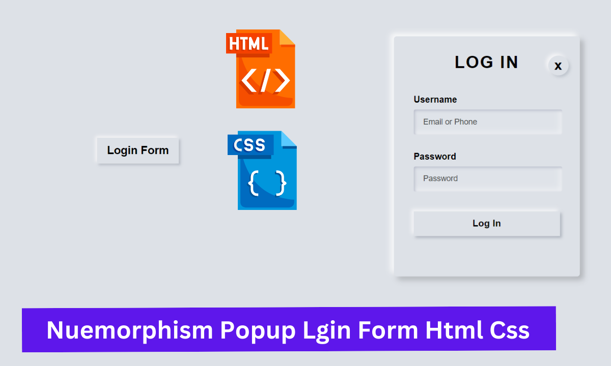
As shown in the image, this is a Light Neumorphism popup login form created with only HTML and CSS. Essentially, there are two options in our Light Neumorphism Login: username and password.
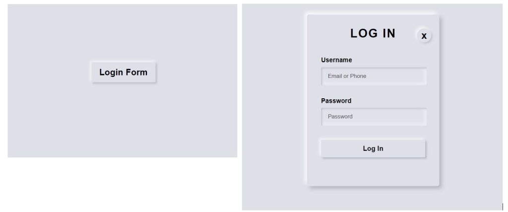
I hope you must have got an idea about the project.
So, let’s get started on the Popup form Project by adding the source codes. First, we’re going to use HTML code.
Step1: HTML code for Neumorphism Popup Login Form
<!DOCTYPE html>
<html lang="en">
  <head>
    <meta charset="UTF-8">
    <meta http-equiv="X-UA-Compatible" content="IE=edge">
    <meta name="viewport" content="width=device-width, initial-scale=1.0">
    <title>PopUp Login Form Design</title>
    <link rel="stylesheet" href="style.css">
</head>
<body>

    <div class="center">
        <!-- Home page button -->
      <input type="checkbox" id="click">
      <label for="click" class="click-me">Login Form</label>


        <!-- Popup login form -->
        <div class="content">
          <div class="text">
              LOG IN
          </div>
<label for="click" id="times">x</label>

          <form >

            <label for="username">Username</label>
              <input type="text" placeholder="Email or Phone" id="username">

              <label for="password">Password</label>
              <input type="password" placeholder="Password" id="password">

              <!-- Create a login button in the popup login form -->
             <button>Log In</button>

            </form>

        </div>
    </div>


</body>
- First, we’ll use the div tag to create the main container, which will house our login button and form.
- We’ll make a login form button now by using the input tag with type check box.
- Now we will create our popup login form structure by creating a div tag with the class (.content) that will contain our popup login form.Using the div with (.text) class we will create the main heading of our popup login form.
- We will now create a login form with the form tag.
- The label tag will be used to create the label “Username” for our input type text.
- We also add a new input box with type as “password”.
- A login button was also created using the button tag.
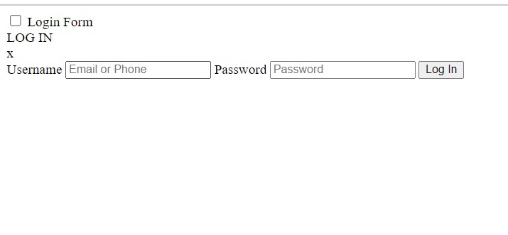
Let’s take a look at our output that was created solely with HTML.
Portfolio Website Using HTML CSS And JAVASCRIPT ( Source Code)
Neumorphism Popup Login Form Html Css Output:
So we have added the HTML tags and Their contents, Now it’s time to make it attractive by adding the CSS code.
Before we can style our page, we must add external styling links to the head section of our html.
<link rel="stylesheet" href="styles.css" />
Step2: CSS code for Popup Login Form
body{
  margin: 0;
  padding: 0;
  font-family: sans-serif;
  background: #dde1e7;
  min-height: 100vh;
}

#click{
  display: none;
}

.click-me{
  display: block;
  width: 160px;
  height: 50px;
  background: #dde1e7;
 text-align: center;
  font-size: 22px;
  line-height: 50px;
  cursor: pointer;
  box-shadow: -3px -3px 7px #fffdfdcc, 3px 3px 5px rgba(94, 104, 121, 0.342);
}

.click-me:hover{
  color: #351acc;
  box-shadow: inset 2px 2px 5px #babecc,
  inset -5px -5px 10px #ffffff73;
}

.center, .content{
  position: absolute;
  top: 50%;
  left: 50%;
  transform: translate(-50%, -50%);
}

/* Content page after click the login form */
.content{
   opacity: 0;
   visibility: hidden;
   width: 330px;
   height: auto;
   background: #dde1e7;
   padding: 30px 35px 40px;
   box-sizing: border-box;
   border-radius: 5px;
   box-shadow: -6px -6px 10px rgba(255, 255, 255, 0.8),
   6px 6px 10px rgba(0, 0, 0, 0.2);

  }

  #click:checked~.content{
      opacity: 1;
      visibility: visible;
  }

  .text{
      font-size: 30px;
      color: #000000;
      font-weight: 600;
      text-align: center;
      letter-spacing: 2px;
  }
#times{
   position: absolute;
   right: 20px;
   top: 5px;
   font-size: 25px;
   background: #dde1e7;
   padding: 3px;
   padding-left: 11px;
   padding-right: 11px;
   border-radius: 50%;

   box-shadow:  -4px -4px 7px #fffdfdb7,
   3px 3px 5px rgba(94, 104, 121, 0.24);
   cursor: pointer;
}

/* Form design */
form{
  margin-top: 40px;
}

label{
  display: block;
  margin-top: 30px;
  font-size: 16px;
  font-weight: 600;
}

/* I have designed the input spaces using these codes. */
input{
  display: block;
  height: 43px;
  width: 100%;
  background-color:  rgba(255,255,255,0.07);
  border-radius: 3px;
  border: none;
  box-shadow: inset 2px 2px 5px #babecc,
            inset -5px -5px 10px #ffffff73;
   margin-top: 8px;
   font-size: 14px;
   font-weight: 500;

}

::placeholder{
  color: #4b4e4d;
  padding-left: 15px;
}

/* Design a login button in the popup login form */
button{
  width: 100%;
  margin-top: 35px;
  font-size: 17px;
  font-weight: 700;
  box-shadow: -4px -4px 7px #fffdfdb7,
  3px 3px 5px rgba(94, 104, 121, 0.388);
  background: #dde1e7;
  border: none;
  margin-bottom: 32px;
  padding: 12px;

}

button:hover{
  box-shadow: inset -3px -3px 7px #ffffffb0,
  inset 3px 3px 5px rgba(94, 104, 121, 0.692);
}
Now that we’ve included our CSS code in our article, let’s go over it step by step.
Step1:Using the body tag, we now set the margin and padding on our webpage to “zero.” The font family is “sans-serif.” The background colour is “Hawkes Blue.” We also specified “100 vh” as the minimum height. We set the display to “none” using the ID selector (#click).
body{
  margin: 0;
  padding: 0;
  font-family: sans-serif;
  background: #dde1e7;
  min-height: 100vh;
}

#click{
  display: none;
}
Step2: Now, we’ll style the popup login form button with the class selector (.class-me). The display is set to “block,” and the width and height are defined as “160xp” and “50” px, respectively. Our button’s background colour is “Hawkes blue.” We also placed the text in the centre. The text font size is “22px”. We also set the line height to “50px.” The cursor is also set to “pointer.” We also added a box shadow to our login form.
We will add the hover property to the login form using the hover selector. as the user moves their mouse over the popup login form button The font colour is now “blue.” As an inset property, we also added the box shadow.
.click-me{
  display: block;
  width: 160px;
  height: 50px;
  background: #dde1e7;
 text-align: center;
  font-size: 22px;
  line-height: 50px;
  cursor: pointer;
  box-shadow: -3px -3px 7px #fffdfdcc, 3px 3px 5px rgba(94, 104, 121, 0.342);
}

.click-me:hover{
  color: #351acc;
  box-shadow: inset 2px 2px 5px #babecc,
  inset -5px -5px 10px #ffffff73;
}
Step3: Using the class selector, we will now position our form and login button (.center,.content). The position has been set to “absolute.” “50%” is written in the top space, and “50%” is written in the bottom space. We will set the position of our login form button (-50%) horizontally and vertically using the transform function.
.center, .content{
  position: absolute;
  top: 50%;
  left: 50%;
  transform: translate(-50%, -50%);
}Step4:To style our form, we will now use the “.content” class. We reduced its opacity to 0. In addition, the visibility is set to hidden. The width of the form is 330px, and the height is auto. Our form’s background colour is “Hawkes blue,” and we’ve added some padding to it. We set the size to “border-box” using the box-sizing property. We also specify a border-radius of “5 px” with a box shadow.
Now, using the checked property on our ID selector (#click), if it is checked, the visibility of our form content is set to “visible” and its opacity is set to “1.”
.center, .content{
  position: absolute;
  top: 50%;
  left: 50%;
  transform: translate(-50%, -50%);
}

/* Content page after click the login form */
.content{
   opacity: 0;
   visibility: hidden;
   width: 330px;
   height: auto;
   background: #dde1e7;
   padding: 30px 35px 40px;
   box-sizing: border-box;
   border-radius: 5px;
   box-shadow: -6px -6px 10px rgba(255, 255, 255, 0.8),
   6px 6px 10px rgba(0, 0, 0, 0.2);

  }

  #click:checked~.content{
      opacity: 1;
      visibility: visible;
  }
Step5: We will now create our form labels and inputs. Now, we’ll use the form tag to set the margin-top to “40px,” and the label tag to set the display to “block” and the margin-top to “30px.” We also set the font-weight to “bold” and the font-size to “16px.”
We will style our input with the input tag. We set the display to “block,” the height to “43 px,” and the width to “100%.” The background colour is dark grey. We changed the colour of our placeholder to a light grey, and we also added padding to our form input.
form{
  margin-top: 40px;
}

label{
  display: block;
  margin-top: 30px;
  font-size: 16px;
  font-weight: 600;
}

/* I have designed the input spaces using these codes. */
input{
  display: block;
  height: 43px;
  width: 100%;
  background-color:  rgba(255,255,255,0.07);
  border-radius: 3px;
  border: none;
  box-shadow: inset 2px 2px 5px #babecc,
            inset -5px -5px 10px #ffffff73;
   margin-top: 8px;
   font-size: 14px;
   font-weight: 500;

}

::placeholder{
  color: #4b4e4d;
  padding-left: 15px;
}
Step6 : We will now style our button. The width is set to 100% and the margin-top is set to 35px. We also increased the font size and added a box shadow to our login button. Our button’s background colour is “Hawkes blue.” The padding was also set to 12 pixels.
Using the hover selector now. When the user hovers over the button, the box shadow transforms into an inset with a different colour.
button{
  width: 100%;
  margin-top: 35px;
  font-size: 17px;
  font-weight: 700;
  box-shadow: -4px -4px 7px #fffdfdb7,
  3px 3px 5px rgba(94, 104, 121, 0.388);
  background: #dde1e7;
  border: none;
  margin-bottom: 32px;
  padding: 12px;

}

button:hover{
  box-shadow: inset -3px -3px 7px #ffffffb0,
  inset 3px 3px 5px rgba(94, 104, 121, 0.692);
}
Let’s take a look at our final output now that we’ve styled our popup login form.
ADVERTISEMENT
Output:
ADVERTISEMENT

ADVERTISEMENT
The project is now finished, we have completed Popup Login form using HTML and CSS. Now look at the live preview.
ADVERTISEMENT
Output:
ADVERTISEMENT
Codepen preview of Nuemorphism Popup Lgin Form Html Css
See the Pen
LogIn Page with HTML, CSS only by Talha khan (@Talha_shinwari)
on CodePen.
Now We have Successfully created the Nuemorphism Popup Lgin Form using HTML and CSS . You can use this project directly by copying into your IDE. WE hope you understood the project , If you any doubt feel free to comment!!
If you find out this Blog helpful, then make sure to search code with random on google for Front End Projects with Source codes and make sure to Follow the Code with Random Instagram page.
Thank You!!!
