How To Create Hamburger Menu Using JavaScript
Hello programmers! As of now, we know how to build an expanding sidebar menu. Check it out by clicking the link below if you haven’t already. We’ll build a responsive hamburger menu in this article. You may readily comprehend that this project is absolutely beginner-friendly by reading this post.
The hamburger menu is essential when working with responsive design. To maintain simple website navigation, it is imperative that the menu may be displayed or hidden on small screens. We will create a responsive hamburger menu in this tutorial.
In this article, we present a How To Create Hamburger Menu using Javascript with complete source code for you so you can copy and paste it into your project.

We will design a fully functional, responsive hamburger menu using the step-by-step instructions in this post.
Step1: Adding some basic HTML Code
<!DOCTYPE html>
<html>
  <head>
    <link rel="stylesheet" href="style.css" />
    <title>Hamburger Menu</title>
  </head>

  <body>
    <div class="container">
      <nav>
        <div class="toggle active">
          <span></span>
          <span></span>
          <span></span>
        </div>
        <div class="menu">
          <ul>
            <li><a href="#">Home</a></li>
            <li><a href="#">About</a></li>
            <li><a href="#">Services</a></li>
            <li><a href="#">Contact</a></li>
            <li><a href="#">Portfolio</a></li>
          </ul>
        </div>
      </nav>

      <section></section>
      <section></section>
      <section></section>
    </div>
    <script src="index.js"></script>
  </body>
</html>
To provide structure to our website, this project just requires a very small amount of code. The photos here are simply for instructional purposes so that you guys can learn how to make a hamburger menu, and we use some simple HTML tags to create our hamburger menu.
- First, we’ll use a div tag to build a container that will house the webpage’s structure.
- We’ll define a navigation tag inside of it to aid in the construction of our hamburger menu. To toggle between the active and inactive states in javascript, we will now add a few empty span tags.
- We will make a list of the things we wish to appear in our hamburger menu using the unordered list. In addition, we’ll include a link in our list item.
- To assist you in readily grasping the project, we’ll build some blank sections right away so that we may fill them with content.
100+ Front-end Projects for Web developers (Source Code)
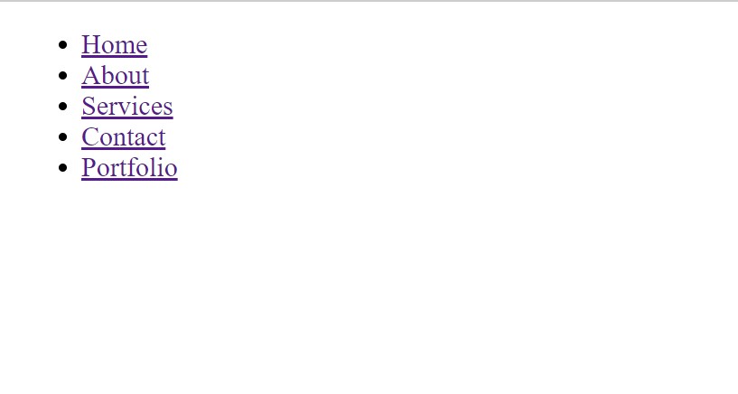
Our website now has a structure added to it. Let’s quickly review what we produced.
Output:

Before the code, you just need to add the CSS link to our HTML file so that we add styling to our website:
<link rel="stylesheet" href="./style.css">
Keep note that you must add this link under the head tag.
Step2: Adding CSS Code
@import url('https://fonts.googleapis.com/css2?family=Quicksand:wght@500&display=swap');
*{
    padding: 0;
    margin: 0;
    font-family: 'Quicksand', sans-serif;
   }
body{
    background: #fff;
}
.container{
    position: relative;
    width: 100%;
}
.container section{
    position: relative;
    width: 100%;  min-height: 100vh;
}
.container section:nth-of-type(1){
    background: url(https://www.gettyimages.fr/gi-resources/images/500px/983794168.jpg);
    background-size: 100% 100vh;
}
.container section:nth-of-type(2){
    background: url(https://img.wallpapersafari.com/desktop/1366/768/75/54/LR5fOw.jpg);
    background-size: 100% 100vh;
}
.container section:nth-of-type(3){
    background: url(https://clippingpathbirds.com/wp-content/uploads/2019/12/blog.jpg);
    background-size: 100% 100vh;
}


.container nav{
    position: fixed;
    top: 0;  left: 0;
    width: 100%;
    z-index: 10;
}

/**************  nav .toggle  **************/
.container nav .toggle{
    position: absolute;
    top: 0;  left: 0;
    width: 60px;  height: 60px;
    background: #ccc;
    z-index: 2;
    cursor: pointer;
}
.container nav .toggle span{
    display: block;
    width: 90%;  height: 5px;
    background: #262626;
    position: absolute;
    left: 5%;
    transform: translateY(-50%);
    transition: 1s;
}
.container nav .toggle span:nth-of-type(1){
    top: 25%;
}
.container nav .toggle span:nth-of-type(2){
    top: 50%;
}
.container nav .toggle span:nth-of-type(3){
    top: 75%;
}
.container nav .toggle.active span:nth-of-type(1){
    top: 50%;
    transform: rotate(45deg);
}
.container nav .toggle.active span:nth-of-type(2){
    left: -100%;   opacity: 0;
}
.container nav .toggle.active span:nth-of-type(3){
    top: 50%;
    transform: rotate(-45deg);
}

/**************  nav .menu  **************/
.container nav .menu{
    position: absolute;
    top: 0;   left: -100%;
    width: 100%;  height: 60px;
    background: #ccc;
    z-index: 1;
    transition: 1s;
}
.container nav .toggle.active + .menu{
    left: 0;
}

.container nav .menu ul{
    position: relative;
    float: right;
    display: flex;
}
.container nav .menu ul li{
    list-style: none;
}
.container nav .menu ul li a{
    display: inline-block;
    position: relative;
    height: 60px;   line-height: 60px;
    padding: 0 20px;
    color: #262626;
    text-decoration: none;  text-transform: uppercase;
    font-size: 20px;
}
.container nav .menu ul li:hover a{
    background: #ff5722;    color: #fff;
}

@media screen and (max-width: 700px) {
    .container nav .menu{
         height: auto;
    }
    .container nav .menu ul{
        float: none;
        display: block;
    }
    .container nav .menu ul li{
        width: 100%;  height: 60px;
    }
    .container nav .menu ul li a{
        width: 100%;  height: 100%;
        text-align: center;
        padding: 0
    }
}
After we’ve added the CSS code, we’ll go over it step by step. To save time, you can simply copy this code and paste it into your IDE. Let us now examine our code step by step.
Step1: We initially had to import the “quicksand” font family from Google Fonts into our webpage so that we could lay out the text in our hamburger. We now set the padding and margin to “zero” and the font family to “Quicksand” using the universal selector.
We gave our website’s background the color “white” using the body tag.
@import url('https://fonts.googleapis.com/css2?family=Quicksand:wght@500&display=swap');
*{
    padding: 0;
    margin: 0;
    font-family: 'Quicksand', sans-serif;
   }
body{
    background: #fff;
}
Step2: We’ll now customize our primary container utilizing the class selector (.container). The position is set to “relative” and the width is set to “100%.”
The nth-of-type() function will be used to add to our section’s styling. This type of selector is utilized to choose the number of sections we defined based on their order. Now utilizing this, we specify the width as “100%” and the backdrop as an image. In a similar manner, we will add the picture to our other section.
.container{
    position: relative;
    width: 100%;
}
.container section{
    position: relative;
    width: 100%;  min-height: 100vh;
}
.container section:nth-of-type(1){
    background: url(https://www.gettyimages.fr/gi-resources/images/500px/983794168.jpg);
    background-size: 100% 100vh;
}
.container section:nth-of-type(2){
    background: url(https://img.wallpapersafari.com/desktop/1366/768/75/54/LR5fOw.jpg);
    background-size: 100% 100vh;
}
.container section:nth-of-type(3){
    background: url(https://clippingpathbirds.com/wp-content/uploads/2019/12/blog.jpg);
    background-size: 100% 100vh;
}
Step3: Our hamburger menu will now be styled. Its position is set to “fixed,” and the z-index is adjusted so that it is close to the screen. Its position is set to entirely fill the top header area of our website.
Now let’s style the toggle span. We introduced a transform attribute to adjust the position in relation to the y-axis. The display is set to block, the width to “90%,” and the backdrop to “dark black.”
Using the same nth-of-type selector we will add a different style to our hamburger.
.container nav .toggle{
    position: absolute;
    top: 0;  left: 0;
    width: 60px;  height: 60px;
    background: #ccc;
    z-index: 2;
    cursor: pointer;
}
.container nav .toggle span{
    display: block;
    width: 90%;  height: 5px;
    background: #262626;
    position: absolute;
    left: 5%;
    transform: translateY(-50%);
    transition: 1s;
}
.container nav .toggle span:nth-of-type(1){
    top: 25%;
}
.container nav .toggle span:nth-of-type(2){
    top: 50%;
}
.container nav .toggle span:nth-of-type(3){
    top: 75%;
}
.container nav .toggle.active span:nth-of-type(1){
    top: 50%;
    transform: rotate(45deg);
}
.container nav .toggle.active span:nth-of-type(2){
    left: -100%;   opacity: 0;
}
.container nav .toggle.active span:nth-of-type(3){
    top: 50%;
    transform: rotate(-45deg);
}Step5:Using a media query, we will now make our website responsive. The maximum width (700 px) will be established using a media query, and if the screen size falls within the defined range, the container height will be determined depending on the size of the screen window.
ADVERTISEMENT
@media screen and (max-width: 700px) {
    .container nav .menu{
         height: auto;
    }
    .container nav .menu ul{
        float: none;
        display: block;
    }
    .container nav .menu ul li{
        width: 100%;  height: 60px;
    }
    .container nav .menu ul li a{
        width: 100%;  height: 100%;
        text-align: center;
        padding: 0
    }
}
Now we have completed our CSS code and below here is the output after styling our webpage.
ADVERTISEMENT
Output:
ADVERTISEMENT

Step3: Adding Javascript Code
var toggleConponent = document.querySelector('nav .toggle');
toggleConponent.addEventListener('click',()=>{
    toggleConponent.classList.toggle('active');
})
The ability to add or remove classes has just been added to JavaScript. Using the document. query selector, we will first choose our Html element with class. Then, with EventListener on click, we will add a toggle function and an active class to our hamburger using the (.classList) method.
ADVERTISEMENT
The design of our hamburger menu in HTML, CSS, and JavaScript is now complete. To help you fully comprehend and attempt to put all those concepts into practice on your own, we’ll now have a look at the video output.
ADVERTISEMENT
Output:
Codepen Preview Of hamburger Menu
See the Pen
HTML CSS Javascript Responsive Sliding Menu by Bousahla Mounir (@bousahla-mounir)
on CodePen.
Now We have Successfully added the hamburger Menu using HTML, CSS & Javascript. You can use this project directly by copying it into your IDE. We hope you understood the project, If you have any doubts feel free to comment!!
If you find out this Blog helpful, then make sure to search codewithrandom on google for Front End Projects with Source codes and make sure to Follow the Code with Random Instagram page.
Thank You And Happy Learning!!!


