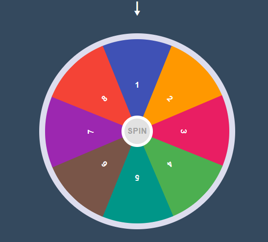
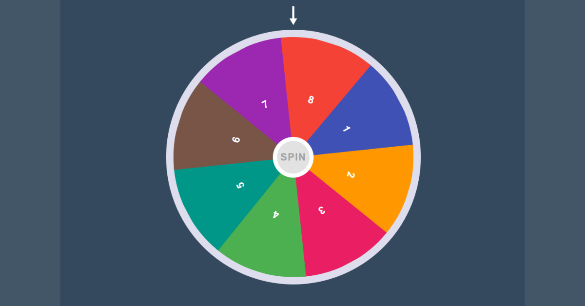
Hello Coder , Welcome to our Codewithrandom website, In Today’s Blog We are going to create a Spin Wheel Using HTML, CSS, and JavaScript Code. When you click on spin, Wheel starts and stops after a few seconds on any random number. We Create 1 to 8 numbers in the spinner wheel and you Spin the Wheel.
Spin Wheel Using HTML and JavaScript Code
Spin Wheel is a simple JavaScript game that you can create with basic HTML, CSS and JavaScript. If you are new to coding world and want to learn web development then JavaScript is very important for you. You can practice various JavaScript projects to learn basic JavaScript. But for advanced knowledge this kind of javascript game will help you.
I have shared the complete code and step by step tutorial of this Spin Wheel Using HTML and JavaScript here. Also get live preview here.
Do you know on this site I have already shared many types of JavaScript games like Dinosaur Game Using JavaScript, Build Flappy Bird Game, Spin Wheel Game, Car Racing Game etc.
| Code by | Ghost Code |
| Project Download | Link Available Below |
| Language used | HTML, CSS, and JavaScript |
| External link / Dependencies | No |
| Responsive | No |
Now The Project is going to create and for that, we are first adding an HTML Code.
Spin Wheel HTML Code:-
<html lang="en">
<head>
    <meta charset="UTF-8">
    <meta name="viewport" content="width=device-width, initial-scale=1.0">

    <title>Spin Wheel</title>
</head>
<body>
    <button id="spin">Spin</button>
    <span class="arrow"></span>
<div class="container">
    <div class="one">1</div>
    <div class="two">2</div>
    <div class="three">3</div>
    <div class="four">4</div>
    <div class="five">5</div>
    <div class="six">6</div>
    <div class="seven">7</div>
    <div class="eight">8</div>
</div>
</body>
</html>
Only HTML Output:-

In This HTML Code , We first creating an button class with ID =”spin” and inside of of it a an empty span class is added for the arrow to be represent.
Then With Simple div class with name as container we are adding more sub divisions inside of it until the number up to 8 that contains separate class names.
Restaurant Website Using HTML and CSS
Now the HTML code for spin wheel is complete. So we go for CSS to make some stylings in the spin wheel.
CSS Code For Spin Wheel Code:-
*{
    box-sizing:border-box;
}

body{
    margin:0;
    padding:0;
    background-color: #34495e;
    display:flex;
    align-items:center;
    justify-content: center;
    height:100vh;
    overflow:hidden;
}

.container{
    width:500px;
    height:500px;
    background-color: #ccc;
    border-radius:50%;
    border:15px solid #dde;
    position: relative;
    overflow: hidden;
    transition: 5s;
}

.container div{
    height:50%;
    width:200px;
    position: absolute;
    clip-path: polygon(100% 0 , 50% 100% , 0 0 );
    transform:translateX(-50%);
    transform-origin:bottom;
    text-align:center;
    display:flex;
    align-items: center;
    justify-content: center;
    font-size:20px;
    font-weight:bold;
    font-family:sans-serif;
    color:#fff;
    left:135px;
}

.container .one{
    background-color: #3f51b5;
    left:50%;
}
.container .two{
    background-color: #ff9800;
    transform: rotate(45deg);
}
.container .three{
    background-color: #e91e63;
    transform:rotate(90deg);
}
.container .four{
    background-color: #4caf50;
    transform: rotate(135deg);
}
.container .five{
    background-color: #009688;
    transform: rotate(180deg);
}
.container .six{
    background-color: #795548;
    transform: rotate(225deg);
}
.container .seven{
    background-color: #9c27b0;
    transform: rotate(270deg);
}
.container .eight{
    background-color: #f44336;
    transform: rotate(315deg);
}

.arrow{
    position: absolute;
    top:0;
    left:50%;
    transform: translateX(-50%);
    color:#fff;
}

.arrow::before{
    content:"\1F817";
    font-size:50px;
}

#spin{
    position: absolute;
    top:50%;
    left:50%;
    transform:translate(-50%,-50%);
    z-index:10;
    background-color: #e2e2e2;
    text-transform: uppercase;
    border:8px solid #fff;
    font-weight:bold;
    font-size:20px;
    color:#a2a2a2;
    width: 80px;
    height:80px;
    font-family: sans-serif;
    border-radius:50%;
    cursor: pointer;
    outline:none;
    letter-spacing: 1px;
}
The Following Steps given below is the explanation of each CSS. So Follow the steps given below.
ADVERTISEMENT
STEP 1: Inside of BODY container We are adding the alignment and flex box properties like display , margin , padding , align-items , justify-content ,etc… for making the spin wheel to fix in center of web page sizes and additionally the background color for the web page is also added.
ADVERTISEMENT
ADVERTISEMENT
ADVERTISEMENT
body{
    margin:0;
    padding:0;
    background-color: #34495e;
    display:flex;
    align-items:center;
    justify-content: center;
    height:100vh;
    overflow:hidden;
}

.container{
    width:500px;
    height:500px;
    background-color: #ccc;
    border-radius:50%;
    border:15px solid #dde;
    position: relative;
    overflow: hidden;
    transition: 5s;
}
ADVERTISEMENT
STEP 2: Now We calling out each div classes that contains the number from 1 to 8 and adding separate background color and animate properties using transform: translate.
.container .one{
    background-color: #3f51b5;
    left:50%;
}
.container .two{
    background-color: #ff9800;
    transform: rotate(45deg);
}
.container .three{
    background-color: #e91e63;
    transform:rotate(90deg);
}
.container .four{
    background-color: #4caf50;
    transform: rotate(135deg);
}
.container .five{
    background-color: #009688;
    transform: rotate(180deg);
}
.container .six{
    background-color: #795548;
    transform: rotate(225deg);
}
.container .seven{
    background-color: #9c27b0;
    transform: rotate(270deg);
}
.container .eight{
    background-color: #f44336;
    transform: rotate(315deg);
}
STEP 3: The Third Step is about the button that will make rotate the circle when we click on it. The code for this is given below.
Ecommerce Website Using HTML, CSS, & JavaScript (Source Code)
#spin{
    position: absolute;
    top:50%;
    left:50%;
    transform:translate(-50%,-50%);
    z-index:10;
    background-color: #e2e2e2;
    text-transform: uppercase;
    border:8px solid #fff;
    font-weight:bold;
    font-size:20px;
    color:#a2a2a2;
    width: 80px;
    height:80px;
    font-family: sans-serif;
    border-radius:50%;
    cursor: pointer;
    outline:none;
    letter-spacing: 1px;
}
Now We have Completed our CSS code. The Last Needed one is Java Script to make the rotation stop on the random numbers between 1 to 8.
Spin Wheel JavaScript Code
let container = document.querySelector(".container");
let btn = document.getElementById("spin");
let number = Math.ceil(Math.random() * 1000);

btn.onclick = function () {
    container.style.transform = "rotate(" + number + "deg)";
    number += Math.ceil(Math.random() * 1000);
}
First of all , we are getting the div class container , and button class spin using JS query selector property. Then using JS Math property we are setting it to random and storing it in a variable called number.
In Second step , We are adding onclick function to a button and adding the transformation property by mentioning it with container class and then adding it with random numbers and it will declare the smallest integer among others in the arrow after spin.
So that’s of for Java script, and Hence we have completed our project successfully by mentioning source codes. Now we can move for Output Section to make a preview of our project.
Final Output Of Spin Wheel Using JavaScript
Final Output:-

Now We have Successfully created our Spin Wheel Using HTML, CSS, and JavaScript. You can use this project for your personnel needs and the respective lines of code are given with the code pen link mentioned below.
If you find out this Blog helpful, then make sure to search Codewithrandom on Google for Front End Projects with Source codes and make sure to Follow the Code with Random Instagram page.
Thanks for visiting our website
Stay with us😊🌹
Follow on Instagram For Interesting Coding Post :- codewith_random


