How To Create Flip Card With CSS
The cards on your website that flip, when you mouse over them, are called flip cards. When you hover over the cards, information, websites, or photos will appear on the back face of the card.
In this article, we’ll use some CSS fundamentals—transforms, flex, and grid—to create a flip card grid that addresses that issue. You’ll need to be familiar with these, and a solid understanding of CSS positioning techniques will be helpful. We’ll talk about:
Using HTML And CSS we present How To Create Flip Card With CSS projects with source code available for you to copy and paste directly into your own project.
How flip cards are often accomplished using absolute positioning, the scaling issue that absolute positioning presents, and a generic fix for automatic sizing of superimposed content.
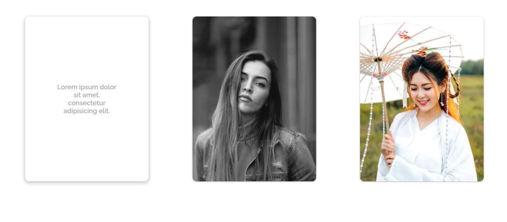
Step1: Adding Some Basic HTML
HTML stands for HyperText Markup Language. This is a markup language. Its main job is to give our project structure. We will provide our project structure by utilizing this markup language. So let’s look at our HTML code.
<!DOCTYPE html>
<html lang="en">

<head>
    <meta charset="UTF-8">
    <title>Flip-photo</title>
    <link rel="stylesheet" href="style.css">
    <meta name="viewport" content="width=device-width, initial-scale=1">
    <link href="https://fonts.googleapis.com/css?family=Raleway:400,600,700&display=swap" rel="stylesheet">
</head>

<body>
    <div class="scene">
        <label class="card-wrap">
            <input type="checkbox" class="flipcard">
            <div class="card">
                <div class="front card-face">
                    <img src="https://images.unsplash.com/photo-1517374148673-a38e9dd4fe6f?ixlib=rb-1.2.1&ixid=eyJhcHBfaWQiOjEyMDd9&auto=format&fit=crop&w=500&q=60"
                        alt="" class="card-photo">
                </div>
                <div class="back card-face">
                    <p>Lorem ipsum dolor sit amet, consectetur adipisicing elit.</p>
                </div>
            </div>
        </label>
        <label class="card-wrap">
            <input type="checkbox" class="flipcard">
            <div class="card">
                <div class="front card-face">
                    <img src="https://images.unsplash.com/photo-1531518326825-96490ddf2a89?ixlib=rb-1.2.1&ixid=eyJhcHBfaWQiOjEyMDd9&auto=format&fit=crop&w=500&q=60"
                        alt="" class="card-photo">
                </div>
                <div class="back card-face">
                    <p>Lorem ipsum dolor sit amet, consectetur adipisicing elit.</p>
                </div>
            </div>
        </label>
        <label class="card-wrap">
            <input type="checkbox" class="flipcard">
            <div class="card">
                <div class="front card-face">
                    <img src="https://images.unsplash.com/photo-1529911194209-8578109840df?ixlib=rb-1.2.1&ixid=eyJhcHBfaWQiOjEyMDd9&auto=format&fit=crop&w=500&q=60"
                        alt="" class="card-photo">
                </div>
                <div class="back card-face">
                    <p>Lorem ipsum dolor sit amet, consectetur adipisicing elit.</p>
                </div>
            </div>
        </label>
    </div>
</body>

</html>
before we begin building out the structure of our website. First, we need to include a link in the head section. In order to include CSS in HTML, we must include a link to an external stylesheet in the head section. For our Flip Card to include Google Fonts, we must include a Google Fonts link in our HTML.
Ecommerce Website Using Html Css And Javascript Source Code
Now let’s build a structure for our flip card using HTML.
- First of all, we create a div with a class scene which will hold up our flip card structure.
- The front and back faces of our card will now be stored in a label class we will construct for the card wrap.
- We have added an input box of type checkbox to show that we can use the CSS checked function to toggle between the front face and back face.
- The front face of our card is added using the image tag, and the back of our card, which contains the card’s information, is added using the paragraph tag.
- We will use a similar method to add the other two flip cards.
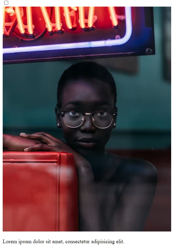
Now lets a look at our structure.
Output:
Step2: Adding CSS
* {
  margin: 0;
  padding: 0;
  box-sizing: border-box;
}

.input {
  position: absolute;
}

.scene {
  width: 1440px;
  max-width: 100%;
  min-height: 100vh;
  margin: auto;
  padding: 40px 30px;
}

.card-wrap {
  display: block;
  width: 300px;
  max-width: 100%;
  height: 400px;
  margin: 0 auto;
  margin-bottom: 15px;
}

.card,
.front,
.back,
.card-photo {
  width: 100%;
  height: 100%;
}

.card-face {
  position: absolute;
  backface-visibility: hidden;
}

.card {
  position: relative;
  transform-style: preserve-3d;
  transition: transform 1s, box-shadow 0.4s;
  box-shadow: 0 1px 2px 0 rgba(60, 64, 67, 0.302),
    0 1px 3px 1px rgba(60, 64, 67, 0.149);
  border-radius: 10px;
}

.card-photo {
  object-fit: none;
  border-radius: 10px;
}

.card:hover {
  box-shadow: 0 1px 3px 0 rgba(60, 64, 67, 0.302),
    0 4px 8px 3px rgba(60, 64, 67, 0.149);
}

.back {
  background-color: white;
  transform: rotateY(180deg);
  text-align: center;
  color: darkgray;
  border-radius: 10px;
  font-family: "Raleway", sans-serif;
  font-weight: 600;
}

.back p {
  margin: 0;
  position: absolute;
  top: 50%;
  left: 50%;
  transform: translate(-50%, -50%);
}

.flipcard {
  opacity: 0;
}

input:checked + .card {
  transform: rotateY(180deg);
}

@media screen and (min-width: 960px) {
  .scene {
    display: flex;
    justify-content: space-around;
  }
}
After we’ve added the CSS code, we’ll go over it step by step. To save time, you can simply copy this code and paste it into your IDE. Let us now examine our code step by step.
Portfolio Website using HTML and CSS (Source Code)
Step1: Start by using the Global Selector (*). We will add “zero” padding, “zero” margins, and “border-box” box sizes to our body.
The class selector will now be used to decorate our flip card container (.scene). Our flip card container will receive a width of “1440 px.” The minimum height is set to “100vh” and a maximum width of 100% has also been introduced. Along with setting the padding to 40 pixels in the top and bottom and 30 pixels in the left and right, we also set the margin to “Auto.”
* {
  margin: 0;
  padding: 0;
  box-sizing: border-box;
}

.input {
  position: absolute;
}

.scene {
  width: 1440px;
  max-width: 100%;
  min-height: 100vh;
  margin: auto;
  padding: 40px 30px;
}
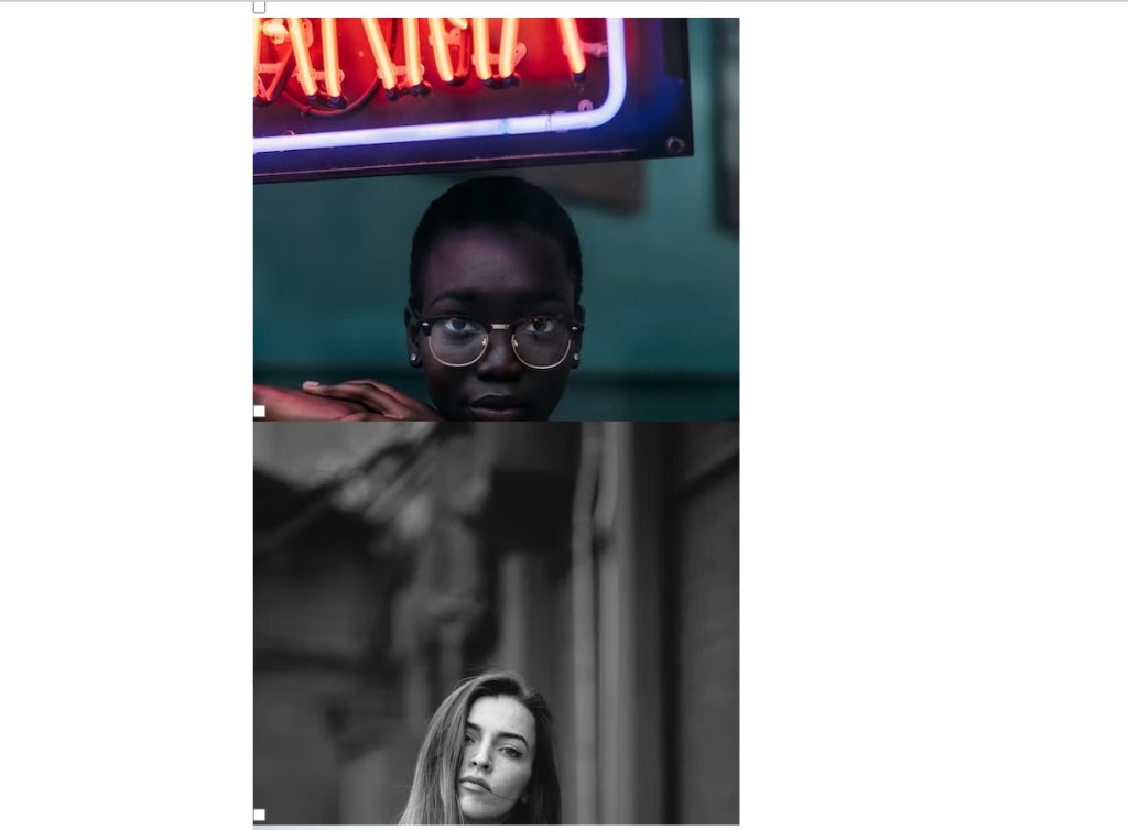
Step2: The class “.card-wrap” will be used as a starting point for styling our flip card containers. The width and height will be set to 300 px and 400 px, respectively, with the display being set to “Block.” We chose “auto” for the margin.
.card-wrap {
  display: block;
  width: 300px;
  max-width: 100%;
  height: 400px;
  margin: 0 auto;
  margin-bottom: 15px;
}Step3:We will now style our card using the lessons (.card,.front, back, card-photo). The width and height are both set to 100%. We set its position to absolute and its visibility to hidden using the backface-visibility property. Additionally, we introduced a hover attribute, which causes a box shadow to form as users hover over the flip card.
.card,
.front,
.back,
.card-photo {
  width: 100%;
  height: 100%;
}

.card-face {
  position: absolute;
  backface-visibility: hidden;
}

.card {
  position: relative;
  transform-style: preserve-3d;
  transition: transform 1s, box-shadow 0.4s;
  box-shadow: 0 1px 2px 0 rgba(60, 64, 67, 0.302),
    0 1px 3px 1px rgba(60, 64, 67, 0.149);
  border-radius: 10px;
}

.card-photo {
  object-fit: none;
  border-radius: 10px;
}

.card:hover {
  box-shadow: 0 1px 3px 0 rgba(60, 64, 67, 0.302),
    0 4px 8px 3px rgba(60, 64, 67, 0.149);
}
Step4: We are going to style our back face right now. We chose “white” as the background color. We’ll add a 180-degree rotation toward the y-axis using the transform attribute. The font is displayed in the color “dark gray.” To give the corners of our flip card some curve, we also added a border radius of 10 pixels.
We have set the opacity on our flip card to 0. When a user clicks on the front face of the flip card, the checked function we applied on our card causes it to rotate 180 degrees on the y-axis.
.back {
  background-color: white;
  transform: rotateY(180deg);
  text-align: center;
  color: darkgray;
  border-radius: 10px;
  font-family: "Raleway", sans-serif;
  font-weight: 600;
}

.back p {
  margin: 0;
  position: absolute;
  top: 50%;
  left: 50%;
  transform: translate(-50%, -50%);
}

.flipcard {
  opacity: 0;
}

input:checked + .card {
  transform: rotateY(180deg);
}
Step5:We will now add a minimum width using the media query. The display will be set to “flex” and justify if the screen size is equal to or more than the defined size; the space surrounding the flip card will then be set automatically based on the window size.
@media screen and (min-width: 960px) {
  .scene {
    display: flex;
    justify-content: space-around;
  }
}
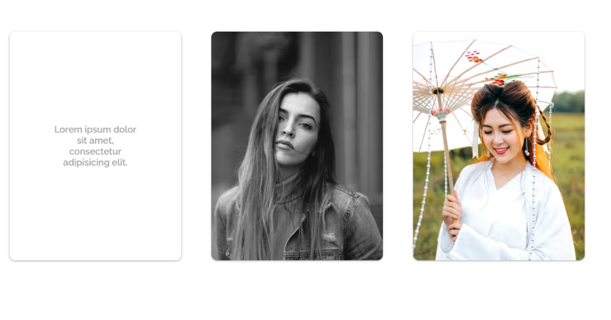
The project is now finished, we have completed the flip card design using HTML & CSS. Now, look at the live preview.
ADVERTISEMENT
100+ JavaScript Projects With Source Code ( Beginners to Advanced)
ADVERTISEMENT
Output:
you can use this project directly by copying it into your IDE. We hope you understood the project, If you have any doubts feel free to comment!!
ADVERTISEMENT
Using HTML And CSS we show you How To Create Flip Card With CSS projects with source code available for you to copy and paste directly into your own project.
ADVERTISEMENT
If you find out this Blog helpful, then make sure to search code random on google for Front End Projects with Source codes and make sure to Follow the Code with Random Instagram page.
ADVERTISEMENT
Thank You And Keep Learning!!
![34+ Tailwind CSS Forms Template [ Demo + Code ] Read more about the article 34+ Tailwind CSS Forms Template [ Demo + Code ]](https://www.codewithrandom.com/wp-content/uploads/2022/11/15-Bootstrap-login-forms127-300x157.png)

