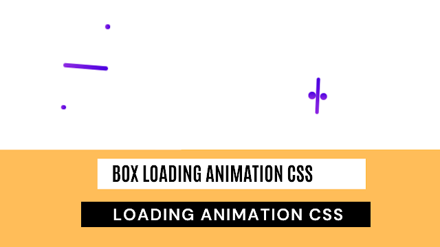
Create Loading Animation Using CSS
Welcome to the Codewithrandom blog. In this blog, we learn that how to create Loading Animation on a Website. We use HTML and CSS for this Loading Animation.
I hope you enjoy our blog so let’s start with a basic Html Structure for Loading Animation CSS.
HTML Code For Loading Animation
<!DOCTYPE html>
<html lang="en">
<head>
<meta charset="UTF-8">
<meta http-equiv="X-UA-Compatible" content="IE=edge">
<meta name="viewport" content="width=device-width, initial-scale=1.0">
<title>loading Animation</title>
<link rel="stylesheet" href="style.css">
</head>
<body>
<div class="box"></div>
</body>
</html>
There is all the Html Code for the Loading Animation. Now, you can see output without CSS, then we write CSS for our Loading Animation.
Portfolio Website Using HTML ,CSS ,Bootstrap and JavaScript
Html Code Output
There is only a white browser screen because we have only a blank div and we don’t add any single line of Css.
CSS Code For Loading Animation
* {
margin: 0;
padding: 0;
box-sizing: border-box;
}
body {
display: flex;
justify-content: center;
align-items: center;
height: 100vh;
}
.box {
width: 50px;
height: 5px;
background: linear-gradient(to right, #8e2de2, #4a00e0);
border-radius: 10px;
animation: anim 4s infinite;
position: relative;
}
.box::before {
content: "";
position: absolute;
top: 50px;
width: 5px;
height: 5px;
border-radius: 50%;
background: linear-gradient(to right, #8e2de2, #4a00e0);
animation: anim2 2s infinite;
}
.box::after {
content: "";
position: absolute;
right: 0;
bottom: 50px;
width: 5px;
height: 5px;
border-radius: 50%;
background: linear-gradient(to right, #8e2de2, #4a00e0);
animation: anim3 2s infinite;
}
@keyframes anim {
0%,
100% {
transform: rotate(0deg);
}
50% {
transform: rotate(360deg);
}
}
@keyframes anim2 {
0%,
100% {
transform: translateY();
}
50% {
transform: translateY(-45px) translateX(20px);
width: 10px;
height: 10px;
}
}
@keyframes anim3 {
0%,
100% {
transform: translateY();
}
50% {
transform: translateY(45px) translateX(-20px);
width: 10px;
height: 10px;
}
}
Now we have completed our Loading Animation Project. Here is our updated output HTML + CSS.
50+ HTML, CSS &JavaScript Projects With Source Code
Final Output Of Loading Animation Using CSS
How To Create OTP Input Field Using HTML , CSS & Javascript
Now we have completed our Loading Animation, Here is our updated output with CSS. Hope you like loading animation css, you can see the output video and project screenshots. See our other blogs and gain knowledge in front-end development.
Thank you!
In this post, we learn how to Create a Loading Animation Using CSS. If we made a mistake or any confusion, please drop a comment to reply or help you in easy learning.
Written by – Code With Random/Anki


