Glassmorphism Login Form Using HTML and CSS Code
Creating a website allows you to think outside the box and add personal touches to your website according to your choices. Although CSS provides different types of styling for developers, glassmorphism is one of the most visually appealing designs in the field of web design. Glassmorphism is a kind of glass design in which the background of the website is blurred and the content is highlighted, which gives a glassy look to the content of the website.
50+ HTML, CSS and JavaScript Projects With Source Code
| Code by | Md Aman |
| Project Download | Link Available Below |
| Language used | HTML and CSS |
| External link / Dependencies | NO |
| Responsive | YES |
Live Preview Of Glassmorphism Login Form Login Page Using CSS
Html Code For Glassmorphism Login Form
<!DOCTYPE html>
<html lang="en">

<head>
  <meta charset="UTF-8">
  <meta http-equiv="X-UA-Compatible" content="IE=edge">
  <meta name="viewport" content="width=device-width, initial-scale=1.0">
  <title>Glassmorphism login Formr</title>
  <link rel="stylesheet" href="style1.css">
  <link rel="stylesheet" href="https://cdnjs.cloudflare.com/ajax/libs/font-awesome/5.15.4/css/all.min.css">
  <link href="https://fonts.googleapis.com/css2?family=Poppins:wght@300;500;600&display=swap" rel="stylesheet">
</head>

<body>
  <div class="inFormBackground">
    <div class="circle"></div>
    <div class="circle"></div>
    <div class="inLoginForm">
      <form onsubmit="return false">
        <div class="title">
          <h3>Login Here</h3>
        </div>
        <div class="inputGroup">
          <label for="email">Email</label>
          <input type="email" placeholder="Enter Email" id="email">
        </div>
        <div class="inputGroup">
          <label for="password">Password</label>
          <input type="email" placeholder="Enter Password" id="password">
        </div>
        <button class="submitForm">Log In</button>
        <div class="social">
          <div class="go"><i class="fab fa-google"></i></div>
          <div class="fb"><i class="fab fa-facebook"></i></div>
          <div class="tw"><i class="fab fa-twitter"></i></div>
        </div>
      </form>
    </div>
  </div>
</body>

</html>
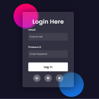
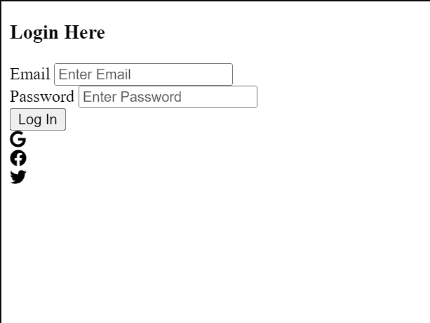
Inside the <body>tag we have created the structure into several sections, primarily for styling and layout purposes. Inside a container with the class “inFormBackground,” two decorative elements with the class “circle” create a design effect. Within this container, the actual login form resides in a <div> element with the class “inLoginForm.”
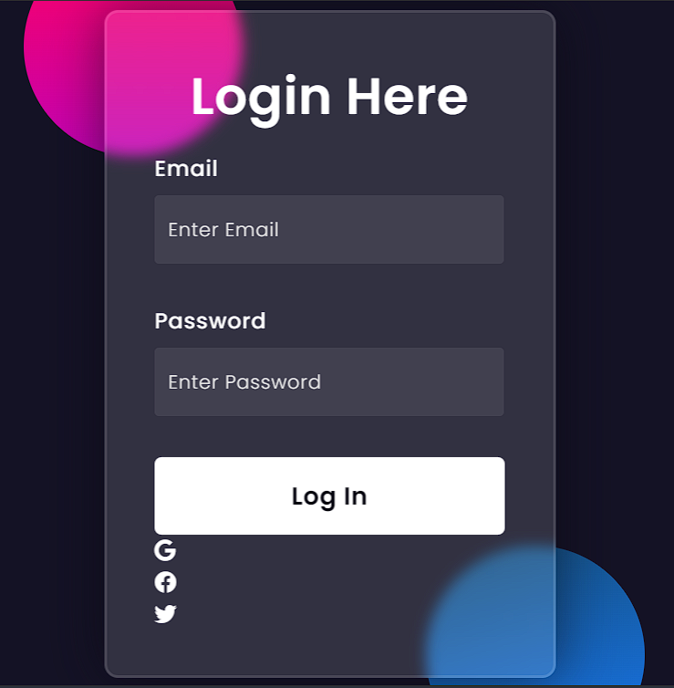
The form includes a “Login Here” heading, two input fields for email and password, and a “Log In” button. There’s a JavaScript onsubmit event handler set to “return false” on the form, which prevents it from being submitted when the “Log In” button is clicked, effectively disabling the form for demonstration purposes.
Output:
Portfolio Website using HTML and CSS (Source Code)
CSS Code For Glassmorphism Login Form
* {
  margin: 0;
  padding: 0;
}

body {
  height: 100vh;
  display: flex;
  overflow: hidden;
  align-items: center;
  justify-content: center;
  background-color: #141225;
}

.inFormBackground {
  margin: 0rem 2rem;
}

.inFormBackground,
.inLoginForm {
  width: 25rem;
  height: 30rem;
  max-width: 320px;
  position: relative;
}

.circle {
  width: 10rem;
  height: 10rem;
  position: absolute;
  border-radius: 50%;
}

.circle:first-child {
  left: -20%;
  top: -12%;
  background: linear-gradient(#ff0060, #c302b5);
}

.circle:nth-child(2) {
  right: -22%;
  bottom: -14%;
  background: linear-gradient(164deg, #144e7cfc, #1877f2);
}

.inLoginForm form {
  top: 50%;
  left: 50%;
  width: 16rem;
  height: 24rem;
  max-width: 320px;
  position: absolute;
  padding: 50px 35px;
  border-radius: 10px;
  backdrop-filter: blur(5px);
  transform: translate(-50%, -50%);
  box-shadow: 0 0 40px rgba(8, 7, 16, 0.6);
  border: 2px solid rgba(255, 255, 255, 0.1);
  background-color: rgba(255, 255, 255, 0.13);
}

form * {
  border: none;
  outline: none;
  color: #ffffff;
  letter-spacing: 0.5px;
  font-family: "Poppins", sans-serif;
}

.title {
  font-size: 32px;
  font-weight: 500;
  line-height: 22px;
  text-align: center;
}

.inputGroup label {
  display: block;
  margin-top: 30px;
  font-size: 16px;
  font-weight: 500;
}

.inputGroup input {
  width: 92%;
  height: 50px;
  display: block;
  padding: 0 10px;
  margin-top: 8px;
  font-size: 14px;
  font-weight: 300;
  border-radius: 3px;
  background-color: rgba(255, 255, 255, 0.07);
}

::placeholder {
  color: #e5e5e5;
}

.submitForm {
  width: 100%;
  z-index: 1;
  margin-top: 30px;
  color: #080710;
  padding: 15px 0;
  font-size: 18px;
  font-weight: 600;
  cursor: pointer;
  overflow: hidden;
  border-radius: 5px;
  position: relative;
  background: #fff;
}

.submitForm::before {
  content: "";
  top: 0%;
  left: -100%;
  z-index: -1;
  width: 100%;
  height: 100%;
  color: #fff;
  border-radius: 5px;
  position: absolute;
  transition: left 0.4s, color 0.4s;
  background-color: #202020;
}

.submitForm:hover {
  color: #fff;
}

.submitForm:hover::before {
  left: 0%;
}

.social {
  display: flex;
  margin-top: 20px;
  align-items: center;
  justify-content: center;
}

.social div {
  width: 3rem;
  height: 3rem;
  display: flex;
  cursor: pointer;
  color: #eaf0fb;
  border-radius: 50%;
  align-items: center;
  justify-content: center;
  background-color: rgba(255, 255, 255, 0.27);
}

.social div:hover {
  background-color: rgba(255, 255, 255, 0.47);
}

.social .fb {
  margin-left: 25px;
}

.social .tw {
  margin-left: 25px;
}
Now, let’s take a more in-depth look at the styling. We’ll go over each and every line of code and see how our styling affects our webpage so that even beginners are able to understand the idea of glass morphism.
Step1: Using the universal (*) tag selector we will first set the default margin and padding our webpage to zero and then using the body tag select we will set the height of the body as ‘100 vh’ and the display type is set to “flex” which helps in responsiveness to our project.Also we have set the background color as “black” using the background- color property.
Now using the class selector (.informbackground) we will set the margin of our form container as 0rem for top and bottom and 2 rem in the left and right of our form.
Then using the multiple class selectors we will add the width and height of our login form and position of our login form is set to the relative according to the body.
* {
    margin: 0;
    padding: 0;
}
body {
    height: 100vh;
    display: flex;
    overflow: hidden;
    align-items: center;
    justify-content: center;
    background-color: #141225;
}
.inFormBackground {
    margin: 0rem 2rem;
}
.inFormBackground,
.inLoginForm {
    width: 25rem;
    height: 30rem;
    max-width: 320px;
    position: relative;
}v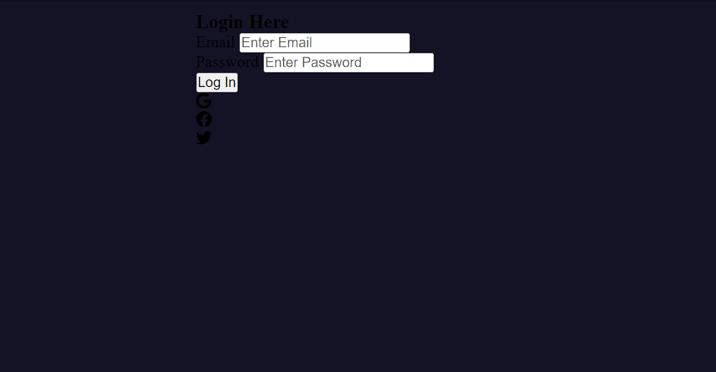
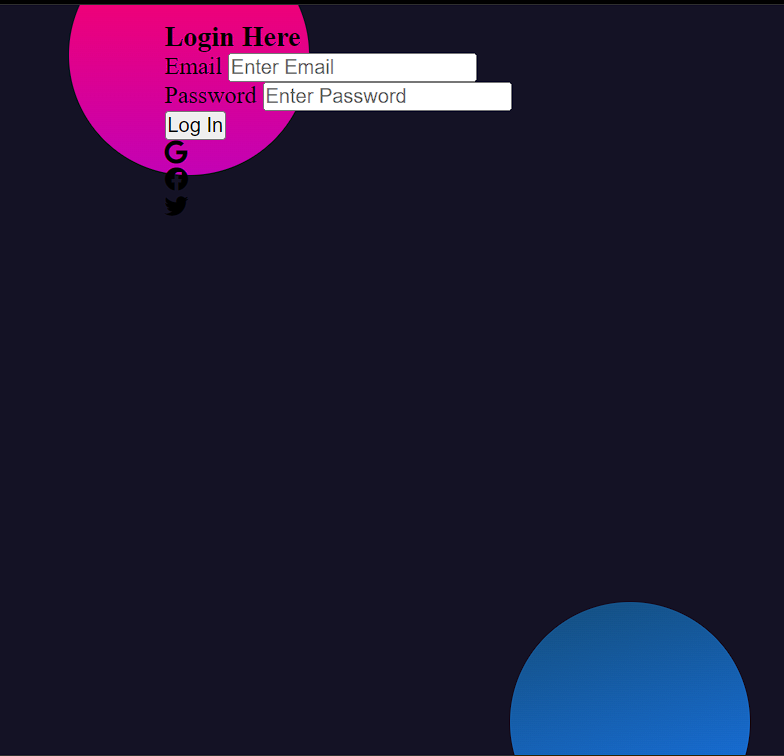
Step 2: Using the (.circle) class selector we will create two circles as a styling element behind our login form. The first circle is positioned slightly above and to the left, with a gradient background transitioning from pink to purple. The second circle is placed below and to the right, featuring a gradient background that shifts from deep blue to light blue. These circles are used as styling elements, enhancing the visual appeal of a web page, typically in alignment with the glass morphism design style.
.circle {
    width: 10rem;
    height: 10rem;
    position: absolute;
    border-radius: 50%;
}
.circle:first-child {
    left: -20%;
    top: -12%;
    background: linear-gradient(#ff0060, #c302b5);
}
.circle:nth-child(2) {
    right: -22%;
    bottom: -14%;
    background: linear-gradient(164deg, #144e7cfc, #1877f2);
}
Step3:Using the class selector (.inLoginForm). The form is positioned in the center of the container using the top: 50% and left: 50% properties, with a specified width and height. The max-width property ensures the form doesn’t exceed 320px on wider screens.
It uses the position: absolute property to position the form independently, applying padding, border-radius, and a backdrop filter to create a frosted glass effect. The transform: translate(-50%, -50%) centers the form within its container, and a box shadow adds depth to the form. We have also added a small border around our login form which adds glass morphism style to our project.
Using the (.title) class selector we will add the styles of the heading within the form, setting the font size, weight, and text alignment.
.inLoginForm {
    width: 25rem;
    height: 30rem;
    max-width: 320px;
    position: relative;
}
.circle {
    width: 10rem;
    height: 10rem;
    position: absolute;
    border-radius: 50%;
}
.circle:first-child {
    left: -20%;
    top: -12%;
    background: linear-gradient(#ff0060, #c302b5);
}
.circle:nth-child(2) {
    right: -22%;
    bottom: -14%;
    background: linear-gradient(164deg, #144e7cfc, #1877f2);
}
.inLoginForm form {
    top: 50%;
    left: 50%;
    width: 16rem;
    height: 24rem;
    max-width: 320px;
    position: absolute;
    padding: 50px 35px;
    border-radius: 10px;
    backdrop-filter: blur(5px);
    transform: translate(-50%, -50%);
    box-shadow: 0 0 40px rgba(8, 7, 16, 0.6);
    border: 2px solid rgba(255, 255, 255, 0.1);
    background-color: rgba(255, 255, 255, 0.13);
}
form * {
    border: none;
    outline: none;
    color: #ffffff;
    letter-spacing: 0.5px;
    font-family: "Poppins", sans-serif;
}
.title {
    font-size: 32px;
    font-weight: 500;
    line-height: 22px;
    text-align: center;
}
Step4:
The .inputGroup class styles the labels for the input fields, ensuring they are displayed as block elements with appropriate margin and text properties.
Using the class selector (.inputGroup) .We will specifies their dimensions, padding, margin, font properties, border radius, and a semi-transparent background color. The ::placeholder selector changes the placeholder text color to a light gray.
.inputGroup label {
    display: block;
    margin-top: 30px;
    font-size: 16px;
    font-weight: 500;
}
.inputGroup input {
    width: 92%;
    height: 50px;
    display: block;
    padding: 0 10px;
    margin-top: 8px;
    font-size: 14px;
    font-weight: 300;
    border-radius: 3px;
    background-color: rgba(255, 255, 255, 0.07);
}
::placeholder {
    color: #e5e5e5;
}
.submitForm {
    width: 100%;
    z-index: 1;
    margin-top: 30px;
    color: #080710;
    padding: 15px 0;
    font-size: 18px;
    font-weight: 600;
    cursor: pointer;
    overflow: hidden;
    border-radius: 5px;
    position: relative;
    background: #fff;
}
.submitForm::before {
    content: "";
    top: 0%;
    left: -100%;
    z-index: -1;
    width: 100%;
    height: 100%;
    color: #fff;
    border-radius: 5px;
    position: absolute;
    transition: left 0.4s, color 0.4s;
    background-color: #202020;
}
.submitForm:hover {
    color: #fff;
}
.submitForm:hover::before {
    left: 0%;
}
.social {
    display: flex;
    margin-top: 20px;
    align-items: center;
    justify-content: center;
}
.social div {
    width: 3rem;
    height: 3rem;
    display: flex;
    cursor: pointer;
    color: #eaf0fb;
    border-radius: 50%;
    align-items: center;
    justify-content: center;
    background-color: rgba(255, 255, 255, 0.27);
}
.social div:hover {
    background-color: rgba(255, 255, 255, 0.47);
}
.social .fb {
    margin-left: 25px;
}
.social .tw {
    margin-left: 25px;
}
ADVERTISEMENT
ADVERTISEMENT
100+ HTML,CSS and JavaScript Projects With Source Code ( Beginners to Advanced)
ADVERTISEMENT
Final Output Of Glassmorphism Login Form Using Css
ADVERTISEMENT
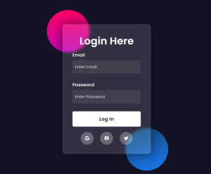
Hope you like the Glassmorphism Login Form, you can see the output project screenshots. See our other blogs and gain knowledge in front-end development.
ADVERTISEMENT
Thank you Restaurant Website Using HTML and CSS Written by – Code With Random/Anki code by – Md Aman
What is the Glassmorphism Effect?
Glassmorphism is a design that gives a 3D glass effect to the website. glass morphism effect, in which we blur the background of the website and give it a transparent look.
Can glass morphism be applied to any website Element?
Yes, glass morphism can be applied to various web page elements, including containers, buttons, input fields, and backgrounds.
Which code editor do you use for this Indian Flag coding?
I personally recommend using VS Code Studio, it’s straightforward and easy to use.
is this project responsive or not?
Yes! this project is a responsive project.
Do you use any external links to create this project?
No!
