Responsive Drop-down Menu With Sub Menu
Introduction:
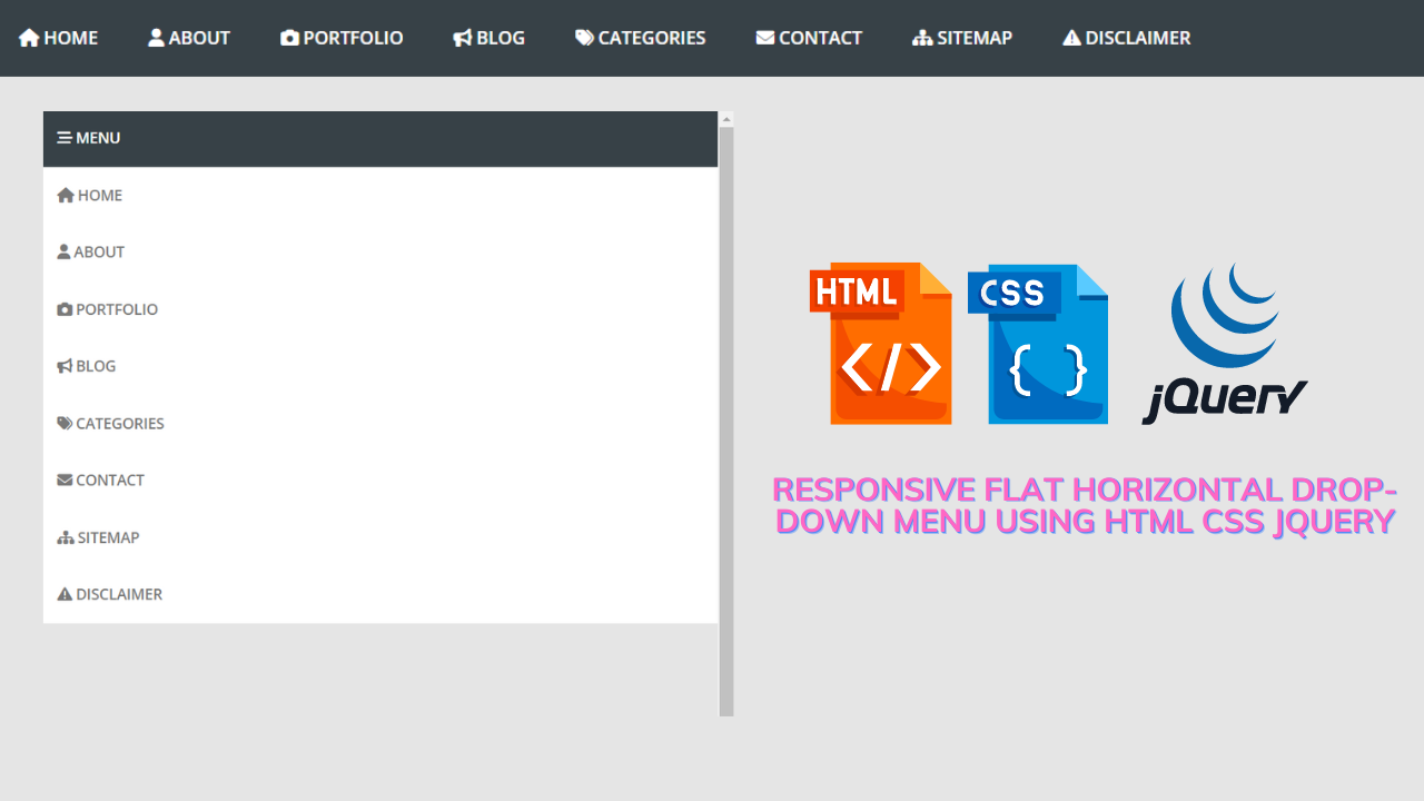
Hello Coders, Welcome to Codewithrandom. Today we are Going to Create a Responsive Drop-down Menu With Sub Menu. Drop down menu is necessary to be included in each and every website to reduce vast content and arrange the things in an order that looks simple best.
But in the dropdown, we can also create a submenu so that it can give more simplicity to the user and also reduces the theory. We as a developer can present this thing in different ways using our tools html, css & javascript. Let us see the creation of a drop-down menu with a sub-menu.
50+ HTML, CSS and JavaScript Projects With Source Code
Html Code For Drop-down Menu:-
Html means a markup language through which we create a layout of the website. The main content of the layout lies inside the body tag of the website. Before going through the code portion of html it would be better to know the concepts which we are going to use in this project.
In this project, we are using the basic concepts of html like div, span, classes, ids unordered list, list, anchor tag, and semantic tags(here we are using a semantic tag like nav, other examples of semantic tags are footer /header/navbar/main,etc.), icon tag.
Here we are using icons, for icons here we are using the font awesome icon cdn(content-delivery-network), and before using the icons tag and their classes we need to integrate the font-awesome cdn link (link of fontawesome) .
<nav>
    <a id="resp-menu" class="responsive-menu" href="#"
        ><i class="fa fa-reorder"></i> Menu</a
    >
    <ul class="menu">
        <li>
            <a class="homer" href="#"><i class="fa fa-home"></i> HOME</a>
            <ul class="sub-menu">
                <li><a href="#">Sub-Menu 1</a></li>
                <li><a href="#">Sub-Menu 2</a></li>
                <li><a href="#">Sub-Menu 3</a></li>
                <li><a href="#">Sub-Menu 4</a></li>
                <li><a href="#">Sub-Menu 5</a></li>
            </ul>
        </li>
        <li>
            <a href="#"><i class="fa fa-user"></i> ABOUT</a>
        </li>
        <li>
            <a href="#"><i class="fa fa-camera"></i> PORTFOLIO</a>
            <ul class="sub-menu">
                <li><a href="#">Sub-Menu 1</a></li>
                <li>
                    <a href="#">Sub-Menu 2</a>
                    <ul>
                        <li><a href="#">Sub Sub-Menu 1</a></li>
                        <li><a href="#">Sub Sub-Menu 2</a></li>
                        <li><a href="#">Sub Sub-Menu 3</a></li>
                        <li><a href="#">Sub Sub-Menu 4</a></li>
                        <li><a href="#">Sub Sub-Menu 5</a></li>
                    </ul>
                </li>
                <li>
                    <a href="#">Sub-Menu 3</a>
                    <ul>
                        <li><a href="#">Sub Sub-Menu 1</a></li>
                        <li><a href="#">Sub Sub-Menu 2</a></li>
                        <li><a href="#">Sub Sub-Menu 3</a></li>
                        <li><a href="#">Sub Sub-Menu 4</a></li>
                        <li><a href="#">Sub Sub-Menu 5</a></li>
                    </ul>
                </li>
            </ul>
        </li>
        <li>
            <a href="#"><i class="fa fa-bullhorn"></i> BLOG</a>
        </li>
        <li>
            <a href="#"><i class="fa fa-tags"></i> CATEGORIES</a>
            <ul class="sub-menu">
                <li><a href="#">Sub-Menu 1</a></li>
                <li>
                    <a href="#">Sub-Menu 2</a>
                    <ul>
                        <li><a href="#">Sub Sub-Menu 1</a></li>
                        <li><a href="#">Sub Sub-Menu 2</a></li>
                        <li><a href="#">Sub Sub-Menu 3</a></li>
                        <li><a href="#">Sub Sub-Menu 4</a></li>
                        <li><a href="#">Sub Sub-Menu 5</a></li>
                    </ul>
                </li>
                <li>
                    <a href="#">Sub-Menu 3</a>
                    <ul>
                        <li><a href="#">Sub Sub-Menu 1</a></li>
                        <li><a href="#">Sub Sub-Menu 2</a></li>
                        <li><a href="#">Sub Sub-Menu 3</a></li>
                        <li><a href="#">Sub Sub-Menu 4</a></li>
                        <li><a href="#">Sub Sub-Menu 5</a></li>
                    </ul>
                </li>
            </ul>
        </li>
        <li>
            <a href="#"><i class="fa fa-envelope"></i> CONTACT</a>
        </li>
        <li>
            <a href="#"><i class="fa fa-sitemap"></i> SITEMAP</a>
        </li>
        <li>
            <a href="#"
                ><i class="fa fa-exclamation-triangle"></i> DISCLAIMER</a
            >
        </li>
    </ul>
</nav>
In this html code we have created a responsive menu and then called the <ul> tag to make it in menu order and labeled it. Then we created a sub-menu under the labeled name, we have done this process, again and again, to make it a menu and sub-menu. And created the logo of the required logo by fa fa.
Here, using HTML, we’ve built the framework for our drop-down menu-equipped adaptable navbar. We’ll design a navigable area that makes navigation easy and facilitates navigation.
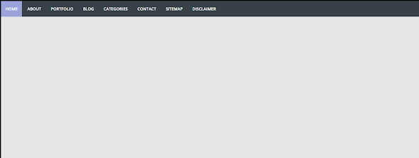
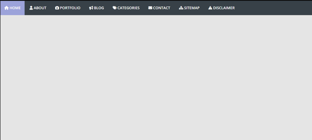
Let us look at the html output.
HTML Code Output: –
You can see the html output of the above html code.
CSS Code For Drop-Down Menu:-
Css stands for cascading style sheet. As the name contains style, it is used for styling in simple language we use css for styling/decoration of the layout/html of the website.
Here we are using pure css for styling which is easy but to make it more convenient there are more methods for styling bootstrap5, sass, sass, tailwind, etc.
Ecommerce Website Using HTML, CSS, and JavaScript (Source Code)
Before going through the css code I think it would be better to go through the concepts involved in this code if you are not aware of those concepts. Here we are using the basic concepts of css like border-box, positing properties,css selectors of css and ids, transform, visibility, display properties, etc.
@import url(https://fonts.googleapis.com/css?family=Open+Sans:400,400italic,600,700,800);
*,
html,
body,
div,
dl,
dt,
dd,
ul,
ol,
li,
h1,
h2,
h3,
h4,
h5,
h6,
pre,
form,
label,
fieldset,
input,
p,
blockquote,
th,
td {
    margin: 0;
    padding: 0;
}
article,
aside,
figure,
footer,
header,
hgroup,
nav,
section {
    display: block;
}
* {
    -webkit-box-sizing: border-box;
    -moz-box-sizing: border-box;
    box-sizing: border-box;
}
html {
    -webkit-font-smoothing: antialiased;
}
a {
    color: #BA0707;
    text-decoration: none;
}
a:hover {
    color: #BA0707;
}
body {
    background: #e5e5e5;
    color: #374147;
    font: 14px "Open Sans", Helvetica, Arial, sans-serif;
    -webkit-font-smoothing: antialiased;
    line-height: 1;
    width: 100%;
}
nav {
    display: block;
    background: #374147;
}
.menu {
    display: block;
}
.menu li {
    display: inline-block;
    position: relative;
    z-index: 100;
}
.menu li:first-child {
    margin-left: 0;
}
.menu li a {
    font-weight: 600;
    text-decoration: none;
    padding: 20px 15px;
    display: block;
    color: #fff;
    transition: all 0.2s ease-in-out 0s;
}
.menu li a:hover,
.menu li:hover > a {
    color: #fff;
    background: #9ca3da;
}
.menu ul {
    visibility: hidden;
    opacity: 0;
    margin: 0;
    padding: 0;
    width: 170px;
    position: absolute;
    left: 0px;
    background: #fff;
    z-index: 99;
    transform: translate(0, 20px);
    transition: all 0.2s ease-out;
}
.menu ul:after {
    bottom: 100%;
    left: 20%;
    border: solid transparent;
    content: " ";
    height: 0;
    width: 0;
    position: absolute;
    pointer-events: none;
    border-color: rgba(255, 255, 255, 0);
    border-bottom-color: #fff;
    border-width: 6px;
    margin-left: -6px;
}
.menu ul li {
    display: block;
    float: none;
    background: none;
    margin: 0;
    padding: 0;
}

.menu ul li a {
    font-size: 12px;
    font-weight: normal;
    display: block;
    color: #797979;
    background: #fff;
}

.menu ul li a:hover,
.menu ul li:hover>a {
    background: #9ca3da;
    color: #fff;
}

.menu li:hover>ul {
    visibility: visible;
    opacity: 1;
    transform: translate(0, 0);
}

.menu ul ul {
    left: 169px;
    top: 0px;
    visibility: hidden;
    opacity: 0;
    transform: translate(20px, 20px);
    transition: all 0.2s ease-out;
}

.menu ul ul:after {
    left: -6px;
    top: 10%;
    border: solid transparent;
    content: " ";
    height: 0;
    width: 0;
    position: absolute;
    pointer-events: none;
    border-color: rgba(255, 255, 255, 0);
    border-right-color: #fff;
    border-width: 6px;
    margin-top: -6px;
}

.menu li>ul ul:hover {
    visibility: visible;
    opacity: 1;
    transform: translate(0, 0);
}

.responsive-menu {
    display: none;
    width: 100%;
    padding: 20px 15px;
    background: #374147;
    color: #fff;
    text-transform: uppercase;
    font-weight: 600;
}

.responsive-menu:hover {
    background: #374147;
    color: #fff;
    text-decoration: none;
}

a.homer {
    background: #9ca3da;
}

@media (min-width: 768px) and (max-width: 979px) {
    .mainWrap {
        width: 768px;
    }

    .menu ul {
        top: 37px;
    }

    .menu li a {
        font-size: 12px;
    }

    a.homer {
        background: #374147;
    }
}

@media (max-width: 767px) {
    .mainWrap {
        width: auto;
        padding: 50px 20px;
    }

    .menu {
        display: none;
    }

    .responsive-menu {
        display: block;
    }

    nav {
        margin: 0;
        background: none;
    }

    .menu li {
        display: block;
        margin: 0;
    }

    .menu li a {
        background: #fff;
        color: #797979;
    }

    .menu li a:hover,
    .menu li:hover>a {
        background: #9ca3da;
        color: #fff;
}.menu ul {
visibility: hidden;
opacity: 0;
top: 0;
left: 0;
width: 100%;
transform: initial;
}
.menu li:hover>ul {
visibility: visible;
opacity: 1;
position: relative;
transform: initial;
}
.menu ul ul {
left: 0;
transform: initial;
}
.menu li>ul ul:hover {
transform: initial;
}
}
@media (max-width: 480px) {}
@media (max-width: 320px) {}In this final snippet we have basically now focused on opacity, visibility and the transformation of the menu bar. This also a necessary that how much should be the opacity & visibility of the menu.
How to Create a Website Header Design In HTML and CSS Code
Css output drop-down menu :
JavaScript Code drop-down menu:-
Javascript is used to add logic/functionalities to the website. Instead of javascript here we are using jquery.
What is Jquery?
Jquery is a javascript library designed to simplify html dom tree traversal and manipulation, as well as event handling, css animation, and ajax. It is free, open-source software using the permissive MIT license. As of Aug 2022, jquery is used by 77% of the 10 million most popular websites.
$(document).ready(function () {
    var touch = $("#resp-menu");
    var menu = $(".menu");
    $(touch).on("click", function (e) {
        e.preventDefault();
        menu.slideToggle();
    });
    $(window).resize(function () {
        var w = $(window).width();
        if (w > 767 && menu.is(":hidden")) {
            menu.removeAttr("style");
        }
    });
});
In this js code, we have called variable(var) only menu and submenu and set the function while the mouse pointer will go to the drop-down. And pass on an if statement. So that there is no error or glitch when the user takes the mouse pointer on it.
Final Output Of Responsive Drop-down Menu With Sub Menu:
Video Output:
Summary Responsive Drop-down Menu With Sub Menu:-
We have created the Responsive Drop-down Menu With Sub Menu. We created an HTML file that defined the suitable tags and classes for the menu and sub-menu.
100+ HTML,CSS and JavaScript Projects With Source Code ( Beginners to Advanced)
ADVERTISEMENT
Then we styled them in our External CSS and set the padding, opacity & transition. And we have set the working of the menu & sub-menu in JavaScript. If you loved it does comment as it boosts our motivation to bring new projects. If you face any difficulty while performing you can reach out to us with the help of the comment section.
ADVERTISEMENT
Happy Coding
ADVERTISEMENT
Written by @Harsh_9 & Himanshu Singh
ADVERTISEMENT
What is a Navbar?
A navigation bar, also known as a navbar, is a graphic representation of the menu header of a website. The home page, about page, contact page, and other important sections of a website are typically linked from there. Typically, the navigation bar is a fixed element that is always visible, regardless of how far down or up the user scrolls the website.
ADVERTISEMENT
What is a drop-down Menu?
A “dropdown” menu resembles a list of choices but is concealed within a button or other element. When the user clicks on the button, the dropdown menu is revealed. This blog post will discuss how to make a sidebar dropdown menu using HTML and JavaScript.
