Create 3D Button Form Scratch Using HTML and CSS
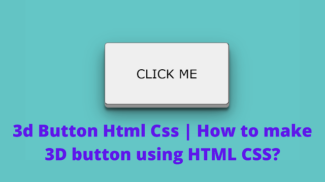
Welcome to today’s tutorial. Today we are going to create a 3D Button using HTML and CSS. For this, we create a simple button using Html and Stying 3D Button Using CSS.
You need basic knowledge of CSS for this project. This tutorial is well-suited for CSS Beginners. Let us get started with the project.
I am sure that you have seen many 3D scenes movies in or in books, also in drawings, 3D effects are most common for us and it is very pleasing to us, so we are here today, going to make a 3D effect in text using only by HTML and CSS.
Portfolio Website using HTML and CSS (Source Code)
When we are talking about 3D buttons, it looks so appealing Due to their 3D effect, the button attracts the viewers. And make them. The field at the button is important to click. So that’s why people started using 3D buttons in the frontend part of the website.
Live Preview Of 3D Button Using Html Css
Before moving forward to the code first of all we will see the life sever of the code so you can see how it is working on clicking the button.
HTML Code For 3D Button:-
<!DOCTYPE html>
<html lang="en">
<head>
  <meta charset="UTF-8">
  <meta http-equiv="X-UA-Compatible" content="IE=edge">
  <meta name="viewport" content="width=device-width, initial-scale=1.0">
  <title>Document</title>
</head>
<body>
  <button>Click me</button>
</body>
</html>
CSS Code For 3D Button:-
box-shadow: h-offset v-offset blur spread color
border-radius gives a radius at the corners of the buttons.
body {
    background-color: #64c6c6;

}

button {
  height:200px;
  width:400px;
    position: absolute;
    top: 50%;
    right: 50%;
    transform: translate(50%,-50%);
    text-transform: uppercase;
    font-family: verdana;
    border-radius:10px;

    color:black;
  font-size:40px;
  font-weight:600px;
    box-shadow: 1px 1px 1px #919191,
        1px 2px 1px #919191,
        1px 3px 1px #919191,
        1px 4px 1px #919191,
        1px 5px 1px #919191,
        1px 6px 1px #919191,
        1px 7px 1px #919191,
        1px 8px 1px #919191,
        1px 9px 1px #919191,
        1px 10px 1px #919191,
    1px 18px 6px rgba(16,16,16,0.4),
    1px 22px 10px rgba(16,16,16,0.2),
    1px 25px 35px rgba(16,16,16,0.2),
    1px 30px 60px rgba(16,16,16,0.4);
}
I hope you have loved this blog and learned many things at a place please let us know your review in the comment section if you liked it please comment below as it will give us the motivation to create more blogs.


