A progress bar is the major tool used on the EdTech website to display the progress of the courses. A progress bar is used to display the progress of the user.
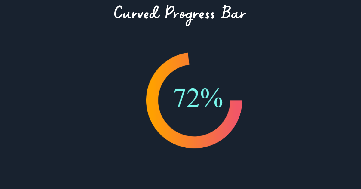
There are mainly two types of progress bars. Straight-line progress bars are standard, and curved progress bars can give your online projects an appeal of style and uniqueness.
In this article, we will create a curved progress bar from scratch using HTML, CSS, and Javascript.
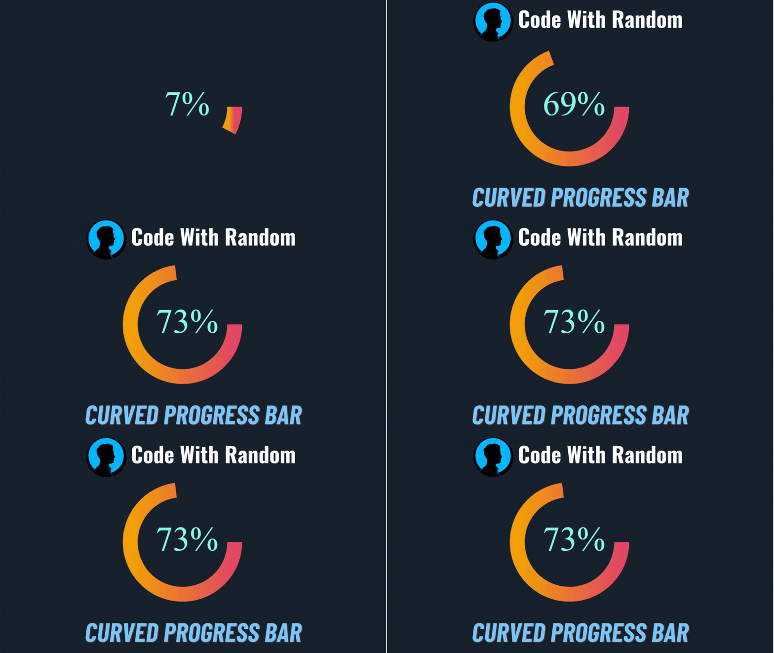
This article is very helpful for beginners as well as advanced web developers. We will be creating the progress bar step by step so that everybody can understand it easily. By the end of the article, you will be able to create your own progress bar according to your designs.
Without further ado, let’s get straight into the project.
Prerequisites
Before we begin, please ensure that you have the necessary tools and knowledge:
- Basic knowledge of HTML, CSS, and JavaScript.
- Your preferred code editor (for example, Visual Studio Code, Sublime Text, or Atom).
- A web browser is required to test your progress bar.
Curved Progress Bar (Source Code)
In order to get the following HTML CSS and JavaScript code for the Curved Progress bar, you have to create three files: an HTML file, a CSS file, and a JavaScript file. After you have created these three files, you can copy and paste the given codes into your document. You can also download all source code files by clicking on the download button.
HTML Structure
Let’s begin by creating the HTML structure for our curved progress bar. Create a new HTML file and insert the following code:
<div class="wrapper">
  <div class="container chart" data-size="300" data-value="73" data-arrow="down"></div>
</div>
We have created a simple structure containing two elements. The first ‘div’ is labeled as a “wrapper” and used as a container. Inside this container, there’s a second ‘div’ with classes “container” and “chart.” This second includes custom data attributes, namely “data size” (set to 300), “data value” (set to 73), and “data-arrow” (indicating “down”). These custom data attributes are often used to store additional information associated with the chart element, such as its size, value, and directional indicator.
Styling with CSS
Let’s now use CSS to style our curved progress bar. Create a file called styles.css and add the following styles:
body {
  background-color: #18222f;
}
.wrapper {
  position: absolute;
  width: 400px;
  height: 400px;
  margin: auto;
  top: 0;
  left: 0;
  bottom: 0;
  right: 0;
  display: flex;
}
.container {
  font: 1px;
  padding: 0 20px;
}
Now using the body tag select we will set the background color of the entire page to a dark blue-gray shade (#18222f) for a smooth design.
Then using the class select”.wrapper” we will add the styling to our container element and we will set the size as 400×400 pixels in size, centered both horizontally and vertically within its parent container using absolute positioning and flex display. Additionally, using the”container” class we will set the font size of the progress bar as 1 pixel, effectively hiding text content and adding 20 pixels of horizontal padding.
CSS Output:

Adding Functionality to our Progress Bar (using Javascript)
Let’s now add the JavaScript logic to make our curved progress bar work. Create a script.js file and add the following code:
class Dial {
  constructor(container) {
    this.container = container;
    this.size = this.container.dataset.size;
    this.strokeWidth = this.size / 8;
    this.radius = this.size / 2 - this.strokeWidth / 2;
    this.value = this.container.dataset.value;
    this.direction = this.container.dataset.arrow;
    this.svg;
    this.defs;
    this.slice;
    this.overlay;
    this.text;
    this.arrow;
    this.create();
  }

  create() {
    this.createSvg();
    this.createDefs();
    this.createSlice();
    this.createOverlay();
    this.createText();
    this.createArrow();
    this.container.appendChild(this.svg);
  }

  createSvg() {
    let svg = document.createElementNS("http://www.w3.org/2000/svg", "svg");
    svg.setAttribute("width", `${this.size}px`);
    svg.setAttribute("height", `${this.size}px`);
    this.svg = svg;
  }

  createDefs() {
    var defs = document.createElementNS("http://www.w3.org/2000/svg", "defs"),
      linearGradient = document.createElementNS(
        "http://www.w3.org/2000/svg",
        "linearGradient"
      ),
      stop1 = document.createElementNS("http://www.w3.org/2000/svg", "stop"),
      stop2 = document.createElementNS("http://www.w3.org/2000/svg", "stop"),
      linearGradientBackground = document.createElementNS(
        "http://www.w3.org/2000/svg",
        "background"
      );
    linearGradient.setAttribute("id", "gradient");
    stop1.setAttribute("stop-color", "#ffa000");
    stop1.setAttribute("offset", "0%");
    linearGradient.appendChild(stop1);
    stop2.setAttribute("stop-color", "#f25767");
    stop2.setAttribute("offset", "100%");
    linearGradient.appendChild(stop2);
    linearGradientBackground.setAttribute("id", "gradient-background");
    var stop1 = document.createElementNS("http://www.w3.org/2000/svg", "stop");
    stop1.setAttribute("stop-color", "rgba(0,0,0,0.2)");
    stop1.setAttribute("offset", "0%");
    linearGradientBackground.appendChild(stop1);
    var stop2 = document.createElementNS("http://www.w3.org/2000/svg", "stop");
    stop2.setAttribute("stop-color", "rgba(0,0,0,0.5)");
    stop2.setAttribute("offset", "1000%");
    linearGradientBackground.appendChild(stop2);
    defs.appendChild(linearGradient);
    defs.appendChild(linearGradientBackground);
    this.svg.appendChild(defs);
    this.defs = defs;
  }

  createSlice() {
    let slice = document.createElementNS("http://www.w3.org/2000/svg", "path");
    slice.setAttribute("fill", "none");
    slice.setAttribute("stroke", "url(#gradient)");
    slice.setAttribute("stroke-width", this.strokeWidth);
    slice.setAttribute(
      "transform",
      `translate(${this.strokeWidth / 2},${this.strokeWidth / 2})`
    );
    slice.setAttribute("class", "animate-draw");
    this.svg.appendChild(slice);
    this.slice = slice;
  }

  createOverlay() {
    const r = this.size - this.size / 2 - this.strokeWidth / 2;
    const circle = document.createElementNS(
      "http://www.w3.org/2000/svg",
      "circle"
    );
    circle.setAttribute("cx", this.size / 2);
    circle.setAttribute("cy", this.size / 2);
    circle.setAttribute("r", r);
    circle.setAttribute("fill", "url(#gradient-background)");
    circle.setAttribute("class", "animate-draw");
    this.svg.appendChild(circle);
    this.overlay = circle;
  }

  createText() {
    const fontSize = this.size / 3.5;
    let text = document.createElementNS("http://www.w3.org/2000/svg", "text");
    text.setAttribute("x", this.size / 2 + fontSize / 7.5);
    text.setAttribute("y", this.size / 2 + fontSize / 4);
    text.setAttribute("font-family", "Century Gothic Lato");
    text.setAttribute("font-size", fontSize);
    text.setAttribute("fill", "#78f8ec");
    text.setAttribute("text-anchor", "middle");
    const tspanSize = fontSize / 3;
    text.innerHTML = `${0}% `;
    this.svg.appendChild(text);
    this.text = text;
  }

  createArrow() {
    var arrowSize = this.size / 10;
    var mapDir = {
      up: [(arrowYOffset = arrowSize / 2), (m = -1)],
      down: [(arrowYOffset = 0), (m = 1)]
    };
    function getDirection(i) {
      return mapDir[i];
    }
    var [arrowYOffset, m] = getDirection(this.direction);

    let arrowPosX = this.size / 2 - arrowSize / 2,
      arrowPosY = this.size - this.size / 3 + arrowYOffset,
      arrowDOffset = m * (arrowSize / 1.5),
      arrow = document.createElementNS("http://www.w3.org/2000/svg", "path");
    arrow.setAttribute(
      "d",
      `M 0 0 ${arrowSize} 0 ${arrowSize / 2} ${arrowDOffset} 0 0 Z`
    );
    arrow.setAttribute("fill", "none");
    arrow.setAttribute("opacity", "0.6");
    arrow.setAttribute("transform", `translate(${arrowPosX},${arrowPosY})`);
    this.svg.appendChild(arrow);
    this.arrow = arrow;
  }

  animateStart() {
    let v = 0;
    const intervalOne = setInterval(() => {
      const p = +(v / this.value).toFixed(2);
      const a = p < 0.95 ? 2 - 2 * p : 0.05;
      v += a;
      if (v >= +this.value) {
        v = this.value;
        clearInterval(intervalOne);
      }
      this.setValue(v);
    }, 10);
  }

  polarToCartesian(centerX, centerY, radius, angleInDegrees) {
    const angleInRadians = ((angleInDegrees - 180) * Math.PI) / 180.0;
    return {
      x: centerX + radius * Math.cos(angleInRadians),
      y: centerY + radius * Math.sin(angleInRadians)
    };
  }

  describeArc(x, y, radius, startAngle, endAngle) {
    const start = this.polarToCartesian(x, y, radius, endAngle);
    const end = this.polarToCartesian(x, y, radius, startAngle);
    const largeArcFlag = endAngle - startAngle <= 180 ? "0" : "1";
    const d = [
      "M",
      start.x,
      start.y,
      "A",
      radius,
      radius,
      0,
      largeArcFlag,
      0,
      end.x,
      end.y
    ].join(" ");
    return d;
  }

  setValue(value) {
    let c = (value / 100) * 360;
    if (c === 360) c = 359.99;
    const xy = this.size / 2 - this.strokeWidth / 2;
    const d = this.describeArc(xy, xy, xy, 180, 180 + c);
    this.slice.setAttribute("d", d);
    const tspanSize = this.size / 3.5 / 3;
    this.text.innerHTML = `${Math.floor(value)}% `;
  }

  animateReset() {
    this.setValue(0);
  }
}

const containers = document.getElementsByClassName("chart");
const dial = new Dial(containers[0]);
dial.animateStart();
The Dial class is responsible for creating and animating circular dials inside our progress bar. we have created a class constructor that extracts attributes and data values from an HTML container, such as size, stroke width, value, and arrow orientation.
We have used the create method for creating the SVG elements for our curved progress bar. We will use this element for adding background gradients, text, overlay, and arrow indicators to our progress bar.
To use this dial component, the code selects HTML elements with the class “chart” from the document, creates a Dial instance, and starts the animation.
Final output:
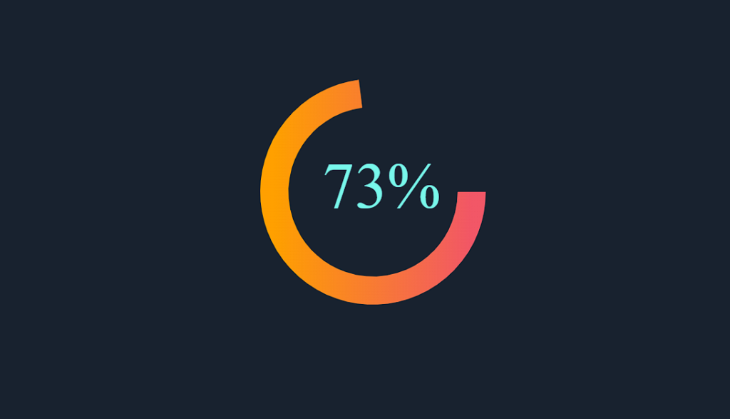
Video Output:
Customization:
After you’ve created a basic curved progress bar, you can further adjust it to fit the look of your project. Here are several examples:
- Change Colors: Modify the background color of the progress bar and the border color of the container to match your website’s color scheme.
- Adjust Size: Experiment with the dimensions of the progress container and bar to make it larger or smaller.
- Add Text: Include text inside or around the progress bar to display the current percentage.
- Animate: Apply different CSS transitions to create unique animations when the progress updates.
Project Link: – https://codepen.io/mazdevelop100/pen/qBZWRGr
Conclusion
Hopefully, you have learned step by step how I created this curved progress bar using HTML CSS, and JavaScript from this article.
If you find this Blog helpful, then make sure to search Codewithrandom on Google for Front End Projects with Source codes and make sure to Follow the Code with Random Instagram page.
