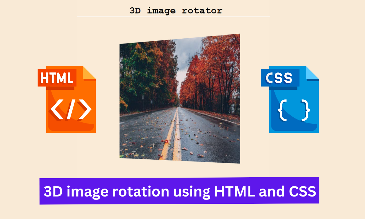
Hello, Coders. In this article, we will create 3D image rotations with HTML and CSS. In this project, we will add an image to our webpage and style it with CSS to add 3D image rotation effects.
How to create 3D image rotation using HTML & CSS?
This project is intended for beginners. This project will teach you how to use CSS to add effects to your images.
I hope you must have got an idea about the project.
Let’s have a look at our project 3D image rotation.👇
Step1: Lets Start with adding some Basic HTML
The HTML is hypertext markup language is the main structure of our webpage which will help us to display our content to the browser.
All the HTML document must start with <!doctypehtml> this helps the browser to understand the code written follows the lastest HTML format.
The HTML document itself begin With <html> and end with </html>.
The content that will be displayed in the brower comes under the body section <body></body>.Inside the body tag main content lies.
<!DOCTYPE html>
<html lang="en" dir="ltr">
  <head>
    <meta charset="utf-8" />
    <meta name="viewport" content="width=device-width, initial-scale=1.0" />
    <title>3D image rotator</title>
    <link rel="stylesheet" href="style.css" />
  <body>
  <h1>3D image rotator</h1>
  <div>
    <div class = "square">
      <img src="https://images.pexels.com/photos/1563356/pexels-photo-1563356.jpeg?auto=compress&cs=tinysrgb&dpr=1&w=500">
    </div>
  </div>
  </body>
</html>
Our HTML contains the following part :
- First and foremost, we will use a h1> tag to create the main heading for our webpage.
- Now, we’ll create a container for our image by using the div tag.
- Now, using the img tag, we will add an image to our webpage, and this image will be used to add the 3D image rotation effect using CSS.
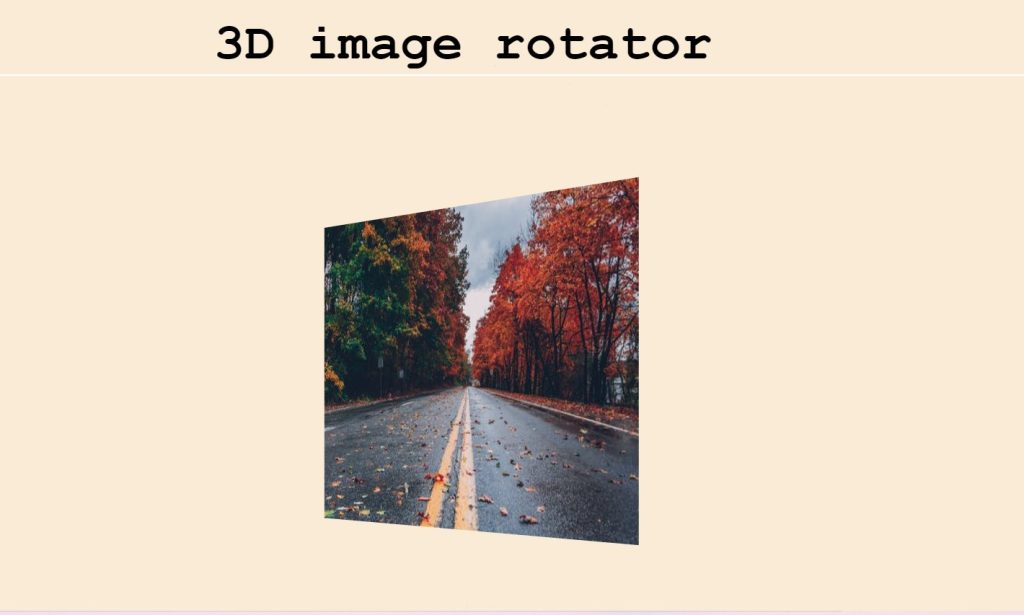
Now we have the added the basic structure of our webpage . Let’s us take a look at our HTML output.
Output:
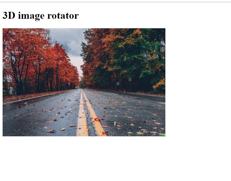
Before the code, you just need to add the CSS link to our HTML file so that we add styling to our website:
<link rel="stylesheet" href="./style.css">
Keep note that you must add this link under the head tag .
Step2: Adding the CSS Code.
Cascading Style Sheets (CSS) is a markup language for describing the presentation of a document written in HTML or XML. CSS, like HTML and JavaScript, is a key component of the World Wide Web.
Portfolio Website Using HTML CSS And JAVASCRIPT ( Source Code)
Now we will look at our CSS code.
body{
  font-family:'Segoe UI', Tahoma, Geneva, Verdana, sans-serif;
  overflow: hidden;
  background-color: antiquewhite;
}
h1{
  font-size: 4rem;
  text-align: center;
  color: black;
  box-shadow: 2px 2px white;

}
div {
    perspective: 500px;
    display: flex;
    justify-content: center;
    align-items: center;
    height: 100vh;
}
img{
    width:400px;
    height:400px;
}
.square {
    width: 400px;
    height: 400px;
  margin-bottom:120px;
    background: grey;
    transform: rotateY(45deg);
    animation: rotateAnimation 1s linear infinite;
}

@keyframes rotateAnimation {
    from {transform: rotateY(45deg);}
    to {transform: rotateY(225deg);}
}
@media screen and  (max-width:900px){
    h1{
    font-size: 2rem;
    text-align: center;
  }
  img{
    width:200px;
    height: 200px;
  }
  .square{
        width:200px;
        height:200px;
        background: grey;
        transform: rotateY(45deg);
        animation: rotateAnimation 1s linear infinite;

    }
}
@media screen and  (max-width:600px){
  h1{
    font-size: 2rem;
    text-align: center;
  }
    img{
    width:100px;
    height:100px;
  }
  .square{
        width:100px;
        height:100px;
        background: grey;
        transform: rotateY(45deg);
        animation: rotateAnimation 1s linear infinite;

    }
}
After we’ve added the CSS code, we’ll go over it step by step. To save time, you can simply copy this code and paste it into your IDE. Let us now understand our code step by step.
Step1:To begin, we will add the font family “new-courier” to the body tag. The background colour is antiquewhite, and we hide any excessive flow of content by setting the overflow property to “hidden”. We will now add styling to our webpage heading using the H1 tag. We’ve changed the font size to “4 rem.” The text is also centre aligned.
body{
  font-family: 'Segoe UI', Tahoma, Geneva, Verdana ,Sans-Serif;
  overflow: hidden;
  background-color: antiquewhite;
}
h1{
  font-size: 4rem;
  text-align: center;
  color: black;
  box-shadow: 2px 2px white;

}Step2:We will add the style to our webpage’s parent container using the div tag. The perspective property will be used to add the 3D position to the element in this case. We added the display as “flex,” and the content is justified as “centre.” The contents of our container are also centred. Our container now has a 100 vh height.We will define the width and height of our image as “400px” using the image tag.
div {
    perspective: 500px;
    display: flex;
    justify-content: center;
    align-items: center;
    height: 100vh;
}
img{
    width:400px;
    height:400px;
}Step3:Using the (.square) class, we will now add the 3D image rotation effect to our image. The width and height are both specified as “400px.” We also specified a background colour so that if the image fails to load for some reason, the background colour will aid in understanding the 3D rotation of our image.
We will now rotate the image using the transform property (at 45 degrees along the y-axis). We’ve also included an animation that rotates the image along the specified axis. We’ve added the keyframe to see how our rotation changes gradually.
.square {
    width: 400px;
    height: 400px;
  margin-bottom:120px;
    background: grey;
    transform: rotateY(45deg);
    animation: rotateAnimation 1s linear infinite;
}

@keyframes rotateAnimation {
    from {transform: rotateY(45deg);}
    to {transform: rotateY(225deg);}
}
Step4: Now we’ll add the main styling to our webpage, which will make it responsive; we’ll add the media query and set the maximum width.
If the content width is greater than the defined width, the font sizes of the h1 and the width and height of our image tag will change depending on the window size.
ADVERTISEMENT
@media screen and  (max-width:900px){
    h1{
    font-size: 2rem;
    text-align: center;
  }
  img{
    width:200px;
    height: 200px;
  }
  .square{
        width:200px;
        height:200px;
        background: grey;
        transform: rotateY(45deg);
        animation: rotateAnimation 1s linear infinite;

    }
}
@media screen and  (max-width:600px){
  h1{
    font-size: 2rem;
    text-align: center;
  }
    img{
    width:100px;
    height:100px;
  }
  .square{
        width:100px;
        height:100px;
        background: grey;
        transform: rotateY(45deg);
        animation: rotateAnimation 1s linear infinite;

    }
}
Now we have completed our css code and below👇here is the output after styling our webpage.
ADVERTISEMENT
Final Output Of 3D image rotation

ADVERTISEMENT
The project is now finished, we have added the 3d image rotation with HTML and CSS. Now look at the live preview.
ADVERTISEMENT
Output:
ADVERTISEMENT
Codepen Preview of 3D image rotation effect using HTML and CSS
Now We have Successfully added the 3D image rotation effect using HTML and CSS . You can use this project directly by copying into your IDE. WE hope you understood the project , If you any doubt feel free to comment!!
If you find out this Blog helpful, then make sure to search code with random on google for Front End Projects with Source codes and make sure to Follow the Code with Random Instagram page.
