Circular Progress Bar Using HTML and CSS
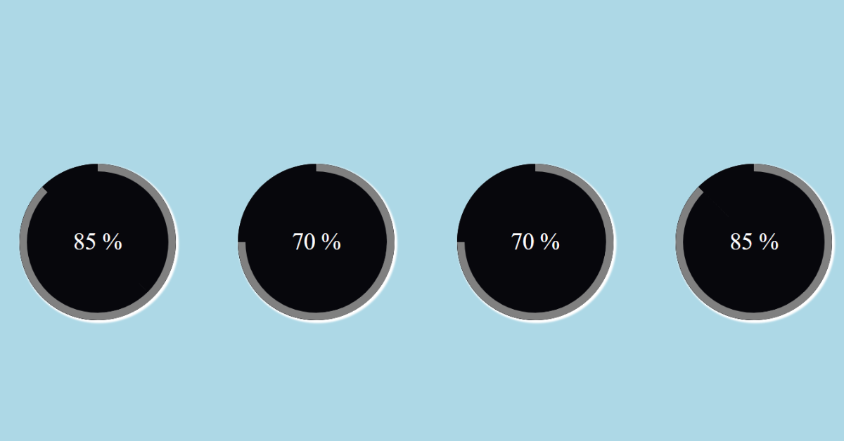
Hello Coder, Welcome to the Codewithrandom blog. Today we are going to create Circular Progress Bar Using HTML and CSS. The progress of a process in an application is shown via a progress bar. The amount of the process that has been finished and the amount that is still to be done are indicated by a progress bar. We will design the various parts of the progress bar using HTML, and we may customize the progress bar using the CSS attributes.
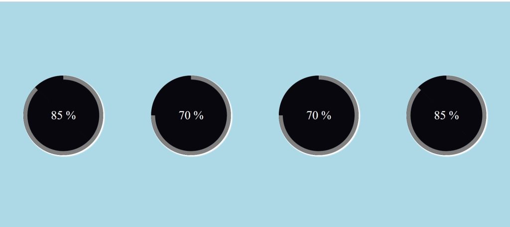
This tutorial will assist you if you wish to use HTML and CSS to make a Circular Progress Bar. Here, I’ll demonstrate how to create a straightforward CSS circleProgress Bar.
Before we start our project, let’s discuss some of the important concepts of the circular progress bar that will help you understand the progress bar and its uses.
What is a Circular Progress Bar?
A circular progress bar is a javascript feature that creates a function that keeps a record of the user’s progress and displays progress lines that keep on increasing aligned with the progress line. A circular progress bar helps users manage their work and complete it as per the guidance.
What are the benefits of a circular progress bar?
The key benefits of a circular progress bar are:
- increase working efficiency.
- Saves time.
- Provide accurate information.
- Easy Management.
50+ HTML, CSS & JavaScript Projects With Source Code
Live Preview Of Circle Progress Bar
| Code by | Arun |
| Project Download | Link Available Below |
| Language used | HTML and CSS |
| External link / Dependencies | No |
| Responsive | Yes |
This animation will change from 0 to the meaning that you have been given when you load the page. Although a portion of the text is animated, this text does not. It is pretty simply constructed.
This tutorial will walk you through each step I took to create the circular progress bar. You must be familiar with basic HTML and CSS concepts in order to create it.
Step 1: Adding the basic Structure with Styling.
To begin with, we must include a container for our circular progress bar. We’ll employ the fundamental HTML idea for it. The container for our circular progress bar will be made using the div tag.
<div class="container">

    </div>
Our circular progress bar now has a container. we will now use CSS concepts to add styling to our container.
We will add some styling to our website using the universal selector. We’ll include a box-sizing as a “border-box” using the box-sizing property. Padding and margin both have a value of “0.”
ADVERTISEMENT
Restaurant Website Using HTML And CSS With Source Code
ADVERTISEMENT
ADVERTISEMENT
* {
  box-sizing: border-box;
  padding: 0;
  margin: 0;
}

.container {
  display: flex;
  justify-content: space-around;
  flex-wrap: wrap;
  background-color:lightblue;
  height: 100vh;
  align-items: center;

}
ADVERTISEMENT
Using the class selector (.container). The display is set to “flex,” and we have set the space around each progress bar using the justify-content attribute. We’ll give our project a light blue background colour by using the background-color attribute.
ADVERTISEMENT

Ecommerce Website Using HTML, CSS, & JavaScript (Source Code)
Step 2: Adding the Circle.
To build the Circular Progress Bar’s we have used HTML and CSS. A new div with the class (progress) will be created inside of our container. Our project will get a circle by use of the class selector in our CSS.
<div class="container">
        <div class="progress">

        </div>
    </div>
.progress {
width: 200px;
height: 200px;
font-size: 30px;
color: #fff;
border-radius: 50%;
overflow: hidden;
position: relative;
background: #07070c;
text-align: center;
line-height: 200px;
margin: 20px;
box-shadow: 2px 2px 2px 2px white;
}
.progress::after {
content: "";
}The class selector is utilised (.progress). The dimensions are 200px for both the width and the height. The font-size attribute will be used to set the font size to 30px. We’ll make advantage of the border-radius feature to give the circular appearance. To create the appearance of a circle, we will set its border radius to 50%. The circle we’re using now has a black background. In order to give our circle a 3D appearance, we have also included a box shadow.
100+ HTML,CSS and JavaScript Projects With Source Code ( Beginners to Advanced)

Step 3: Adding Input to the Circle.
Now, using the span tag, we’ll add a numeric input to our circle and adjust the value’s range from 0 to 85. To add the progress motion to our circular progress bar, we will make 3 divs from within our progress div. A div with a class will be created first (overlay).
<div class="container">
        <div class="progress">
            <span class="title timer" data-from="0" data-to="85" data-speed="1800">85</span>
            <div class="overlay"></div>
            <div class="left"></div>
            <div class="right"></div>
        </div>
    </div>
We will now add a 50% width and 100% height using the overlay. The position has a “absolute” setting as well. Our circle progress bar’s half is styled by the overlay only. Using the background-color property, we added a black background to our overlay.
Gym Website Using HTML ,CSS and JavaScript (Source Code)
.progress .overlay {
  width: 50%;
  height: 100%;
  position: absolute;
  top: 0;
  left: 0;
  z-index: 1;
  background-color: #07070c;
}
Step 4: Adding Animation Progress Bar to the Circle.
The div we specified in our container tag will be used to add the progress. Two divs have been made and given the classes “left” and “right.” We’re going to use them to give our circle a progress bar.
<div class="container">
        <div class="progress">
            <span class="title timer" data-from="0" data-to="85" data-speed="1800">85</span>
            <div class="overlay"></div>
            <div class="left"></div>
            <div class="right"></div>
        </div>
    </div>
A progress bar will now be added utilizing two distinct classes (.left &.right). The height is set to 100%, and the width is set to 50%. We’ll add solid, 10 px-wide borders using the border attribute. We will use the border-radius to add a border radius of 100px to the top and right corner of our element.
Now to add the animation to our project we have used the simple concepts of CSS using animation property. An element can progressively switch from one style to another through animation. You are free to make as many CSS changes as you like, whenever you like. You must first define the animation’s keyframes before you can use CSS animation. The styles that the elements will have at specific moments are stored in keyframes.
How to Add Search Icon in Input field Using HTML & CSS
Here we used the animation as a load for 0.5sec and then using the linear forward we will add another animation.
Now we will use keyframes we will add the different styles at different time intervals using the keyframes only.

The progress bar will adjust in accordance with the value as we add three additional circular progress bars, each with a different value. Try adding more circular bars if you can make a single progress bar to go with it. You’ll be able to understand things better as a result.
Now let’s take a look at the video preview of our project.
Final Output Of Circular progress bar:
Complete Code Circular Progress Bar:
HTML:
FAQ
Which code editor do you use for this Circular Progress Bar?
I recommend using VS Code Studio, it’s straightforward and easy to use.
What is a Circular Progress Bar?
A circular progress bar is a javascript feature that creates a function that keeps a record of the user’s progress and displays progress lines that keep on increasing, aligned with the progress line. A circular progress bar helps users manage their work and complete it as per the guidance.
What are the benefits of a circular progress bar?
The key benefits of a circular progress bar are:
increase working efficiency.
Saves time.
Provide accurate information.
Easy Management.
<html>

<head>
    <link rel="stylesheet" href="style.css">
    <title>Cicrular Progress Bar </title>
</head>

<body>
    <div class="container">
        <div class="progress">
            <span class="title timer" data-from="0" data-to="85" data-speed="1800">85</span>
            <div class="overlay"></div>
            <div class="left"></div>
            <div class="right"></div>
        </div>
        <div class="progress">
            <span class="title timer" data-from="0" data-to="70" data-speed="1500">70</span>
            <div class="overlay"></div>
            <div class="left"></div>
            <div class="right"></div>
        </div>

        <div class="progress">
            <span class="title timer" data-from="0" data-to="70" data-speed="1500">70</span>
            <div class="overlay"></div>
            <div class="left"></div>
            <div class="right"></div>
        </div>

        <div class="progress">
            <span class="title timer" data-from="0" data-to="85" data-speed="1800">85</span>
            <div class="overlay"></div>
            <div class="left"></div>
            <div class="right"></div>
        </div>
    </div>
</body>

</html>
CSS:
* {
  box-sizing: border-box;
  padding: 0;
  margin: 0;
}

.container {
  display: flex;
  justify-content: space-around;
  flex-wrap: wrap;
  background-color:lightblue;
  height: 100vh;
  align-items: center;

}

.progress {
  width: 200px;
  height: 200px;
  font-size: 30px;
  color: #fff;
  border-radius: 50%;
  overflow: hidden;
  position: relative;
  background: #07070c;
  text-align: center;
  line-height: 200px;
  margin: 20px;
  box-shadow: 2px 2px 2px 2px white;
}

.progress::after {
  content: "%";
}

.progress .title {
  position: relative;
  z-index: 100;
}

.progress .overlay {
  width: 50%;
  height: 100%;
  position: absolute;
  top: 0;
  left: 0;
  z-index: 1;
  background-color: #07070c;
}

.progress .left,
.progress .right {
  width: 50%;
  height: 100%;
  position: absolute;
  top: 0;
  left: 0;
  border: 10px solid gray;
  border-radius: 100px 0px 0px 100px;
  border-right: 0;
  transform-origin: right;
}

.progress .left {
  animation: load1 1s linear forwards;
}

.progress:nth-of-type(2) .right,
.progress:nth-of-type(3) .right {
  animation: load2 0.5s linear forwards 1s;
}

.progress:last-of-type .right,
.progress:first-of-type .right {
  animation: load3 0.8s linear forwards 1s;
}

@keyframes load1 {
  0% {
    transform: rotate(0deg);
  }

  100% {
    transform: rotate(180deg);
  }
}

@keyframes load2 {
  0% {
    z-index: 100;
    transform: rotate(180deg);
  }

  100% {
    z-index: 100;
    transform: rotate(270deg);
  }
}

@keyframes load3 {
  0% {
    z-index: 100;
    transform: rotate(180deg);
  }

  100% {
    z-index: 100;
    transform: rotate(315deg);
  }
}
Now we have successfully created our circular progress bar using HTML and CSS. You can use this project directly by copying it into your IDE. We hope you understood the project. If you have any doubt, feel free to comment!
Create a news website using HTML and CSS (source code).
If you find this blog helpful, then make sure to search for codes at random on Google for front-end projects with source codes, and make sure to follow the Code with Random Instagram page.
