Responsive Dropdown Menu using HTML, CSS & JavaScript
Nowadays we all know how navigation plays an important role as technology and AI is reaching a new level. Whether it is road navigation or website navigation. Work that is done is the same in that it navigates us to the next page o redirects us to some links.
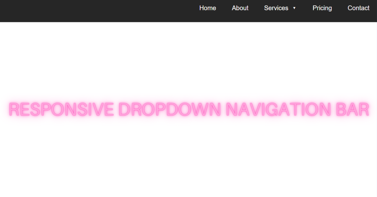
On that note, I welcome you all to Codewithrandom with a new blog in which We’ll learn how to Create a Responsive Dropdown Menu using HTML, CSS, and JavaScript Code. So When You Click On Navbar Item So there are More Menu Item So Lets Start the Responsive Dropdown Menu.
I hope you have got an idea about the project.
HTML Code for Responsive Dropdown Menu
<section class="navigation">
  <div class="nav-container">
    <nav>
     <div class="nav-mobile">
      <a id="nav-toggle" href="#!"><span></span></a>
     </div>
     <ul class="nav-list">
       <li><a href="#">Home</a></li>
       <li><a href="#">About</a></li>
       <li>
        <a href="#">Services</a>
        <ul class="nav-dropdown">
         <li>
          <a href="#!">Web Design</a>
         </li>
         <li>
          <a href="#!">Web Development</a>
         </li>
         <li>
          <a href="#!">Graphic Design</a>
         </li>
       </ul>
      </li>
      <li><a href="#">Pricing</a></li>
      <li><a href="#">Contact</a></li>
     </ul>
   </nav>
  </div>
</section>
In this HTML Code, we have defined the structure for the navigation bar in that we have arranged every label in a list format and defined it under href tag so that in future we may add links that will navigate us there. Let us style the navbar using CSS.
100+ JavaScript Projects With Source Code ( Beginners to Advanced)
CSS Code for Responsive Dropdown Menu
$content-width: 1000px;
$breakpoint: 800px;
$nav-height: 70px;
$nav-background: #262626;
$nav-font-color: #ffffff;
$link-hover-color: #2581DC;

nav {
  float: right;
  ul {
    list-style: none;
    margin: 0;
    padding: 0;
    li {
      float: left;
      position: relative;
      a {
        display: block;
        padding: 0 20px;
        line-height: $nav-height;
        background: $nav-background;
        color: $nav-font-color;
        text-decoration: none;
        &:hover {
          background: $link-hover-color;
          color: $nav-font-color;
        }
        &:not(:only-child):after {
        padding-left: 4px;
        content: ' ▾';
        }
      }
      ul li {
        min-width: 190px;
        & a {
          padding: 15px;
          line-height: 20px;
          z-index: 1;
        }
      }
    }
  }
}

.nav-dropdown {
  position: absolute;
  display: none;
  z-index: 1;
  box-shadow: 0 3px 12px rgba(0, 0, 0, 0.15);
}
.nav-mobile {
  display: none;
  position: absolute;
  top: 0;
  right: 0;
  background: $nav-background;
  height: $nav-height;
  width: $nav-height;
}

#nav-toggle {
  position: absolute;
  left: 18px;
  top: 22px;
  cursor: pointer;
  padding: 10px 35px 16px 0px;
  span,
  span:before,
  span:after {
    cursor: pointer;
    border-radius: 1px;
    height: 5px;
    width: 35px;
    background: $nav-font-color;
    position: absolute;
    display: block;
    content: '';
    transition: all 300ms ease-in-out;
  }
  span:before {
    top: -10px;
  }
  span:after {
    bottom: -10px;
  }
  &.active span {
    background-color: transparent;
    &:before,
    &:after {
      top: 0;
    }
    &:before {
      transform: rotate(45deg);
    }
    &:after {
      transform: rotate(-45deg);
    }
  }
}

@media only screen and (max-width: $breakpoint) {
  .nav-mobile {
    display: block;
  }
   nav {
    width: 100%;
    padding: $nav-height 0 15px;
    ul {
      display: none;
      li {
        float: none;
         a {
          padding: 15px;
          line-height: 20px;
        }
        ul li a {
          padding-left: 30px;
        }
      }
    }
  }

 .nav-dropdown {
   position: static;
  }
}

@media screen and (min-width: $breakpoint) {
  .nav-list {
    display: block !important;
  }
}

.navigation {
  height: $nav-height;
  background: $nav-background;
}

.nav-container {
  max-width: $content-width;
  margin: 0 auto;
}

.brand {
  position: absolute;
  padding-left: 20px;
  float: left;
  line-height: $nav-height;
  text-transform: uppercase;
  font-size: 1.4em;
  a,
  a:visited {
    color: $nav-font-color;
    text-decoration: none;
  }
}
In this CSS code we have styled the navigation and specified and given it a proper position so that it occupy only that space and the position is defined. Then we have padded and set the alignment for the navbar and defined the font weight for each label which is defined in the HTML Code. Let us code the JavaScript part.
JavaScript Code for Responsive Dropdown Menu
(function($){
 $(function(){
  $('nav ul li > a:not(:only-child)').click(function(e) {
    $(this).siblings('.nav-dropdown').toggle();
    $('.nav-dropdown').not($(this).siblings()).hide();
    e.stopPropagation();
  });
 });
 $('html').click(function() {
  $('.nav-dropdown').hide();
 });
 document.querySelector('#nav-toggle').addEventListener('click', function() {
  this.classList.toggle('active');
 });
 $('#nav-toggle').click(function() {
  $('nav ul').toggle();
 });
})(jQuery);
In this JavaScript Code we have defined the function for the navbar and then under document.querySelector and set a command as active so that the navbar is responsive on click but will not navigate us unless and until we’ll add a location or link in the href section. Let us see the final output.
Final Output Responsive Dropdown Menu using HTML, CSS & JS
See the Pen
Responsive Dropdown Navigation Bar using HTML5, CSS3 & JS by Harsh Sawant (@harshh9)
on CodePen.
We have successfully created our Responsive Dropdown Menu using HTML, CSS & JS. You can use this project for your personal needs and the respective lines of code are given with the code pen link mentioned above.
10+ Javascript Projects For Beginners With Source Code
If you find out this Blog helpful, then make sure to search code with random on google for Front End Projects with Source codes and make sure to Follow the Code with Random Instagram page.
Written By – Harsh Sawant
Code By – @harshh9


