Full-Screen Overlay Navigation Menu Bar Using HTML & CSS
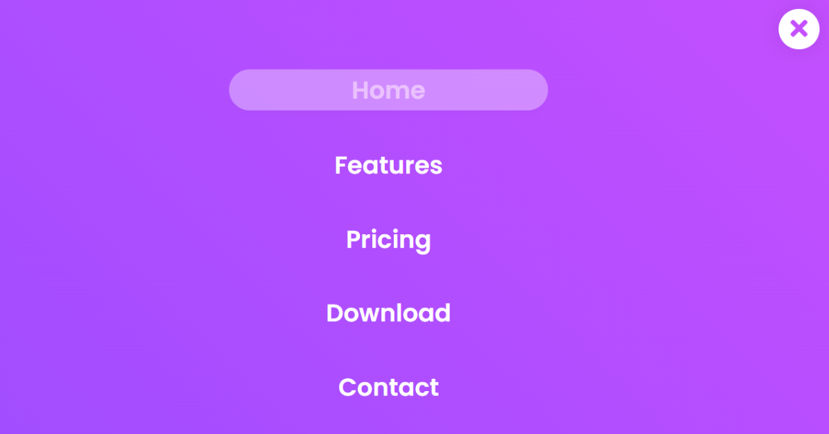
Hello everyone. Welcome to today’s tutorial on Codewithrandom. We’ll learn how to make Fullscreen Overlay Navigation in which the navbar will be presented in a fullscreen format and will overlay on the main screen. In Today’s session, We will use HTML, CSS, and JavaScript to complete this Fullscreen Overlay Navigation Project.
The HTML (Hypertext Markup Language) will help us to create the structure for the list with some necessary attributes and elements to make Fullscreen Overlay Navigation Project. Then we will use CSS (Cascading Stylesheet) which will help us to style or design the project with suitable padding and alignment in the Fullscreen Overlay Navigation Project.
Using CSS we present Full Screen Overlay Navigation Menu Bar Using HTML & CSS projects with source code available for you to copy and paste directly into your own project.
I hope you have got an idea about the project.
HTML Code for Fullscreen Overlay Navigation
First, we’ll start with creating the structure of the Fullscreen Overlay Navigation project for that as you can see in the above code we have used all the necessary elements & attributes to set up the structure. Let us know code the CSS part to add styling and aligned the tags.
<html>
<head>
    <title>Full Page Navigation</title>

    <link href="https://fonts.googleapis.com/css2?family=Poppins:wght@600&display=swap" rel="stylesheet">

    <link rel="stylesheet" href="https://cdnjs.cloudflare.com/ajax/libs/font-awesome/5.13.1/css/all.min.css">

    <link rel="stylesheet" href="style.css">


</head>
<body>
    <nav>
        <ul id="navbar">
            <li>
                <a href="#home">
                    home
                </a>
            </li>
            <li>
                <a href="#features">
                    features
                </a>
            </li>
            <li>
                <a href="#pricing">
                    pricing
                </a>
            </li>
            <li>
                <a href="#download">
                    download
                </a>
            </li>
            <li>
                <a href="#contact">
                    contact
                </a>
            </li>
        </ul>

        <i class="fas fa-bars" id="icon" onclick="navigation()"></i>

    </nav>

    <script type="text/javascript">
        function navigation(){
            var icon=document.getElementById("icon");
            var navbar=document.getElementById("navbar");

            if(icon.classList.contains('fa-bars')){
                icon.classList.remove('fa-bars');
                icon.classList.add('fa-times');
                navbar.style.left = '0';
            }
            else{
                icon.classList.remove('fa-times');
                icon.classList.add('fa-bars');
                navbar.style.left = '-100%';
            }

        }

    </script>
</body>
</html>
Create Netflix Landing Page Clone Using HTML &CSS
CSS Code for Fullscreen Overlay Navigation
Second, comes the CSS code which we have styled for the structure we have padded as well as aligned the Fullscreen Overlay Navigation project so that it is properly situated and doesn’t get messy with suitable CSS elements. Let us see the Final Output of the project Fullscreen Overlay Navigation using HTML & CSS
*{
    padding: 0;
    margin: 0;
    box-sizing: border-box;
}
body{
    background-color: #202020;
}

ul{
    height: 100vh;
    width: 100vw;
    background: linear-gradient(
        45deg,
        #9e4dff,
        #c44fff
        );
    display: flex;
    flex-direction: column;
    justify-content: center;
    position: absolute;
    left: -100%;
    transition:left 1s;
}
li{
    display: block;
    width: 100%;
    text-align: center;
}
li:not(:last-child){
    margin-bottom: 40px;
}

ul a{
    display: inline-block;
    text-decoration: none;
    text-transform: capitalize;
    color: white;
    font-family: 'Poppins',sans-serif;
    font-size: 30px;
    width: 35%;
    border-radius: 40px;
    transition: 0.3s;
    padding: 3px 0;
}

ul a:hover{
    background-color: white;
    color: #c44fff;
    transform: translateY(-5px);
    box-shadow: 0 15px 15px rgba(0,0,0,0.05);
}

i.fas{
    position: fixed;
    height: 50px;
    width: 50px;
    display: inline-block;
    background-color: white;
    color: #c44fff;
    top: 30px;
    right: 30px;
    text-align: center;
    font-size: 30px;
    padding: 10px 0;
    border-radius: 50%;
    box-shadow: 0 0 25px rgba(0,0,0,0.1);
    cursor: pointer;
}
Final Output
We have successfully created our Fullscreen Overlay Navigation using HTML & CSS (Source Code). You can use this project for your personal needs and the respective lines of code are given with the code pen link mentioned above.
If you find out this Blog helpful, then make sure to search code with random on google for Front End Projects with Source codes and make sure to Follow the Code with Random Instagram page.
Thank You And Happy Learning!!!
Code Idea – codingartist
Written By – Harsh Sawant
Code By – @harshh9


