Responsive Navbar Codepen
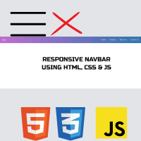
Hey friends, today we’ll create a Cool Responsive Navbar On Codepen. We create this navbar on codepen using HTML, CSS, and JavaScript. So, let’s start our HTML CSS Responsive Navbar Codepen project.
A website’s navigation header is represented graphically by a navigation bar, also referred to as a navbar. Typically, it includes links to the homepage, about page, contact page, and other key pages of a website. The navbar is typically a fixed element that is always visible regardless of how far down or up the user scrolls on a webpage.
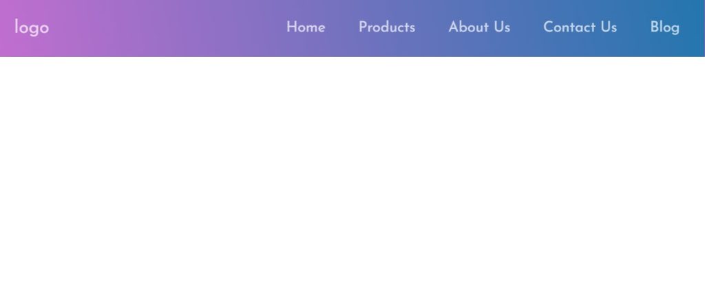
A navbar’s main purpose is to make navigation for users quick and simple. They can easily visit various sections of a website without having to scroll to the top or look for the appropriate link. This can enhance the user experience and provide quicker information discovery for visitors.
Many of the websites, like e-commerce, IT software, etc., use the navbar to provide user-specific products, which helps them to save their
| Code by | codingporium |
| Project Download | Link Available Below |
| Language used | HTML, CSS, and JavaScript |
| External link / Dependencies | Yes |
| Responsive | Yes |
Codepen Navbar Html Code:-
Okay, so first we will need to code our HTML. Generally, all links of the navbar will be stored in an Unordered List Tag as it is a common and good practice.
Besides that we also need to paste the following code in our head tag:
<link href="https://fonts.googleapis.com/css?family=Josefin+Sans" rel="stylesheet">
 <script defer src="https://use.fontawesome.com/releases/v5.0.13/js/all.js" integrity="sha384-xymdQtn1n3lH2wcu0qhcdaOpQwyoarkgLVxC/wZ5q7h9gHtxICrpcaSUfygqZGOe"
        crossorigin="anonymous"></script>
By adding this code snippet to the head tag we are accomplishing the following task:
Import Josefin sans font from Google Fonts
Import FontAwesome Icons for the bars icon to appear on small screens.
Take a look at the code segment below to learn more on what’s below of the head tag:
<body>
  <nav class="navbar">
    <span class="navbar-toggle" id="js-navbar-toggle">
            <i class="fas fa-bars"></i>
        </span>
    <a href="#" class="logo">logo</a>
    <ul class="main-nav" id="js-menu">
      <li>
        <a href="#" class="nav-links">Home</a>
      </li>
      <li>
        <a href="#" class="nav-links">Products</a>
      </li>
      <li>
        <a href="#" class="nav-links">About Us</a>
      </li>
      <li>
        <a href="#" class="nav-links">Contact Us</a>
      </li>
      <li>
        <a href="#" class="nav-links">Blog</a>
      </li>
    </ul>
  </nav>
</body>
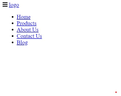
Now inside our body tag using the <nav> tag, we will create a span tag that will include the icon for navbar icons. Using the <a> anchor tag we will add the link to our navbar logo.
Now using the unordered list tag we will create the unordered list for the different navbar items. We will create different navbar links inside our navbar for different options like,home, about us, contact us, blog.
HTML Output:
Codepen Navbar Css Code:-
Next, we’ll add CSS to style our HTML layout and position it like below:
* {
  box-sizing: border-box;
  padding: 0;
  margin: 0;
}

body {
  font-family: "Josefin Sans", sans-serif;
}

.navbar {
  font-size: 18px;
  background-image: linear-gradient(260deg, #2376ae 0%, #c16ecf 100%);
  border: 1px solid rgba(0, 0, 0, 0.2);
  padding-bottom: 10px;
}

.main-nav {
  list-style-type: none;
  display: none;
}

.nav-links,
.logo {
  text-decoration: none;
  color: rgba(255, 255, 255, 0.7);
}

.main-nav li {
  text-align: center;
  margin: 15px auto;
}

.logo {
  display: inline-block;
  font-size: 22px;
  margin-top: 10px;
  margin-left: 20px;
}

.navbar-toggle {
  position: absolute;
  top: 10px;
  right: 20px;
  cursor: pointer;
  color: rgba(255, 255, 255, 0.8);
  font-size: 24px;
}

.active {
  display: block;
}

@media screen and (min-width: 768px) {
  .navbar {
    display: flex;
    justify-content: space-between;
    padding-bottom: 0;
    height: 70px;
    align-items: center;
  }

  .main-nav {
    display: flex;
    margin-right: 30px;
    flex-direction: row;
    justify-content: flex-end;
  }

  .main-nav li {
    margin: 0;
  }

  .nav-links {
    margin-left: 40px;
  }

  .logo {
    margin-top: 0;
  }

  .navbar-toggle {
    display: none;
  }

  .logo:hover,
  .nav-links:hover {
    color: rgba(255, 255, 255, 1);
  }
}
* {
  box-sizing: border-box;
  padding: 0;
  margin: 0;
}

body {
  font-family: "Josefin Sans", sans-serif;
}
Step2: Using the class selector (.navbar) we will add the styling to the navbar using the font-size property we will set the font size as 18px and using the background image property we will set the background as linear gradient and also using the border property we will set the border as 1px solid black.
.navbar {
  font-size: 18px;
  background-image: linear-gradient(260deg, #2376ae 0%, #c16ecf 100%);
  border: 1px solid rgba(0, 0, 0, 0.2);
  padding-bottom: 10px;
}

.main-nav {
  list-style-type: none;
  display: none;
}

.nav-links,
.logo {
  text-decoration: none;
  color: rgba(255, 255, 255, 0.7);
}

.main-nav li {
  text-align: center;
  margin: 15px auto;
}
Step3:Now, using the display property, we will style the navbar’s emblem. Using the font size property, we will set the font size to “22px” and make the display to be an inline block. We will set the top margin to 10px and the left margin to 20px using the margin top and margin left attributes.
We will make our navbar responsive by using the media query selector attribute. The maximum width of the screen will be specified using the max-width property. If the screen size drops below that, formatting will be added based on the media query’s definition of the screen size.
The output is:

Our navigation bar looks stylish enough, however, it needs some more work. This is because the code earlier only styles, positions and makes it responsive. However, when this navigation bar is viewed on small screens/mobile we are supposed to be able to click the icon to open the navbar.
ADVERTISEMENT
10+ Javascript Projects For Beginners With Source Code
ADVERTISEMENT
But we haven’t added JavaScript. Without JavaScript, the navbar will not open completely when the icon is clicked. So next we will add JavaScript.
JavaScript Codes
As I mentioned earlier in the CSS code explanation, we need JavaScript so that the navbar completely opens for small screens when the bar icon is clicked.
ADVERTISEMENT
Here’s how this navbar is without JavaScript:
So let’s solve the problem with JavaScript. Add the following code:
ADVERTISEMENT
let mainNav = document.getElementById("js-menu");
let navBarToggle = document.getElementById("js-navbar-toggle");

navBarToggle.addEventListener("click", function() {
  mainNav.classList.toggle("active");
});
Using the let keyword and the document, we defined two variables in our javascript. Using the ids specified inside the html tags and the getElementById function, we will choose the various html elements.
ADVERTISEMENT
Now, we’ll add an event listener using the variable selector. To locate the navbar links that hide and reveal, we’ll add a click event. switch between the classes that the CSS has defined.
Video Output Of Responsive Navbar Codepen:
Responsive Navbar Codepen:-
100+ JavaScript Projects With Source Code ( Beginners to Advanced)
So now we have coded this responsive navbar.
now you can change the logo name from “logo” to “your website name or you can add an image using the image tag”
Second, add your link to the href=”#”>Blog/a> to make the links work. Add the #, and type, or paste your link.
Thank You!
Do contact me at codingporium.blogspot.com/p/contact.html or comment down below any doubts or suggestions you have. Subscribe to my YouTube channel and do follow me on Instagram. I hope this post was useful and thanks to Code With Random for giving me the chance to write here I hope to see you all in future posts. Goodbye!
Written by: @codingporium
What is a Navbar?
A navigation bar, also known as a navbar, is a graphic representation of a website’s menu header. It typically contains links to a website’s home page, about page, contact page, and other important sites. Typically, the navbar is a fixed element that is always displayed on a webpage, regardless of how far down or up the user scrolls.
What is the use of Navbar?
The navbar’s primary function is to navigate between the website’s various parts.
