Profile Card Design Using HTML and CSS
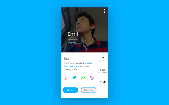
Hello Devs! How are you doing? Today we’re going to be making a UI Profile Card using only Html and Css. We will be focusing specifically on the Grid Display Property to create Profile Card.
Here’s the link for the project so that you can check it out 🙂
Note: Today we’re not going to have a CodePen, since I’m using real-life images.
HTML Code
We’re starting with the document’s structure. In this case, it is bit longer than usual, but it is because we’re having more elements than usual.
100+ JavaScript Projects With Source Code ( Beginners to Advanced)
First of all, we will need to add a Font Awesome link to our project. We’re going to be adding it to the Head element, even though it is a script link. For those of you who don’t know, Font Awesome is a tool used to add icons to our project.
Here’s the code:
<link rel="stylesheet" href="https://cdnjs.cloudflare.com/ajax/libs/font-awesome/6.2.1/css/all.min.css" integrity="sha512-MV7K8+y+gLIBoVD59lQIYicR65iaqukzvf/nwasF0nqhPay5w/9lJmVM2hMDcnK1OnMGCdVK+iQrJ7lzPJQd1w==" crossorigin="anonymous" referrerpolicy="no-referrer" />
Basically, it is just adding a link. Now, when searching for the icons, make sure to be clear, so that you can find them easily.
So we get to the main structure.
First of all, we’re going to create a DIV element, with the Class Selector of “card”. Inside that main DIV, we’re going to be adding two other DIVs; first one will have the class “firsthalf”, and second one “secondhalf”. Plus, they both are going to have the “half” class.
Here’s the code:
<div class = "mainBody">
    <div class = "half firstHalf"></div>
    <div class = "half secondHalf"></div>
</div>
Inside the “first half” DIV, we’re going to add three more containers with the classes “bgImage”, “dots”, and “text” respectively. ONE CLASS per DIV, and in THAT ORDER please.
The code’d be something like this:
<div class = "half firstHalf">
<div class = "bgImage"></div>
<div class = "dots"></div>
<div class = "text"></div>
</div>
Up to now, we shouldn’t be seeing anything within the webpage, since we don’t really have content to show.
How to Create Card Slider Using HTML, CSS & JavaScript
Now, we’re going to leave the first DIV (the one with the “bg.Image” class) alone. Next up, inside the “dots” DIV we’re going to add our first icon! We will be using the following code:
<div class = "dots">
<i class="fas fa-ellipsis-v"></i>
</div>
This icon represents a small “menu” for saying it in some way. That should be the only thing showing up in our page up to now.
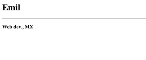
Inside the third DIV, we’re goin’ to add three elements: an H1, HR, and H3 elements.
In this case, the H1 is going to be the biggest text, while HR is going to display a line in our web. The H3 element’s going to represent a small caption.
Here’s the code:
<div class = "text">
    <h1>Emil</h1>
    <hr>
    <h3>Web dev., MX</h3>
</div>
So now we enter the second half of our project. In this case, we’re going to be creating three more containers inside the main DIV (“secondHalf class”).
This three new containers will have the classes “info”, “numbers”, and “buttons” respectively. ONE CLASS per DIV, IN THAT SAME ORDER.
ADVERTISEMENT
So, we should have something like this:
ADVERTISEMENT
<div class = "half secondHalf">
<div class = "info"></div>
<div class = "numbers"></div>
<div class = "buttons"></div>
</div>
<div class = "info">
<div class = "about"></div>
<div class = "socialMediaIcons"></div>
</div>
You guessed right. Inside our “about” DIV, we’re going to add two more DIVs with the classes “aboutHead”, and “aboutText” respectively.
ADVERTISEMENT
Inside “aboutHead”, we’re going to add a P element with the text “about”, and a HR element; inside the “aboutText” DIV, we’re going to add another P element, with a small description of yourself (remember this is a tutorial; you can edit the code as much as you want).
ADVERTISEMENT
Restaurant Website Using HTML And CSS With Source Code
ADVERTISEMENT
Here’s the code:
<div class = "about">
<div class = "aboutHead">
<p>About</p>
<hr>
</div>
<div class = "aboutText">
<p>Freelancer. Worked at <span class = "highlight">CWR</span>, <span class = "highlight">Plum</span>, <span class = "highlight">Xoxoday</span>, etc.
Love coding & life.</p>
</div>
</div>
In my case, I added an optional SPAN tag with the class “highlight”. It is your decision whether to use it or to ignore it.
Now, inside the second DIV (“socialMediaIcons” class), we’re going to add, as you might have already predicted, social media icons. In this case, we’re not going to use DIVs, but the new I tag.
You can add whatever social media you want to.
Here’s the base code:
<div class = "socialMediaIcons">
<i class="fab fa-instagram instagram"></i>
<i class="fab fa-twitter twitter"></i>
<i class="fab fa-whatsapp whatsapp"></i>
<i class="fab fa-dribbble dribble"></i>
</div>
If you read the code, you might have noticed that, apart from the class that determines the icon (“fa + icon name”), I am adding another class with the name of the app. This is only for design purposes, so you can also ignore it if you want to.
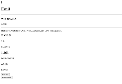
So, that was it for our “info” section. Here’s the complete code of it, and a small preview.
<div class = "info">
<div class = "about">
<div class = "aboutHead">
<p>About</p>
<hr>
</div>
<div class = "aboutText">
<p>Freelancer. Worked at <span class = "highlight">CWR</span>, <span class = "highlight">Plum</span>, <span class = "highlight">Xoxoday</span>, etc.
Love coding & life.</p>
</div>
</div>
<div class = "socialMediaIcons">
<i class="fab fa-instagram instagram"></i>
<i class="fab fa-twitter twitter"></i>
<i class="fab fa-whatsapp whatsapp"></i>
<i class="fab fa-dribbble dribble"></i>
</div>
</div>
Output
It might seem surreal, but we aren’t done with the HTML. We’re missing just two more sections, (notably smaller than the one before).
In this first section (or second?), we’re basically going to add just numbers. We’re trying to recreate this section of the design.
Inside this DIV (the one named “numbers”), we’re going to add three identical DIVs, all with the same class and elements inside, but different content.
Ecommerce Website Using HTML, CSS, & JavaScript (Source Code)
We’re going to add the three DIVs with the “numberSection” class first. Inside of them, we’re going to add an H2 element with a big number, followed by a P that will serve as a caption.
Here’s the code of one of them:
<div class="numberSection">
<h2>12</h2>
<p>CLIENTS</p>
</div>
<div class = "numbers">
<div class="numberSection">
<h2>12</h2>
<p>CLIENTS</p>
</div>
<div class="numberSection">
<h2>1.16k</h2>
<p>FOLLOWERS</p>
</div>
<div class="numberSection">
<h2>+10k</h2>
<p>REACH</p>
</div>
</div>
. . .
We’re now getting to the final stage of the HTML.
This new stage will be assembled by Two smaller DIVs inside the biggest of them (“buttons”-class one), and a respective button with a text inside of it.
So, as mentioned before, we’re going to need two different DIVs inside of the bigger one. They are going to have the classes “firstButton” and “secondButton” respectively; then they’re both going to have a button with a text inside of them.
I really recommend you not changing the texts inside, since the design is a little tricky to adjust.
Here’s the code for the first one:
<div class = "firstButton">
<button>Hire me</button>
</div>
<div class = "buttons">
<div class = "firstButton">
<button>Hire me</button>
</div>
<div class = "secondButton">
<button>Know more</button>
</div>
</div>
. . .
Create A Travel Website Using HTML & CSS
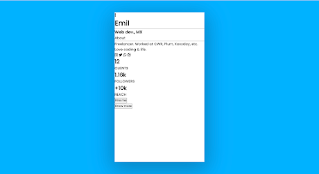
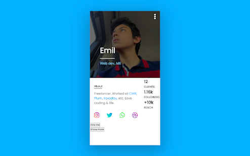
Here’s a screenshot of what you should be having up to now, plus, the code for the whole thing. 🙂
<div class = "card">
<div class = "half firstHalf">
<div class = "bgImage"></div>
<div class = "dots">
<i class="fas fa-ellipsis-v"></i>
</div>
<div class = "text">
<h1>Emil</h1>
<hr>
<h3>Web dev., MX</h3>
</div>
</div>
<div class = "half secondHalf">
<div class = "info">
<div class = "about">
<div class = "aboutHead">
<p>About</p>
<hr>
</div>
<div class = "aboutText">
<p>Freelancer. Worked at <span class = "highlight">CWR</span>, <span class = "highlight">Plum</span>, <span class = "highlight">Xoxoday</span>, etc.
Love coding & life.</p>
</div>
</div>
<div class = "socialMediaIcons">
<i class="fab fa-instagram instagram"></i>
<i class="fab fa-twitter twitter"></i>
<i class="fab fa-whatsapp whatsapp"></i>
<i class="fab fa-dribbble dribble"></i>
</div>
</div>
<div class = "numbers">
<div class="numberSection">
<h2>12</h2>
<p>CLIENTS</p>
</div>
<div class="numberSection">
<h2>1.16k</h2>
<p>FOLLOWERS</p>
</div>
<div class="numberSection">
<h2>+10k</h2>
<p>REACH</p>
</div>
</div>
<div class = "buttons">
<div class = "firstButton">
<button>Hire me</button>
</div>
<div class = "secondButton">
<button>Know more</button>
</div>
</div>
</div>
</div>
CSS Code
We get to the style of this article. Get your hands ready, because you’ll write 400 lines of code 😀
First of all, we’re going to declare some CSS variables. In this case, we’re going to have 4 variables. For that, we’re going to add the Root Selector-Pseudo Class. Inside of it, we’re going to add the variables with the respective colors.
Here’s the code.
:root {
--mainColor: #44b5fc;
--lightTone: #fff;
--grayTone: #7a7a7a;
--darkTone: #000;
}
Apart from making our code easier to be understood, this helps us not to repeat CSS Code and gives us the ability to change it without going through the whole thing.
Next up, we’re going to be styling the card. We’re going to define our height and our width based on responsive CSS units: visual height (VH) and visual width (VW). We’re also going to give it a shadow using the box-shadow property.
Here’s the code:
.card {
height: 86vh;
width: 28.1vw;
background: var(--lightTone);
box-shadow: 0px 24px 98px 17px rgba(0, 0, 0, 0.25);
}Now, we are going to style both parts of our card. We’re going to give them full width (100%) and half height since we’re going to fit them both within just one DIV (50%).
Here’s the code:
.half {
height: 50%;
width: 100%;
}.firstHalf {
cursor: pointer;
transition: 1s;
display: grid;
place-items: center;
}
As you saw, we set the “display” property’s value to “grid”, and, we used a new property: “place-items”. This aligns our elements in certain part of the webpage with only one line of code. Check it out 🙂
Now we get to an interesting part, the “bgImage” DIV. Here, we are going to give 100% as the value for both, height and width properties. Next, we’re going to set the shorthand background property.
First of all, we’re going to put our URL, plus our decision to whether repeat our image or not (in my case not); its position (x and y, in that order).
It will be followed by the background-size property, which would be 100%, and a filter with its value set to “brightness(41%)”. Finally, we will add the “transition” property with its value set to “1s”.
Here’s the code:
.bgImage {
height: 100%;
width: 100%;
background: url("../img/me.png") no-repeat center -7.2rem;
background-size: 100%;
filter: brightness(41%);
transition: 1s;
}Looks weird, doesn’t it?
We’ll, we’re going to fix it, but before, that, we’re going to add a “hover” effect for our “bgImage” DIV.
Here’s the code for it.
.bgImage:hover {
filter: brightness(72%);
background: url("../img/me.png") no-repeat center -7.7rem;
background-size: 105%;
}
So, basically, we’re only overriding properties; changing the filter to a lighter version of the image, changin’ our image’s position and its size.
Try hovering the image. Does it look something different?
Now, we’re going to style our “dots” container. As always, we’re going to be setting the height and the width. But, in this case, we’re going to be using absolute positioning. We are going to leave 7vh from the top, so that it gets aligned with our content. Next, we’re going to add some padding, and, for the display property, we’re now going to use Flexbox, since it is easier to style using it for smaller containers.
Here’s the code:
.dots {
height: 10%;
width: 27vw;
position: absolute;
top: 7vh;
padding-top: 1rem;
padding-right: 1rem;
display: flex;
flex-direction: row;
justify-content: flex-end;
align-items: flex-start;
}
Now, you can also use grid, but, just to variate, I used Flexbox.
10+ Javascript Projects For Beginners With Source Code
Inside of it, we have the three-dot icon. We’re basically going to give it a height and a color. That’d be it.
.dots i {
color: var(--lightTone);
font-size: 2rem
}
Now, we get to style the “text” container. In this case, we’re only giving it a height, since we don’t really need to declare the width. So, we are also going to give it an absolute-position value. In this case, we’re leaving 28vh from top, and 40vw from left.
We’re also going to give it a text shadow, and, as display property, the Flexbox value, since, as I mentioned before, for small containers, Flexbox is the best option.
Here’s the code:
.text {
position: absolute;
top: 28vh;
left: 40vw;
text-shadow: 0px 4px 13px rgba(0, 0, 0, 0.69);
height: 15vh;
min-height: fit-content;
display: flex;
flex-direction: column;
justify-content: space-around;
align-items: flex-start;
}
So, as last container, this one could also be arranged using Grid.
We get to the last part of the first half.
For the H1 element, we are going to give it the color of the text by using “var(–lightTone)” as the value for the “color” property. We are also going to give it the value “2.7rem” to the “font-size” property.
Your code should look like this:
.text h1 {
color: var(--lightTone);
font-size: 2.7rem;
}
Now, we are going to style the HR element. For it, we are going to give it a 1px border of the same color as the text (lightTone variable). We are going to give it a width of the 70%.
Here’s the code:
.text hr {
border: 1px solid var(--lightTone);
width: 70%;
}.text h3 {
color: #9CD9FF;
}.firstHalf {
cursor: pointer;
transition: 1s;
display: grid;
place-items: center;
}
.bgImage {
height: 100%;
width: 100%;
background: url("../img/me.png") no-repeat center -7.2rem;
background-size: 100%;
filter: brightness(41%);
transition: 1s;
}
.bgImage:hover {
filter: brightness(72%);
background: url("../img/me.png") no-repeat center -7.7rem;
background-size: 105%;
}
.dots {
height: 10%;
width: 27vw;
position: absolute;
top: 7vh;
padding-top: 1rem;
padding-right: 1rem;
display: flex;
flex-direction: row;
justify-content: flex-end;
align-items: flex-start;
}
.dots i {
color: var(--lightTone);
font-size: 2rem
}
.text {
position: absolute;
top: 28vh;
left: 40vw;
text-shadow: 0px 4px 13px rgba(0, 0, 0, 0.69);
height: 15vh;
min-height: fit-content;
display: flex;
flex-direction: column;
justify-content: space-around;
align-items: flex-start;
}
.text h1 {
color: var(--lightTone);
font-weight: 400;
font-size: 2.7rem;
}
.text hr {
border: solid 1px var(--lightTone);
width: 70%;
}
.text h3 {
color: #9CD9FF;
font-weight: 300;
}Soooo we get to the Second Half. Before continuing, take a small break; this project is even tiring for me.
Now that you’ve taken your break, check the next part!
First of all, we are going to style the “secondHalf” container. We are going to give it a border of the “lightTone” variable. Now, here we have an interesting part. After the property “display” with “grid” value, we are going to add a new property named “grid-template-areas”.
10+ HTML CSS Projects For Beginners with Source Code
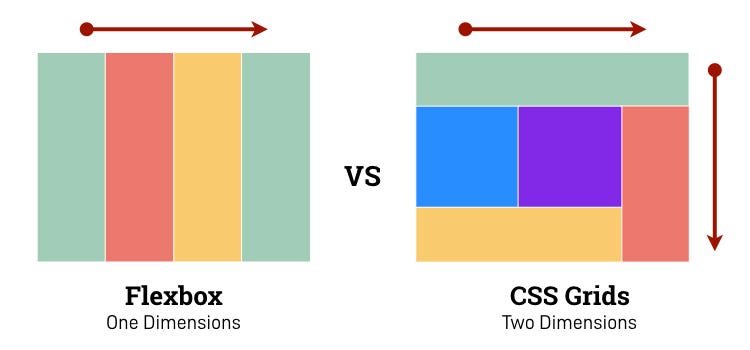
This property aligns elements in a certain way, in a certain order. Have you seen those amazing but weird designs that appear when comparing Grid to Flexbox? This property does that.
There are certain rules we need to follow, for example, that we should have the same number of value-texts in each value.
For using it, we should define each elements identifier using another new property, “grid-area”. This property will be declared inside of our items, not inside the container.
Here’s the code for the grid-area properties:
.info {
grid-area: info;
}
.numbers {
grid-area: numberss; /*Yeah, with double S*/
}
.buttons {
grid-area: buttons;
}
Next up, we are going to use the property “grid-template-areas”. This property, as mentioned before, gives us the ability to do creative designs. If you still want to see more about, here’s this CodePen for you to check out! 🙂
.secondHalf {
    border: solid var(--lightTone);
    display: grid;
    grid-template-areas: "info info numberss" "info info numberss" "info info numberss" "buttons buttons numberss" "buttons buttons numberss";
}
The code’s here:
.info {
    grid-area: info;
    width: 95%;
    display: flex;
    flex-direction: column;
    justify-content: space-evenly;
    align-items: center;
}
Next, we’re going to style the first DIV (the one with the class “about”). Nothin’ new. Just height, width, and flex properties.
.about {
    width: 85%;
    height: 60%;
    display: flex;
    flex-direction: column;
    justify-content: space-evenly;
    align-items: flex-start;
}
.aboutHead hr {
    border: 1px solid var(--darkTone);
    width: 45px;
}
We will basically just set properties for the text inside (color and size).
.aboutText {
    color: var(--grayTone);
    font-size: 18px;
}
Here’s the code:
.highlight {
    color: var(--mainColor);
}
.socialMediaIcons {
    height: 20%;
    width: 100%;
    display: flex;
    flex-direction: row;
    justify-content: space-around;
    align-items: center;
}
Here’s our code:
.socialMediaIcons i {
    width: 30%;
    font-size: 3.7vh;
    cursor: pointer;
    transition: 0.4s;
    display: grid;
    place-items: center;
}
.instagram {
    width: 10%;
    background: linear-gradient(
        45deg,
        #feda75,
        #fa7e1e,
        #d62976,
        #962fbf,
        #4f5bd5
    );
    background-clip: text;
    -webkit-background-clip: text;
    -webkit-text-fill-color: transparent;
}
.twitter {
background: linear-gradient(45deg, #00ffbd, #00e4cd, /*#00c7d6,*/ #00a8d5, #008ac8);
background-clip: text;
-webkit-background-clip: text;
-webkit-text-fill-color: transparent;
}

.whatsapp {
bæackground: linear-gradient(45deg, #25d366, #6ffa1e);
background-clip: text;
-webkit-background-clip: text;
-webkit-text-fill-color: transparent;
}

.dribble {
background: linear-gradient(45deg, #4c3f91, #9145b6, #ff5677);
background-clip: text;
-webkit-background-clip: text;
-webkit-text-fill-color: transparent;
}
Here’s the code 🙂
.socialMediaIcons i:hover {
    transform: rotate(8deg);
    font-size: 4.2vh;
}
Up to now, we should have this:
.info {
    grid-area: info;
    width: 95%;
    display: flex;
    flex-direction: column;
    justify-content: space-evenly;
    align-items: center;
}
.about {
    width: 85%;
    height: 60%;
    display: flex;
    flex-direction: column;
    justify-content: space-evenly;
    align-items: flex-start;
} /*.aboutHead { border: solid royalblue; width: 100% }*/
.aboutHead hr {
    border: 1px solid var(--darkTone);
    width: 45px;
}
.aboutText {
    color: var(--grayTone);
    font-size: 18px;
    font-weight: 400;
}
.highlight {
    color: var(--mainColor);
}
.socialMediaIcons {
    height: 20%;
    width: 100%;
    display: flex;
    flex-direction: row;
    justify-content: space-around;
    align-items: center;
}
.socialMediaIcons i {
    width: 30%;
    font-size: 3.7vh;
    cursor: pointer;
    transition: 0.4s;
    display: grid;
    place-items: center;
}
.instagram {
    width: 10%;
    background: linear-gradient(
        45deg,
        #feda75,
        #fa7e1e,
        #d62976,
        #962fbf,
        #4f5bd5
    );
    background-clip: text;
    -webkit-background-clip: text;
    -webkit-text-fill-color: transparent;
}
.twitter {
    background: linear-gradient(
        45deg,
        #00ffbd,
        #00e4cd,
        /*#00c7d6,*/ #00a8d5,
        #008ac8
    );
    background-clip: text;
    -webkit-background-clip: text;
    -webkit-text-fill-color: transparent;
}
.whatsapp {
    background: linear-gradient(45deg, #25d366, #6ffa1e);
    background-clip: text;
    -webkit-background-clip: text;
    -webkit-text-fill-color: transparent;
}
.dribble {
    background: linear-gradient(45deg, #4c3f91, #9145b6, #ff5677);
    background-clip: text;
    -webkit-background-clip: text;
    -webkit-text-fill-color: transparent;
}
.socialMediaIcons i:hover {
    transform: rotate(8deg);
    font-size: 4.2vh;
}
In the case of the “numbers” DIV, we will give a small margin to separate it from the border, plus a height of 80%. Now, we will use a new property: grid-template-rows. This property establishes a certain number of rows, with a fixed or responsive height. For example, let’s say you want 3 rows, so, you’re going to write three values: 10px 15px 10px. This will display three rows that measure 10, 15, and 10px respectively.
Here’s our code:
.numbers {
    grid-area: numberss;
    margin-right: 0.3rem;
    height: 80%;
    display: grid;
    grid-template-rows: repeat(3);
}
.numberSection {
    display: flex;
    flex-direction: column;
    justify-content: center;
    align-items: center;
}
Here’s the code:
.numberSection p {
    color: var(--grayTone);
    font-size: 8px;
    letter-spacing: 0.245rem;
}
.numbers {
    grid-area: numberss;
    margin-right: 0.3rem;
    height: 80%;
    display: grid;
    grid-template-rows: repeat(3);
}
.numberSection {
    display: flex;
    flex-direction: column;
    justify-content: center;
    align-items: center;
}
.numberSection h2 {
    font-weight: 400;
}
.numberSection p {
    color: var(--grayTone);
    font-size: 8px;
    letter-spacing: 0.245rem;
}
For the “buttons” container, we’re going to use a new property, grid-template-columns. This one does exactly the same as grid-template-rows, but, in this case, it defines columns and not rows.
.buttons {
    grid-area: buttons;
    display: grid;
    grid-template-columns: 50% 50%;
}
.buttons div {
    display: grid;
    place-items: center;
}
.buttons div button {
    height: 3rem;
    width: 85%;
    cursor: pointer;
    border-radius: 84px;
    transition: 0.4s;
}
.buttons div button:hover {
    height: 3.3rem;
    width: 92%;
    box-shadow: 0px 4px 36px rgba(0, 0, 0, 0.25);
}
“If the div is NOT the LAST OF ITS TYPE inside the container, then select its button”.
This is a more advanced CSS topic, but, it’s great you now 🙂
.buttons div:not(:last-of-type) button {
    color: var(--lightTone);
    background: var(--mainColor);
    border: none;
}
Now, we will style the other DIV. The rule will be the same, but without the “:not()” pseudo-class.
.buttons div:last-of-type button { color: var(--darkTone); border: solid var(--mainColor); }. . .
Sorry for shoutin’. But you made it! You just read a 40 min article, plus wrote a plus 500+ code program. 🙂
Really hope you liked this project.
¡Adiós, amigos! (Bye, my friends!)
We will see very soooooon 😀

