3D Image Rotate Effect on Mouse Hover Using CSS And JavaScript
Hello everyone! In this article, you are going to learn how to create a 3D Image Rotate Effect Hover and how to rotate it on mouse move with mouseover and mouse out events using HTML, CSS, and Pure JavaScript.

On mouse move, the card will be rotated according to the cursor moving direction. When the mouse over the card, the card elements (text, images) will be transformed into 3d layers.
When the mouse out all the effects on mouse move and mouseover events will be reset on the card as it looks in the first place.
| Code by | N/A |
| Project Download | Link Available Below |
| Language used | HTML ,CSS and JavaScript |
| External link / Dependencies | No |
| Responsive | Yes |
Hope this article will be helpful to improve your JavaScript knowledge. Let’s see how to design this awesome 3D card.
First, create the index.html file and the style.css file. After you created these two files then start the HTML part of the card in the index.html file as you can see in the video.
50+ HTML, CSS & JavaScript Projects With Source Code
After the HTML part is complete, then link the style.css file to the index.html file in between <head></head> tags to start the CSS styling part.
After you link the style.css file to the index.html file, then go to the style.css file and do the styling part on the card as you can see in the video.
After the styling part is completed then go to the index.html file for the JavaScript part.
In the index.html file before the body close tag open <script></script> tags and complete the JavaScript part of the card mouse move, mouse over, and mouse out events between the script tags as you can see in the Code.
So that’s all, Hope this article will be helpful to improve your javascript knowledge with the mouse events.
HTML CODE
ADVERTISEMENT
<!DOCTYPE html>
<html lang="en" dir="ltr">
  <head>
    <meta charset="utf-8">
    <title>Merry Christmas | Amazing 3D Card Rotate On Mousemove</title>
    <link rel="stylesheet" href="style.css">
  </head>
  <body>

    <div class="container">
      <div class="card">
        <div class="card-bg">
          <img src="card-bg.jpg" alt="">
        </div>
        <div class="title">
          <h2>Merry</h2>
          <h1>Christmas</h1>
          <h3>& Happy New Year</h3>
        </div>
        <div class="images">
          <img src="santa.png" class="santa" alt="">
          <img src="tree.png" class="tree" alt="">
        </div>
      </div>
    </div>

    <script type="text/javascript">
    const container = document.querySelector(".container");
    const card = document.querySelector(".card");
    const title = document.querySelector(".title");
    const santa = document.querySelector(".santa");
    const tree = document.querySelector(".tree");

    //card rotate on mouse move
    container.addEventListener("mousemove", (rotate) => {
      let x = (innerWidth / 2 - rotate.pageX) / 15;
      let y = (innerHeight / 2 - rotate.pageY) / 15;

      card.style.transform = "rotateY(" + x + "deg) rotateX(" + y + "deg)";
    });

    //card effects on mouse over the card
    container.addEventListener("mouseover", () => {
      title.style.transform = "translate3d(0, 0, 160px)";
      santa.style.transform = "translate3d(0, 0, 220px)";
      tree.style.transform = "translate3d(0, 0, 120px)";
      card.style.transition = "all 0.1s ease";
    });

    //card back to normal when mouse out
    container.addEventListener("mouseout", () => {
      card.style.transform = "rotateY(0deg) rotateX(0deg)";
      card.style.transition = "all 0.5s ease";
      title.style.transform = "translate3d(0, 0, 0)";
      santa.style.transform = "translate3d(0, 0, 0)";
      tree.style.transform = "translate3d(0, 0, 0)";
    });
    </script>

  </body>
</html>
ADVERTISEMENT
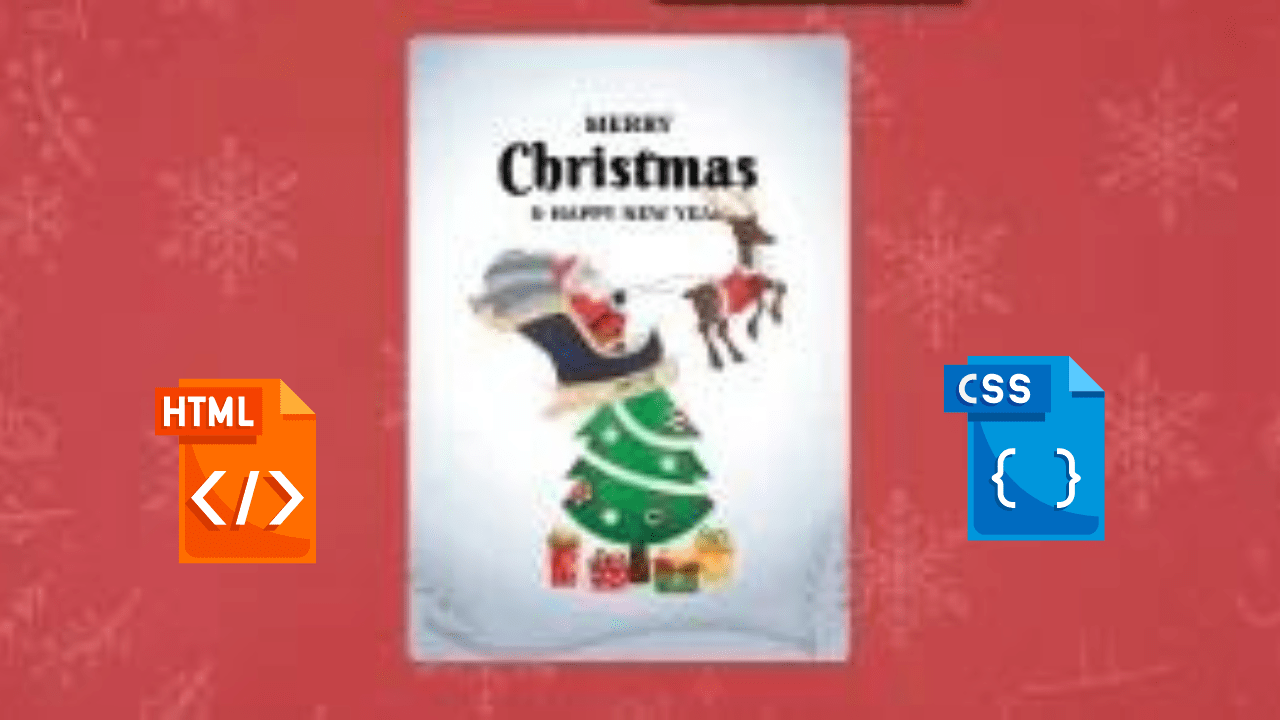
A card with two pictures serves as the code.
ADVERTISEMENT
The first picture features Santa Claus, while the second depicts a Christmas tree.
ADVERTISEMENT
The code contains two divs, one with the class “card” and one with the class “title.”
The card features an image of Santa Claus, with writing about Christmas in the title.
Restaurant Website Using HTML and CSS
The first card is the title, which has a transform of “translate3d(0, 0, 160px)”.
The second card is santa with a transform of “translate3d(0, 0, 220px)”.
The third card is tree with a transform of “translate3d(0, 0, 120px).
The code then adds an event listener to the container for mousemove events.
When this happens it calculates where on the screen the mouse moved from using pageX and pageY values.
It then changes each element’s style property to rotate around that point in degrees.
Portfolio Website using HTML and CSS (Source Code)
The code will rotate the card on mouse move and effects on mouse over.
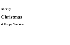
HTML Output
CSS CODE
@import url('https://fonts.googleapis.com/css2?family=Poppins:wght@100;200;300;400;500;600;700;800;900&display=swap');
@import url('https://fonts.googleapis.com/css2?family=Berkshire+Swash&display=swap');
@import url('https://fonts.googleapis.com/css2?family=Eczar:wght@400;500;600;700;800&display=swap');

*{
  margin: 0;
  padding: 0;
  box-sizing: border-box;
  font-family: "Poppins", sans-serif;
}

body{
  height: 100vh;
  display: flex;
  justify-content: center;
  align-items: center;
  background: url(bg.jpg)no-repeat;
  background-size: cover;
  background-position: center;
}

.container{
  display: flex;
  justify-content: center;
  align-items: center;
  width: 700px;
  height: 750px;
  perspective: 1200px;
}

.card{
  position: relative;
  display: flex;
  justify-content: center;
  align-items: center;
  width: 450px;
  height: 600px;
  transform-style: preserve-3d;
}

.card .card-bg{
  position: absolute;
}

.card .card-bg img{
  z-index: 1;
  width: 100%;
  border-radius: 10px;
}

.card .title{
  z-index: 2;
  position: absolute;
  top: 50px;
  text-align: center;
  line-height: 40px;
  transition: all 0.3s ease-out;
}

.card .title h2{
  font-family: "Eczar", serif;
  font-size: 25px;
  text-transform: uppercase;
}

.card .title h1{
  font-family: "Berkshire Swash", cursive;
  font-size: 60px;
  letter-spacing: 2px;
}

.card .title h3{
  font-family: "Eczar", serif;
  font-size: 20px;
  text-transform: uppercase;
  margin-top: 10px;
}

.card .images{
  z-index: 2;
}

.card .images .santa{
  z-index: 3;
  position: absolute;
  width: 400px;
  transition: all 0.3s ease-out;
}

.card .images .tree{
  z-index: 2;
  width: 400px;
  transition: all 0.3s ease-out;
}
The code is a CSS file that sets the font family to “Poppins” and then defines the text size.
The code is also a CSS file that sets the font family to “Berkshire Swash” and then defines the text size.
The code attempts to make the body of the web page display in a flexbox layout.
The code above also includes the following: – The height of the web page is set to 100vh. This means that it will be 100% of the viewport height.
The display property is set to flex, which means that there are no margins or padding on any side of the element and all content will be aligned center by default.
Responsive Gym Website Using HTML ,CSS & JavaScript
The code starts with a div called “card” which has two child elements: “title” and “images”.
The card is positioned relative to the browser window.
It also has flexbox properties applied to it, meaning that its width can change depending on how much space there is in the browser window.
The title element is absolute and positioned at 50px from the top of the card.
Its text-align property is set to center, so it will always be centered horizontally within its parent element (the card).
The h2 tag inside of this element sets up an h1 tag inside of it, which sets up a h3 tag inside of that one as well. This creates nested headings for each level of heading hierarchy in order to create more readable code.
100+ JavaScript Projects With Source Code ( Beginners to Advanced)
The images are absolutely positioned at 400px wide and have a transition effect applied to them all 0.3 seconds long using ease-out timing functions.
The code is a card component that has an image and text.
Final Output Of 3D Image Rotate Effect on Mouse Hover Using CSS And JavaScript

Video Output:
Hope you like this project, we create your own and use this project in any project as a part project like the reviews section, and a contact form. If you need any more project-related frontend. Visit our homepage and you get 100+ projects💝.
if you have any confusion Comment below or you can contact us by filling out our contact us form from the home section. 🤞🎉
written by – Codewithrandom
Which code editor do you use for this 3D Rotate Card Effect on Mouse Hover coding?
I personally recommend using VS Code Studio, it’s straightforward and easy to use.
What is the hover effect?
A CSS hover effect takes place when a user hovers over an element, and the element responds with transition effects. It is used to mark the key items on the web page and it’s an effective way to enhance the user experience.
Which CSS property is used to make the hover effect?
Any element can have a hover effect added by using the hover property, which applies the property specified inside the hover selection as the user moves their cursor over the element.
For Example:
a: hover{
background: Red;
}
