CSS (Cascading Style Sheet) is used in the styling of HTML structure in beautiful and responsive web pages to help the developer build a responsive website that provides great user experience. CSS provides many features like background, height, width, etc.
We will learn about position attributes in CSS which help in aligning objects inside the website, In this post, we will look at the four main position property values: static, relative, absolute, and fixed.

Understanding CSS Position Property
The CSS position property specifies the location of an element within a webpage. position attributes are left, right, top, bottom, and z-index attributes, which help in determining the final position of an element on a page.
The main five values that the position attribute takes are:
- Static
- Relative
- Absolute
- Fixed
- Sticky
Let’s take a look at each property step by step:
Static
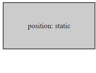
HTML elements have a static position value by default. Elements appear in the order defined in the HTML and are positioned according to other characteristics such as margin, top, right, bottom, and left in this mode. These features function as expected, and elements do not overlap or interfere with one another in any way.
<div class="box box1">
  position: static
</div>
.box{
  width: 200px;
  height: 100px;
  background-color: #ccc;
  border: 2px solid #555;
  text-align: center;
  line-height: 100px;
  margin-bottom: 10px;
}

.box1{
  position: static;
}

Relative
When you set an element’s position to relative, it keeps its original position inside the usual document flow but can be changed using the top, right, bottom, or left attributes. This shift takes place in relation to the element’s initial position.
<div class="first purple">
  position: static
</div>

<div class="another green">
  position: relative<br>
  top: 50px (now positioned 50px below the first element!)
</div>
$bodyBg: #030018;
$purple: #292477;
$green: #13693B;
$magenta: #AD2266;
@mixin bgGradient($color){
background-image: linear-gradient(lighten($color, 12%) 0%, $color 70%);
}
html {
box-sizing: border-box;
font-size: 100%;
}
*, *:before, *:after {
box-sizing: inherit;
}
body {
background: $bodyBg;
color: #ffffff;
font-family: 'Roboto', sans-serif;
padding: 20px;
max-width: 700px;
}
div {
padding: 20px; // 15px 25px;
font-size: 1.5rem;
border-radius: 10px;
overflow: hidden;
margin: 0;
min-height: 150px;
font-size: 1.25rem;
line-height: 1.5;
letter-spacing: 3px;
//text-transform: uppercase;
font-weight: normal;
}
.purple {
background-color: $purple;
@include bgGradient($purple);
}
.green {
background-color: $green;
@include bgGradient($green);
}
.magenta {
background-color: $magenta;
@include bgGradient($magenta);
}
.first {
// No position set, so it's static
}
.another {
position: relative;
top: 50px;
}
Absolute
Elements having absolute position values are excluded from the typical document flow. Instead, they are positioned according to their next ancestor element having a position value other than static. If no such ancestor exists, the element will be positioned relative to the initial contained block (often the viewport).
<h1>center horizontally</h1>
<div class="container">
  <div class="box box-green"></div>
  <div class="box box-purple"></div>
</div>

<h1>center vertically</h1>
<div class="container">
  <div class="box box-red">
  </div>
</div>

<h1>center both horizontally and vertically</h1>
<div class="container">
  <div class="box box-blue">
  </div>
</div>
.container {
width: 600px;
height: 300px;
border: 1px solid;
position: relative;
margin-bottom: 10px;
}
.box {
width: 100px;
height: 100px;
position: absolute;
}
.box-green {
background-color: green;
/* left: 0;
right: 0; */
inset: auto 0;
margin: 0 auto;
}
.box-purple {
background-color: purple;
bottom: 0;
left: 50%;
transform: translateX(-50%);
}
.box-red {
background-color: red;
/* top: 0;
bottom: 0; */
inset: 0 auto;
margin: auto 0;
}
.box-blue {
background-color: blue;
inset: 0;
margin: auto auto;
}
Fixed
Fixed-position elements are also removed from the usual document flow, but are positioned relative to the viewport. This means they stay in the same place even when the user scrolls down the page. Fixed positioning is frequently used for items such as navigation menus or headers that must be visible at the top of the page at all times.
<div class="container-fluid">
  <div class="row">
    <div class="col-lg-12">
      <div class="parent_element">
        <div class="rectangle" id="rectangle1">rectangle1 - position: absolute</div>
        <div class="rectangle" id="rectangle2">rectangle2 - position: fixed</div>
      </div>
    </div>
  </div>
  <div class="row">
    <div class="col-lg-12">
      <h1 class="title">CSS Position Fixed</h1>
    </div>
    <div class="col-lg-6">
      Fixed positioning is similar to absolute in that the element is removed from the regular document flow. The difference is that elements with fixed positioning are positioned relative to the window. Elements with absolute positioning are positioned relative to the document. Since rectangle2 is using fixed positioning, when you scroll down the page the element remains at 100px from the top of the window not the document!
    </div>
  </div>
</div>
#rectangle1 {
height: 50px;
width: 500px;
background-color: #eb4d4b;
position: absolute;
}
#rectangle2 {
height: 50px;
width: 500px;
background-color: #686de0;
position: fixed;
top: 100px;
}
.title {
color: #f0932b;
}
.parent_element {
color: white;
width: 260px;
height: 260px;
}
body {
height: 3000px;
background: #1f2021;
color: #9a859b;
}Sticky
position: sticky is a combination of relative and fixed positions. It behaves similarly to a reasonably positioned element until a specific scroll point, at which point it behaves similarly to a fixed element. If you don’t understand what this implies, don’t worry, the example will help you.
<h4>Scroll to see the sticky element <em>sticking</em></h4>
<div class="extra"></div>
<br />
<div id="wrapper">
  <div id="sticky">
    sticky
  </div>
</div>
<br />
<div class="extra"></div>
#sticky {
position: sticky;
position: -webkit-sticky;
background: #f83d23;
width: 100px;
height: 100px;
top: 70px;
display: flex;
justify-content: center;
align-items: center;
box-shadow: 0 0 6px #000;
color: #fff;
}
.extra,
#wrapper {
width: 75%;
margin: auto;
background-color: #ccc;
}
#wrapper {
height: 800px;
}
.extra {
height: 100px;
}
body {
font-family: georgia;
height: 1000px;
}
h4 {
text-align: center;
}
@media (min-height: 768px) {
#wrapper{
height: 2000px;
}
}Conclusion
Understanding the position attribute in CSS and its values is essential for controlling the layout and positioning of items on a web page. Whether you want items to follow the regular document flow (static), be modified relative to their initial position (relative), be positioned within a specified container (absolute), or be fixed in relation to the viewport (fixed), there are several options available. The position attribute, which is sticky based on the webpage behavior, provides the essential flexibility to achieve your desired layout and design goals.
If you find this Blog helpful, then make sure to search Codewithrandom on Google for Front End Projects with Source codes and make sure to Follow the Code with Random Instagram page.


