How to Build a Skeleton loader Screen with CSS for Better UX
Content loaders, skeleton screens, skeleton loader screen, ghost elements, and content placeholders. These are the names given to the effect we’ll be exploring today.
Many companies, such as Linkedin, Facebook, Youtube and Slack, use this effect in their apps and websites, as you may have noticed.
As much as we developers want our websites to load as quickly as possible, there are times when a lot of data needs to be rendered on the page, so skeleton loader screens are a great option.
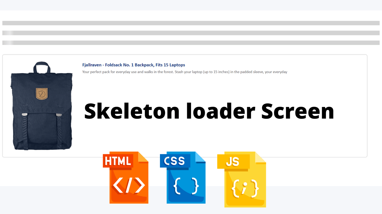
A skeleton loader screen is an animated placeholder that simulates the layout of a website while data is being loaded.
They let the user know that some content is loading and, more importantly, provide an indication of what is loading, whether it’s an image, text, card, and so on.
This gives the user the impression that the website is faster because they already know what type of content is loading before it appears. This is referred to as perceived performance.
In this post, we will dive into the actual implementation of skeleton loader step by step. The first post of the series is focused on providing an overview of skeleton loader, its purpose, usage and points to keep in mind while designing.
HTML Code
<html lang="en">
  <head>
    <meta charset="UTF-8" />
    <meta name="viewport" content="width=device-width, initial-scale=1.0" />
    <link rel="stylesheet" type="text/css" href="loader.css" />
    <link rel="stylesheet" type="text/css" href="tile.css" />
    <script src="script.js"></script>
  </head>
  <body>
    <div>
      <span class="skeleton-loader-background"></span>
    </div>
    <br />
    <div>
      <span class="skeleton-loader-gradient"></span>
    </div>
    <br />
    <div>
      <span class="skeleton-loader"></span>
    </div>
    <div class="prod--wrapper">
      <div class="prod--col prod--img">
        <img id="productImage" class="prod--img-graphic skeleton-loader" />
      </div>
      <div class="prod--col prod--details">
        <div class="prod--row prod--name">
          <span id="productName" class="prod--name-text skeleton-loader"></span>
        </div>
        <div class="prod--row prod--description">
          <span
            id="productId"
            class="prod--description-text skeleton-loader"
          ></span>
        </div>
      </div>
    </div>
  </body>
</html>
We have to keep the background for the placeholders where content has not been loaded yet. These visual placeholders should be in light gray or neutral colors.
A. Create a section for loading content.
B. Create<span> inside that section for adding hooks to a text. Assigned a class “skeleton-loader-background” for styling background.
C. Specify background with light-gray color.
Motion plays an important role in applications. It can help to make interfaces more expressive and intuitive. For the skeleton loader, we have to animate a gradient from the left most end towards the right.
When thinking of motion, we should aim for an appropriate duration. If it is slow it makes users feel they are waiting more than they actually are. If it is quite fast it gives a bad perception.
We have to keep the right balance of speed, direction, and easing to give performant experience.
You Might Like This:
- Dark Mode Toggle Button
- Build your own Tip Calculator
- Portfolio Website Using Html And Css
- Word Guessing Game in HTML CSS & JavaScript
- Popup Box with Html, CSS and JavaScript
We have a light-gray background and gradient designed. Next, we have to animate gradient from left to right, repeatedly with ease.
HTML Output


CSS Code
//loader.css

.skeleton-loader-background {
  width: 100%;
  height: 15px;
  display: block;
  background: lightgray;
}

.skeleton-loader-gradient {
  width: 100%;
  height: 15px;
  display: block;
  background: linear-gradient(
      to right,
      rgba(255, 255, 255, 0),
      rgba(255, 255, 255, 0.5) 50%,
      rgba(255, 255, 255, 0) 80%
    ),
    lightgray;
  background-repeat: repeat-y;
  background-size: 50px 200px;
  background-position: 0 0;
}

.skeleton-loader:empty {
  width: 100%;
  height: 15px;
  display: block;
  background: linear-gradient(
      to right,
      rgba(255, 255, 255, 0),
      rgba(255, 255, 255, 0.5) 50%,
      rgba(255, 255, 255, 0) 80%
    ),
    lightgray;
  background-repeat: repeat-y;
  background-size: 50px 500px;
  background-position: 0 0;
  animation: shine 1s infinite;
}

@keyframes shine {
  to {
    background-position: 100% 0;
  }
}
//tile.css

body {
  margin-top: 35px;
}

.prod--wrapper {
  display: flex;
  width: 95%;
  margin: 32px 0;
  border: 1px solid #b6b6b6;
  border-radius: 6px;
  padding: 22px 10px;
  font-family: "Calibri", "Arial";
}

.prod--wrapper .prod--row {
  display: flex;
  flex-direction: row;
}

.prod--wrapper .prod--col {
  display: flex;
  flex-direction: column;
}

.prod--wrapper .prod--img {
  width: 20%;
  margin: 0 15px;
}

.prod--wrapper .prod--img .prod--img-graphic {
  max-height: 100%;
  height: 100%;
  vertical-align: top;
  max-width: 100%;
}

.prod--wrapper .prod--details {
  width: 90%;
  margin-left: 17px;
}

.prod--wrapper .prod--details .prod--name {
  margin-bottom: 3px;
  width: 85%;
  display: block;
  max-width: 100%;
}

.prod--wrapper .prod--details .prod--name .prod--name-para {
  margin: 0 auto;
}

.prod--wrapper .prod--details .prod--name .prod--name-text {
  font-weight: bold;
  font-size: 16px;
  line-height: 23px;
  color: #002877;
  height: 40px;
}

.prod--wrapper .prod--details .prod--description {
  margin-bottom: 13px;
}

.prod--wrapper .prod--details .prod--description .prod--description-text {
  font-size: 13px;
  line-height: 18px;
  color: #666666;
}
A. Create a section, span for adding hooks and assign a class “skeleton-loader” for styling gradient.
B. Specify gradient and light-gray background for loader.
C. Specify animation name, duration and iteration count.
D. Using keyframes rule, specify how the animation will gradually change from the current style to the new style at certain times. Here, it will change background-position from left to right (0 to 100%).
The :empty selector matches every element that has no child elements or text nodes. Here, it will display the skeleton loader only when content has not been loaded.
Here, we have designed product tile containing image, product name and product description. We are fetching content through live API using JavaScript.
A. DOMContentLoaded will get fired on load of HTML DOM. We will perform JavaScript operations on receipt of this event.
ADVERTISEMENT
B. Access elements through HTML DOM API.
ADVERTISEMENT
C. Fetch data from live API. Here, we are using dummy API for fetching product details (https://fakestoreapi.com/products/1).
ADVERTISEMENT
D. Populate HTML elements with appropriate content.
ADVERTISEMENT
While working with animations, it looks demanding at first sight. However, implementing them shouldn’t be that tough compared to the experience it provides.
ADVERTISEMENT
JavaScript Code
document.addEventListener("DOMContentLoaded", function() {
  console.log("ready!");

  var eleProductImage = document.getElementById("productImage");
  var eleProductName = document.getElementById("productName");
  var eleProductId = document.getElementById("productId");

  function getProductDetails() {
    var xhr = new XMLHttpRequest();
    xhr.open("GET", "https://fakestoreapi.com/products/1", true);
    xhr.onload = function() {
      var res = JSON.parse(xhr.responseText);
      console.log("res: ", res);
      eleProductImage.src = res.image;
      eleProductName.innerHTML = res.title;
      eleProductId.innerHTML = res.description;
    };
    xhr.send();
  }

  getProductDetails();
});
Final Output


Source code
If you enjoyed reading this Skeleton loader Screen with CSS post and have found it useful for you, then please give a share with your friends, and follow me to get updates on my upcoming posts. You can connect with me on Instagram.
if you have any confusion Regarding Skeleton loader Screen with CSS Comment below or you can contact us by filling out our contact us form from the home section.
written by – Ninja_webTech


