Animated Skill Bar using HTML and CSS
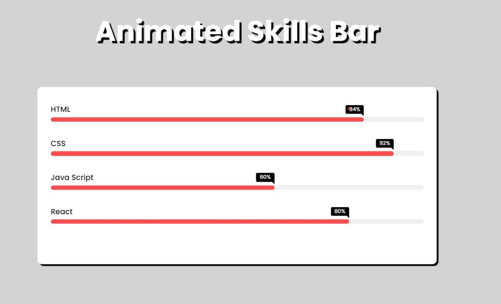
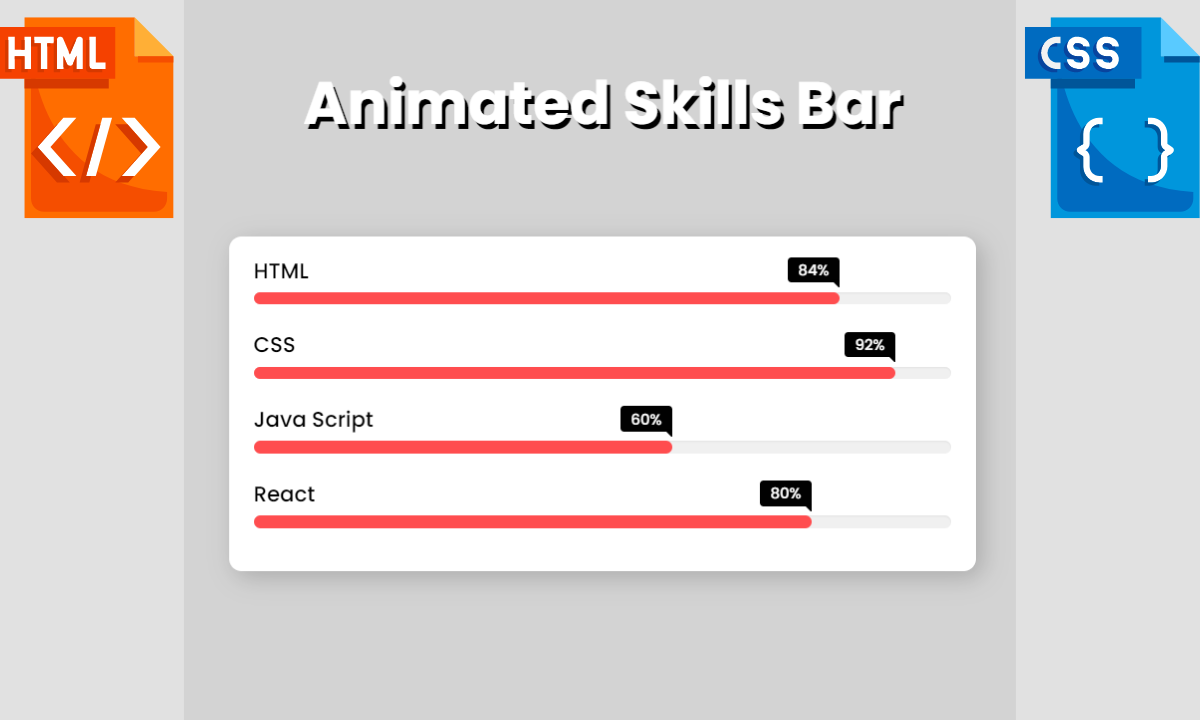
Let’s take a quick look at the image of our upcoming project Animated Skill Bar in HTML and CSS. Six bars can be seen in the image. Every bar has a unique title and skill level. When you refresh or open the page, all the skills will become animated.

An animated skill bar is a graphic representation of a person’s level of proficiency in a given area or subject. Usually, it appears as a horizontal bar that gets colored as the level of proficiency rises. The skill bar becomes more interactive and interesting thanks to the animation, making it a desirable approach to presenting one’s skills to prospective employers or clients.
50+ HTML, CSS & JavaScript Projects With Source Code
The bar’s length can be changed to reflect proficiency levels, and the colour can be changed to coordinate with the style of a website or portfolio. Some animated skill bars also have labels or descriptions that give background information and specifics about the talent that is being highlighted. These animated skill bars are typically added to websites as developer portfolios to showcase their skills to various recruiters.
| Code by | N/A |
| Project Download | Link Available Below |
| Language used | HTML and CSS |
| External link / Dependencies | No |
| Responsive | Yes |
The identical Animated Skill Bar will be produced in this article using simple HTML and CSS. You will learn how to create a talent area for your personal portfolio website with the help of this project, which is appropriate for beginners.
I hope you must have got an idea about the project.
So, Let’s Begin Star Rating Project By Adding The Source Codes. first We Are Using The HTML Code.
Build Multi-Step Form with Progress Bar using HTML & jQuery
Step1: Adding HTML code
Add this code in Code your Main file using any code editor.
<!DOCTYPE html>
<html lang="en" dir="ltr">
  <head>
    <meta charset="utf-8" />
    <meta name="viewport" content="width=device-width, initial-scale=1.0" />
    <title>Animated Skills Bar</title>
    <link rel="stylesheet" href="style.css" />
  <body>
    <h1>Animated Skills Bar</h1>
    <div class="skill-bars">
      <div class="bar">
        <div class="info"> <span>HTML</span> </div>
        <div class="progress-line html"> <span></span> </div>
      </div>
      <div class="bar">
        <div class="info"> <span>CSS</span> </div>
        <div class="progress-line css"> <span></span> </div>
      </div>
      <div class="bar">
        <div class="info"> <span>Java Script</span> </div>
        <div class="progress-line JavaScript"> <span></span> </div>
      </div>
      <div class="bar">
        <div class="info"> <span>React</span> </div>
        <div class="progress-line react"> <span></span> </div>
      </div>
    </div>
  </body>
</html>
First, we include the main heading of our website using the H1 tag. Now we make a div container that will hold all of our skills bar.
Using a div tag, we will now create another div that will contain our first skill, along with its name and progress bar.
We will repeat the preceding step three times so that we can add our remaining skills.
Login Signup Form Using HTML and CSS Code
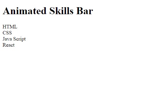
Now let’s take look at our output without adding styling.
ADVERTISEMENT

ADVERTISEMENT
Now that we’ve finished the basic structure of our skill bar in HTML, it’s time to style it and make it look like a responsive skill bar in CSS. So now we’ll add our stylesheet to our webpage.
ADVERTISEMENT
ADVERTISEMENT
Step2: CSS code for SearchBar .
ADVERTISEMENT
Cascading Style Sheets is a style sheet language that is used to describe the presentation of a document written in a markup language like HTML or XML.
Now we will look at our CSS code.
@import url('https://fonts.googleapis.com/css2?family=Poppins:wght@200;300;400;500;600;700&display=swap');
*{
  margin: 0;
  padding: 0;
  box-sizing: border-box;
  font-family: 'Poppins', sans-serif;
}
html,body{
  display: grid; height: 100%;
  place-items: center;
  background-color: lightgray;
}
h1{
  font-size: 4rem;
  text-align: center;
  color: #fff;
  text-shadow: 5px 5px black;
  margin-top: 50px;
}
.skill-bars{
  padding: 30px 30px;
  width: 900px;
  height: 400px;
  background: #fff;
  box-shadow: 5px 5px 20px rgba(0,0,0,0.2);
  border-radius: 10px;
  margin-bottom: 100px;
}
.bar{
  margin: 20px 0;
  padding: 8px 0;
}
.bar:first-child{
  margin-top: 0px;
}
.info{
  margin-bottom: 5px;
}
.info span{
  font-weight: 500;
  font-size: 17px; opacity: 0;
  animation: showText 0.5s 1s linear forwards;
}
@keyframes showText {
  100%{
    opacity: 1;
  }
}
.progress-line{
  height: 10px; width: 100%;
  background: #f0f0f0; position: relative;
  transform: scaleX(0); transform-origin: left;
  border-radius: 10px;
  box-shadow: inset 0 1px 1px rgba(0,0,0,0.05),
              0 1px rgba(255,255,255,0.8);
  animation: animate 1s cubic-bezier(1,0,0.5,1) forwards;
}
.progress-line span{
  height: 100%; position: absolute;
  border-radius: 10px;
  transform: scaleX(0);
  transform-origin: left;
  background: #ff4d4f;
  animation: animate 1s 1s cubic-bezier(1,0,0.5,1) forwards;
}
.progress-line span::before{
  position: absolute; content: "";
  top: -10px; right: 0;
  height: 0; width: 0; opacity: 0;
  border: 7px solid transparent;
  border-bottom-width: 0px;
  border-right-width: 0px;
  border-top-color: #000;
  animation: showText2 0.5s 1.5s linear forwards;
}
.progress-line span::after{
  position: absolute; top: -28px;
  right: 0; font-weight: 500;
  background: #000;
  color: #fff; opacity: 0;
  padding: 1px 8px;
  font-size: 12px;
  border-radius: 3px;
  animation: showText2 0.5s 1.5s linear forwards;
}
@keyframes animate {
  100%{
    transform: scaleX(1);
  }
}
.html span{
  width: 84%;
}
.css span{
  width: 92%;
}
.JavaScript span{
  width: 60%;
}
.react span{
  width: 80%;
}
@keyframes showText2 {
  100%{
    opacity: 1;
  }
}
.html span::after{
  content: "84%";
}
.css span::after{
  content: "92%";
}
.JavaScript span::after{
  content: "60%";
}
.react span::after{
  content: "80%";
}

/* Media Query */
/* For tablet */
@media screen and (max-width:900px){
  h1{
    font-size: 2rem;
    text-align: center;
    color: #fff;
    text-shadow: 3px 4px black;
  }
  .skill-bars{
  padding: 15px 20px;
  width: 600px;
  background: #fff;
  box-shadow: 5px 5px 20px rgba(0,0,0,0.2);
  border-radius: 10px;

  }

}
/* For mobile */
@media screen and (max-width :600px) {
  h1{
    font-size: 1rem;
    text-align: center;
    color: #fff;
    text-shadow: 3px 4px black;
  }
  .skill-bars{
    padding: 10px 10px;
    width: 400px;
    background: #fff;
    box-shadow: 5px 5px 20px rgba(0,0,0,0.2);
    border-radius: 8px;

  }

}
Create Moving Car Animation Using HTML & CSS
Now that we’ve included our CSS code in our article, let’s go over it step by step.
Step 1:.
@import url('https://fonts.googleapis.com/css2?family=Poppins:wght@200;300;400;500;600;700&display=swap');
*{
  margin: 0;
  padding: 0;
  box-sizing: border-box;
  font-family: 'Poppins', sans-serif;
}
html,body{
  display: grid;
  height: 100%;
  place-items: center;
  background-color: lightgray;
}
Step2: Now we’ll style the main heading of our website. We set the font size to 4 rem, centred the text, and made it white. We also added a text-shadow to our text, and the top margin is set to 50px.
h1{
  font-size: 4rem;
  text-align: center;
  color: #fff;
  text-shadow: 5px 5px black;
  margin-top: 50px;
}
Step3:We’ll now style the main container, which will house all of our skills. We set its padding to 30px. The box-shadow property was also added to our main container. The border radius is set to 10px.
.skill-bars{
  padding: 30px 30px;
  width: 900px;
  height: 400px;
  background: #fff;
  box-shadow: 5px 5px 20px rgba(0,0,0,0.2);
  border-radius: 10px;
  margin-bottom: 100px;

}Step4:Now, we’ll style all of our skill containers with the (.bar) class, setting the margin and padding to 20 px and 8 px, respectively. We will now style the label of our skills with (.info). The margin-bottom of our skills heading is defined as 5px. The font weight is (500) and the font size is 17 px. The opacity is set to 0. We also included an animation, which is a linear forward animation with a delay of 0.5 second.
Portfolio Website Using HTML CSS And JAVASCRIPT ( Source Code)
.bar{
  margin: 20px 0;
  padding: 8px 0;
}
.bar:first-child{
  margin-top: 0px;
}
.info{
  margin-bottom: 5px;
}
.info span{
  font-weight: 500;
  font-size: 17px; opacity: 0;
  animation: showText 0.5s 1s linear forwards;
}
@keyframes showText {
  100%{
    opacity: 1;
  }
}Step5:We’ve only styled our heading and main div tag container so far. Now we’ll use CSS to style our progress bar. Making use of the (.progress-line) property The width of the progress bar is set to 100%, and its height is set to 10. We also specified white as the background colour. The position is referred to as “relative.” We’ve also included a 10px border radius. The “cubic beizer” animation has been added to our progress bar. Now, using the span with their name, we will add the width based on our knowledge of a specific skill set.
progress-line{
  height: 10px; width: 100%;
  background: #f0f0f0; position: relative;
  transform: scaleX(0); transform-origin: left;
  border-radius: 10px;
  box-shadow: inset 0 1px 1px rgba(0,0,0,0.05),
              0 1px rgba(255,255,255,0.8);
  animation: animate 1s cubic-bezier(1,0,0.5,1) forwards;
}
.progress-line span{
  height: 100%; position: absolute;
  border-radius: 10px;
  transform: scaleX(0);
  transform-origin: left;
  background: #ff4d4f;
  animation: animate 1s 1s cubic-bezier(1,0,0.5,1) forwards;
}
.progress-line span::before{
  position: absolute; content: "";
  top: -10px; right: 0;
  height: 0; width: 0; opacity: 0;
  border: 7px solid transparent;
  border-bottom-width: 0px;
  border-right-width: 0px;
  border-top-color: #000;
  animation: showText2 0.5s 1.5s linear forwards;
}
.progress-line span::after{
  position: absolute; top: -28px;
  right: 0; font-weight: 500;
  background: #000;
  color: #fff; opacity: 0;
  padding: 1px 8px;
  font-size: 12px;
  border-radius: 3px;
  animation: showText2 0.5s 1.5s linear forwards;
}
@keyframes animate {
  100%{
    transform: scaleX(1);
  }
}
.html span{
  width: 84%;
}
.css span{
  width: 92%;
}
.JavaScript span{
  width: 60%;
}
.react span{
  width: 80%;
}
@keyframes showText2 {
  100%{
    opacity: 1;
  }
}
.html span::after{
  content: "84%";
}
.css span::after{
  content: "92%";
}
.JavaScript span::after{
  content: "60%";
}
.react span::after{
  content: "80%";
}
Step6: Now it’s time to make our webpage responsive . using the media query we have defined the maximum defined as (max-width:900px) if the screen size is less than or equal to the defined width then the font size of haeding and width changes according to the defined width.
Responsive Resume/CV Website Using HTML & CSS
/* Media Query */
/* For tablet */
@media screen and (max-width:900px){
  h1{
    font-size: 2rem;
    text-align: center;
    color: #fff;
    text-shadow: 3px 4px black;
  }
  .skill-bars{
  padding: 15px 20px;
  width: 600px;
  background: #fff;
  box-shadow: 5px 5px 20px rgba(0,0,0,0.2);
  border-radius: 10px;

  }

}
/* For mobile */
@media screen and (max-width :600px) {
  h1{
    font-size: 1rem;
    text-align: center;
    color: #fff;
    text-shadow: 3px 4px black;
  }
  .skill-bars{
    padding: 10px 10px;
    width: 400px;
    background: #fff;
    box-shadow: 5px 5px 20px rgba(0,0,0,0.2);
    border-radius: 8px;

  }

}
Now we have completed our css code and below👇here is the output after styling our webpage.
Output:

Now as we completed our project now will look at how it is working.
Preview:
Conclusion
Now We have Successfully created our Animated Skill Project. You can use this project for your personal webpage and We hope you understood the project , If you any doub’t feel free to comment!!
Ecommerce Website Using Html Css And Javascript Source Code
If you find out this Blog helpful, then make sure to search code with random on google for Front End Projects with Source codes and make sure to Follow the Code with Random Instagram page.
Which code editor do you use for this Animated Skill Bar coding?
I personally recommend using VS Code Studio, it’s straightforward and easy to use.
What are the benefits of using an animated skill bar?
A rapid and aesthetically appealing summary of a person’s skills is provided by an animated skill bar. Additionally, it gives the skill bar an interactive and interesting component that makes it a desirable approach to present one’s skills to potential employers or clients.
What is an animated skill bar?
An animated skill bar is a graphic representation of a person’s level of proficiency in a given area or subject. As the degree of proficiency rises, it is often shown as a horizontal bar that fills up with colour and is animated.


