Learners, In this article we are going to design a very interactive and impressive project which is a CSS Card Skeleton Loader with detailed functionality.
Learners, for any design, what we did as the first step we use a notebook and pen just randomly draw a rough sketch for our project then after taking references from there we code it accordingly in our respective code editor.
Skeleton Loading Animation Using HTML & CSS Code
Doing this creative step what we called it as we have designed the skeleton for our project isn’t it so today we will not design any project, we will build a skeleton for card yeah but not the paper we will have it on our mostly lovable editor called vs code .
Hey learners!
Welcome to our today’s blog with code with random. In this blog, we gonna learn how we can design a CSS Card Skeleton Loader Using HTML CSS JAVASCRIPT.
I hope you must have got an idea about the project.
Let’s have a look at our project.

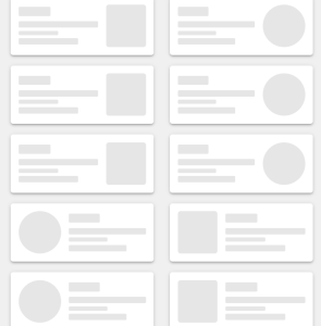
As you are looking in the project preview how the thing is organized in the single container.
Following is the feature of our project:-
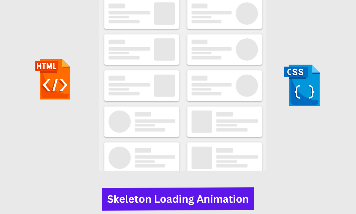
Like we have 6 cards in the two-column within each card we have a square and circular box that will be used for the logo if we use this template and then we have a few lines as a description.
And most important we have a shimmer effect which means it starting it will seem that it is loading after loading content will preview but things are not the same as it is just skeleton with no content. It is also responsive as well.
HTML SECTION For Skeleton Loading Animation
Here I’m not going to add a structure of the HTML file from scratch, I will just paste the body part, it is so because the body is the main part of our designing a browser.
We have the following part in the HTML section.
First, we have a container that will enclose all other parts of the other project.
Portfolio Website Using HTML CSS And JAVASCRIPT ( Source Code)
Then proceeding to the container we have a box and Skelton where our real structure will reside.
Go through the below code and run it in your IDE or where you used to design just HTML without CSS styling.
 <div class="container">
<div class="box">
<div class="skeleton">
<div class="skeleton-left">
<div class="line h17 w40 m10"></div>
<div class="line"></div>
<div class="line h8 w50"></div>
<div class="line w75"></div>
</div>
<div class="skeleton-right">
<div class="square"></div>
</div>
</div>
<div class="skeleton">
<div class="skeleton-left">
<div class="line h17 w40 m10"></div>
<div class="line"></div>
<div class="line h8 w50"></div>
<div class="line w75"></div>
</div>
<div class="skeleton-right">
<div class="square"></div>
</div>
</div>
<div class="skeleton">
<div class="skeleton-left">
<div class="line h17 w40 m10"></div>
<div class="line"></div>
<div class="line h8 w50"></div>
<div class="line w75"></div>
</div>
<div class="skeleton-right">
<div class="square"></div>
</div>
</div>
</div>
<div class="box">
<div class="skeleton">
<div class="skeleton-left">
<div class="line h17 w40 m10"></div>
<div class="line"></div>
<div class="line h8 w50"></div>
<div class="line w75"></div>
</div>
<div class="skeleton-right">
<div class="square circle"></div>
</div>
</div>
<div class="skeleton">
<div class="skeleton-left">
<div class="line h17 w40 m10"></div>
<div class="line"></div>
<div class="line h8 w50"></div>
<div class="line w75"></div>
</div>
<div class="skeleton-right">
<div class="square circle"></div>
</div>
</div>
<div class="skeleton">
<div class="skeleton-left">
<div class="line h17 w40 m10"></div>
<div class="line"></div>
<div class="line h8 w50"></div>
<div class="line w75"></div>
</div>
<div class="skeleton-right">
<div class="square circle"></div>
</div>
</div>
</div>
<div class="box">
<div class="skeleton">
<div class="skeleton-left flex1">
<div class="square circle"></div>
</div>
<div class="skeleton-right flex2">
<div class="line h17 w40 m10"></div>
<div class="line"></div>
<div class="line h8 w50"></div>
<div class="line w75"></div>
</div>
</div>
<div class="skeleton">
<div class="skeleton-left flex1">
<div class="square circle"></div>
</div>
<div class="skeleton-right flex2">
<div class="line h17 w40 m10"></div>
<div class="line"></div>
<div class="line h8 w50"></div>
<div class="line w75"></div>
</div>
</div>
<div class="skeleton">
<div class="skeleton-left flex1">
<div class="square circle"></div>
</div>
<div class="skeleton-right flex2">
<div class="line h17 w40 m10"></div>
<div class="line"></div>
<div class="line h8 w50"></div>
<div class="line w75"></div>
</div>
</div>
</div>
<div class="box">
<div class="skeleton">
<div class="skeleton-left flex1">
<div class="square"></div>
</div>
<div class="skeleton-right flex2">
<div class="line h17 w40 m10"></div>
<div class="line"></div>
<div class="line h8 w50"></div>
<div class="line w75"></div>
</div>
</div>
<div class="skeleton">
<div class="skeleton-left flex1">
<div class="square"></div>
</div>
<div class="skeleton-right flex2">
<div class="line h17 w40 m10"></div>
<div class="line"></div>
<div class="line h8 w50"></div>
<div class="line w75"></div>
</div>
</div>
<div class="skeleton">
<div class="skeleton-left flex1">
<div class="square"></div>
</div>
<div class="skeleton-right flex2">
<div class="line h17 w40 m10"></div>
<div class="line"></div>
<div class="line h8 w50"></div>
<div class="line w75"></div>
</div>
</div>
</div>
</div>
CSS SECTION For Skeleton Loading Animation
By CSS we will design our container and will bring in the center and then we will design each and every content of HTML so that it seems like a skeleton in the webpage.
The Below code will analyze you more. So just add in your HTML half complete file and wait to watch some magic.
*{
box-sizing: border-box;
}
body {
margin: 0;
background: #f0f0f0;
}
.container {
height: 100vh;
display: flex;
flex-flow: wrap row;
justify-content: center;
align-items: center;
}
.box{
max-width: 300px;
width: 100%;
padding: 0 15px;
}
.skeleton {
padding:15px;
max-width: 300px;
width: 100%;
background: #fff;
margin-bottom: 20px;
border-radius: 5px;
display: flex;
justify-content: center;
align-items: center;
box-shadow: 0 3px 4px 0 rgba(0, 0, 0, .14), 0 3px 3px -2px rgba(0, 0, 0, .2), 0 1px 8px 0 rgba(0, 0, 0, .12);
}
.skeleton .square {
height: 80px;
border-radius: 5px;
background: rgba(130, 130, 130, 0.2);
background: -webkit-gradient(linear, left top, right top, color-stop(8%, rgba(130, 130, 130, 0.2)), color-stop(18%, rgba(130, 130, 130, 0.3)), color-stop(33%, rgba(130, 130, 130, 0.2)));
background: linear-gradient(to right, rgba(130, 130, 130, 0.2) 8%, rgba(130, 130, 130, 0.3) 18%, rgba(130, 130, 130, 0.2) 33%);
background-size: 800px 100px;
animation: wave-squares 2s infinite ease-out;
}
.skeleton .line {
height: 12px;
margin-bottom:6px;
border-radius: 2px;
background: rgba(130, 130, 130, 0.2);
background: -webkit-gradient(linear, left top, right top, color-stop(8%, rgba(130, 130, 130, 0.2)), color-stop(18%, rgba(130, 130, 130, 0.3)), color-stop(33%, rgba(130, 130, 130, 0.2)));
background: linear-gradient(to right, rgba(130, 130, 130, 0.2) 8%, rgba(130, 130, 130, 0.3) 18%, rgba(130, 130, 130, 0.2) 33%);
background-size: 800px 100px;
animation: wave-lines 2s infinite ease-out;
}
.skeleton-right{
flex:1;
}
.skeleton-left{
flex:2;
padding-right:15px;
}
.flex1{
flex: 1;
}
.flex2{
flex: 2;
}
.skeleton .line:last-child{
margin-bottom: 0;
}
.h8{
height: 8px !important;
}
.h10{
height: 10px !important;
}
.h12{
height: 12px !important;
}
.h15{
height: 15px !important;
}
.h17{
height: 17px !important;
}
.h20{
height: 20px !important;
}
.h25{
height: 25px !important;
}
.w25{
width: 25% !important
}
.w40{
width:40% !important;
}
.w50{
width: 50% !important
}
.w75{
width: 75% !important
}
.m10{
margin-bottom: 10px !important;
}
.circle{
border-radius: 50% !important;
height: 80px !important;
width: 80px;
}
@keyframes wave-lines {
0% {
background-position: -468px 0;
}
100% {
background-position: 468px 0;
}
}
@keyframes wave-squares {
0% {
background-position: -468px 0;
}
100% {
background-position: 468px 0;
}
}
A live preview of our project is attached below refer to this codepen
By this blog… We have learned how we can design a CSS Card Skeleton Loader Project HTML CSS JAVASCRIPT.
Now I’m looking for your reviews.
So, How was the blog , Learners!
If you want a more crisp blog like this then please check our Blogs sites CodewithRandom. keep tuned with us because every day you will learn something new here.
5+ HTML CSS project With Source Code
I hope that I’m able to make you understand this topic and that you have learned something new from this blog. If you faced any difficulty feel free to drop a comment down your problems and if you liked it, please show your love in the comment section. This fills bloggers’ hearts with enthusiasm for writing more new blogs.
You can follow me on Instagram
Written by @Ankit kumar
ADVERTISEMENT
Code by @munjewar
ADVERTISEMENT


