Responsive Navbar With Search Bar Box Using HTML and CSS
Hello Coders! Today on this blog, you’ll learn how to create a fully Responsive Navbar with a Search Box using HTML and CSS Code.
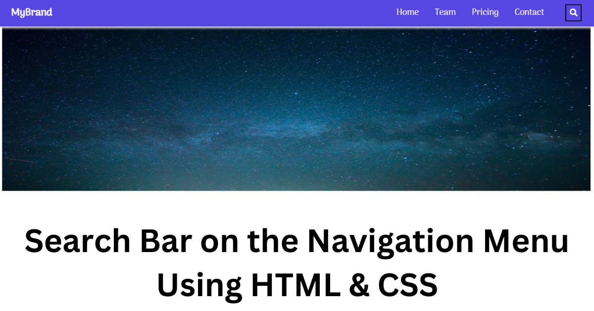
A webpage’s navigation bar is a user interface component that has links to other webpage areas. Most frequently, a website’s navigation bar appears as a horizontal list of links at the top of each page. Similar to adding a new option to the navbar that will perform a database search, adding a search bar is simple. The placement of the search bar must be done with care. Make sure it is displayed in the navbar separately. You’ll need HTML and CSS to make a navbar with a search bar. You may create a search bar by following the step-by-step instructions below.
50+ HTML, CSS & JavaScript Projects With Source Code
Two sections make up this article. In the first section, we’ll design a simple structure and attach the icon’s CDN link. The design of the navbar and the search bar will be done in the second section.
hope you have a general idea of what the project entails. In our article, we will go over this project step by step.
Step1: Adding some basic HTML Code
HTML stands for HyperText Markup Language. This is a markup language. Its main job is to give our project structure. We will provide our project structure by utilising this markup language. So let’s look at our HTML code.
<html>

<head>
    <link href="https://fonts.googleapis.com/css?family=Arima+Madurai" rel="stylesheet">
    <link rel="stylesheet" href="https://use.fontawesome.com/releases/v5.0.13/css/all.css"
        integrity="sha384-DNOHZ68U8hZfKXOrtjWvjxusGo9WQnrNx2sqG0tfsghAvtVlRW3tvkXWZh58N9jp" crossorigin="anonymous">
    <link rel="stylesheet" href="style.css">
    <title>Navigation Bar with search box</title>
</head>

<body>
    <nav>
        <div class="brand">
            <h3>MyBrand</h3>
        </div>
        <div class="navigation">
            <ul class="menu">
                <li><a href="#">Home</a></li>
                <li><a href="#">Team</a></li>
                <li><a href="#">Pricing</a></li>
                <li><a href="#">Contact</a></li>
            </ul>
            <div class="search">
                <div class="search-content">
                    <button class="search-button"><i class="fa fa-search"></i></button>
                    <input type="text" class="search-input" placeholder="Search here...">
                </div>
            </div>
        </div>
    </nav>
    <div class="banner">
        <img src="https://i.imgur.com/XNwuthr.jpg" alt="banner_image">
    </div>
</body>

</html>
Before beginning to add structure to our navbar with a search box, We need to update some links. Because we used two separate files for our HTML and CSS in this project, we need to connect them all.To do this, please include the links to our CSS . We have also used the icons from Font-awesome, so you need to use the CDN link for our Fontawesome.
Simple Portfolio Website Using Html And Css With Source Code
<link href="https://fonts.googleapis.com/css?family=Arima+Madurai" rel="stylesheet">
 <link rel="stylesheet" href="https://use.fontawesome.com/releases/v5.0.13/css/all.css"
     integrity="sha384-DNOHZ68U8hZfKXOrtjWvjxusGo9WQnrNx2sqG0tfsghAvtVlRW3tvkXWZh58N9jp" crossorigin="anonymous">
 <link rel="stylesheet" href="style.css">
Now let’s Add the structure for our Navbar with searchbox.
- We will build a container for our navbar using the <nav>. We’ll use the <h3> tag to include our navbar’s logo within the nav tag.
- We will create a div tag which will be the container for our navigation menu . Inside the div tag, we will be using the unordered list tag to create different menu items.
- The only additions we have made to our navbar so far are a few menu items and a logo. However, a search box makes it easier to access information on any website using keywords. Making use of their classes, we are building a button inside of which we will place the fontawesome search icon.
- We will now search using text input as our input type.
- To make our project look more appealing, we will use the image element to add an image to our body.
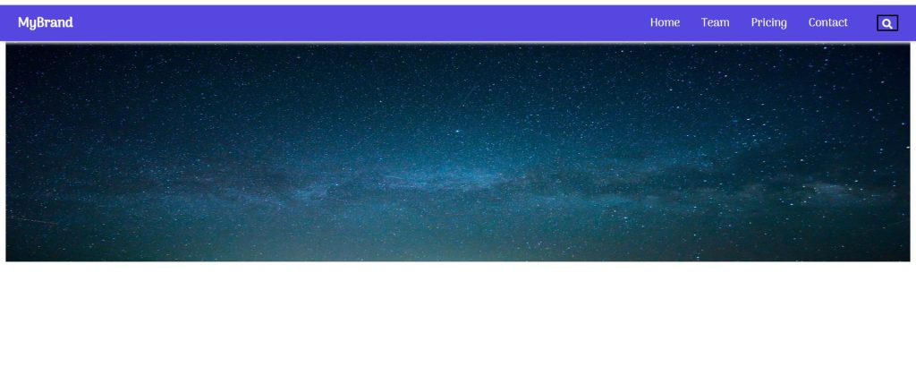
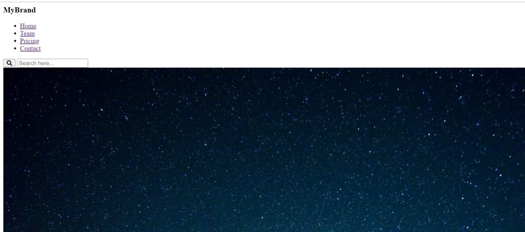
We have now added the basic structure of our webpage. Now we will be using our stylesheet to add styles to our SearchBox with navigation bar, but first let’s take a look at our output.
Temperature Converter Website using HTML, CSS, and JavaScript
Output:
Step2: Adding CSS Code
We will now mostly style our structure using the classes we defined inside our html element.But in this project .
* {
  font-family: "Arima Madurai", sans-serif;
}

nav {
  position: fixed;
  top: 0;
  left: 0;
  right: 0;
  height: 50px;
  display: inline-flex;
  background: #5747e1;
  color: white;
  box-shadow: 1px 3px 4px #e6e6e6;
  align-items: center;
}

.navigation {
  display: inline-flex;
  align-items: center;
  margin: 0 25px;
}

.brand {
  flex: 1;
  margin: 0 25px;
}

.menu {
  display: flex;
  list-style: none;
  margin-right: 25px;
}

.menu li a {
  color: inherit;
  text-decoration: none;
  margin: 0 15px;
}

.menu li a:hover {
  text-decoration: underline;
}

.search {
  position: relative;
  padding-bottom: 15px;
  bottom: -7px;
}

.search-input::placeholder {
  color: white;
  opacity: 0.8;
}

.search-input {
  height: 0px;
  border: none;
  position: absolute;
  left: -200px;
  visibility: hidden;
  opacity: 0;
  top: 40px;
  background: #5747e1;
  color: white;
  padding: 6px;
  font-size: 12px;
  outline: none;
  width: 220px;
  transition: 80ms all ease-in;
  border-bottom-left-radius: 5px;
  border-bottom-right-radius: 5px;
  box-shadow: none;
}

.search-button {
  background: transparent;
  color: white;
  cursor: pointer;
  font-size: 14px;
  padding-top: 4px;
}

.search-button:hover + .search-input,
.search-input:hover,
.search:hover .search-input {
  visibility: visible !important;
  opacity: 1 !important;
  z-index: 9 !important;
  box-shadow: 1px 3px 4px #e6e6e6;
  height: 25px !important;
}
.banner img {
  width: 100%;
  height: 350px;
}
@media screen and (max-width: 1000px) {
  nav {
    width: 100%;
    font-size: 10px;
    display: block;
    height: 200px;
  }
  .brand {
    display: block;
    width: 100%;
    text-align: center;
    margin: 0;
    font-size: 1rem;
  }
  .navigation {
    display: block;
    margin: 0%;
  }
  .menu {
    display: block;
    width: 100%;
    text-align: center;
    margin: 0;
    margin-left: -36px;
    margin-top: -10px;
    font-size: 1rem;
  }
  menu ul li {
    display: block;
    width: 100%;
    margin: 0;
  }
  .search {
    display: block;
    width: 100%;
    text-align: center;
    font-size: 1rem;
  }
  .search-content {
    display: block;
    width: 100%;
    text-align: center;
    font-size: 1rem;
  }

  .search-button {
    display: block;
    width: 7%;
    text-align: center;
    margin-left: 240px;
    font-size: 1rem;
  }
  .search-input {
    display: block;
    width: 30%;
    text-align: center;
    margin-left: 310px;
    font-size: 1rem;
  }
}
After we’ve added the CSS code, we’ll go over it step by step. To save time, you can simply copy this code and paste it into your IDE. Let us now examine our code step by step.
Login Signup Form Using HTML and CSS Code
Step1: Using the universal selector we will add a font-family of “Arima -Madurai” . Now using the tag selector (nav) . The position is set to “fixed” now if the user scroll the webpage the navbar position remain fixed . Using the top,left,right,bottom property we will made a 0 space from all the sides. The height is set as 50px of our navbar . Display is set to flex and the font color is set to “white” and we also added offwhite box shadow.
* {
  font-family: "Arima Madurai", sans-serif;
}

nav {
  position: fixed;
  top: 0;
  left: 0;
  right: 0;
  height: 50px;
  display: inline-flex;
  background: #5747e1;
  color: white;
  box-shadow: 1px 3px 4px #e6e6e6;
  align-items: center;
}
Step2: We will now style each item in the navigation menu separately. We have set the flex count of our logo to “1” using the class selector (.brand). Left and right margins are set to “25px,” but the top and bottom margins are set to “0.” We will set its display and margin using the menu class in a similar manner.
Create 404 Error Page Animated Using HTML & CSS
It’s time for the menu items now. The list item’s colour will be inherited from the parent tag if the colour inherit property is used.
.brand {
  flex: 1;
  margin: 0 25px;
}

.menu {
  display: flex;
  list-style: none;
  margin-right: 25px;
}

.menu li a {
  color: inherit;
  text-decoration: none;
  margin: 0 15px;
}

.menu li a:hover {
  text-decoration: underline;
}

The navbar is beginning to look excellent, as you can see. Our search box still needs some style and motion effects, though. Let’s examine the design options for our search box.
Gym Website Using HTML and CSS With Source Code
ADVERTISEMENT
Step3: Now that the class selector (.search) is in a relative position, the padding-bottom attribute has a bottom value of 15 pixels. The input box’s placeholder text contains white text instead of its previous colour.
ADVERTISEMENT
The input search box will appear as soon as the user hovers over the search icon utilising the CSS ideas we added a visibility of hidden and the hover selector property.
ADVERTISEMENT
.search {
  position: relative;
  padding-bottom: 15px;
  bottom: -7px;
}

.search-input::placeholder {
  color: white;
  opacity: 0.8;
}

.search-input {
  height: 0px;
  border: none;
  position: absolute;
  left: -200px;
  visibility: hidden;
  opacity: 0;
  top: 40px;
  background: #5747e1;
  color: white;
  padding: 6px;
  font-size: 12px;
  outline: none;
  width: 220px;
  transition: 80ms all ease-in;
  border-bottom-left-radius: 5px;
  border-bottom-right-radius: 5px;
  box-shadow: none;
}

.search-button {
  background: transparent;
  color: white;
  cursor: pointer;
  font-size: 14px;
  padding-top: 4px;
}

.search-button:hover + .search-input,
.search-input:hover,
.search:hover .search-input {
  visibility: visible !important;
  opacity: 1 !important;
  z-index: 9 !important;
  box-shadow: 1px 3px 4px #e6e6e6;
  height: 25px !important;
}
.banner img {
  width: 100%;
  height: 350px;
}
Step4: Now the most important task is to add responsiveness, for which we will be using the most common concept of CSS. We’ll make advantage of mediaquery. The maximum width will be set if the window’s screen size is less than or equal to the size specified. The width and height of the navbar will be adjusted according to the window size.
ADVERTISEMENT
@media screen and (max-width: 1000px) {
  nav {
    width: 100%;
    font-size: 10px;
    display: block;
    height: 200px;
  }
  .brand {
    display: block;
    width: 100%;
    text-align: center;
    margin: 0;
    font-size: 1rem;
  }
  .navigation {
    display: block;
    margin: 0%;
  }
  .menu {
    display: block;
    width: 100%;
    text-align: center;
    margin: 0;
    margin-left: -36px;
    margin-top: -10px;
    font-size: 1rem;
  }
  menu ul li {
    display: block;
    width: 100%;
    margin: 0;
  }
  .search {
    display: block;
    width: 100%;
    text-align: center;
    font-size: 1rem;
  }
  .search-content {
    display: block;
    width: 100%;
    text-align: center;
    font-size: 1rem;
  }

  .search-button {
    display: block;
    width: 7%;
    text-align: center;
    margin-left: 240px;
    font-size: 1rem;
  }
  .search-input {
    display: block;
    width: 30%;
    text-align: center;
    margin-left: 310px;
    font-size: 1rem;
  }
}

Now let’s take a look at our video preview of our project. You can get the free source code in the article further.
ADVERTISEMENT
Output:
Now We have Successfully created our Search Bar with navigation bar using HTML & CSS. You can use this project directly by copying into your IDE. WE hope you understood the project , If you any doubt feel free to comment!!
100+ JavaScript Projects With Source Code ( Beginners to Advanced)
Codepen Preview For Responsive NavBar Search Bar:
100+ JavaScript Projects With Source Code ( Beginners to Advanced)
If you find out this Blog helpful, then make sure to search code with random on google for Front End Projects with Source codes and make sure to Follow the Code with Random Instagram page.
What is a Navbar?
A website’s navigation header is represented graphically by a navigation bar, also referred to as a navbar. Typically, it includes links to the homepage, about page, contact page, and other key pages of a website. The navbar is typically a fixed element that is always visible regardless of how far down or up the user scrolls on a webpage
What is the use of Navbar?
The main purpose of the navbar is to move across the different sections of the website.
Which tag is used for the navigation bar?
The <nav> tag defines a set of navigation links.
