Responsive Navbar Design using HTML and CSS Only
Learners, You often have a header with a logo and some left-aligned text such as Home, Feature, etc. This is our navbar. This is one of the main ingredients of every website. If you don’t know How we can design, join me on this blog and make sure your finger is free to scroll down.
Hey learners..!
Welcome to our today’s blog with Codewithrandom. In this blog, we are going to learn how we can design a Responsive Navbar using HTML and Pure CSS. We do not use any JavaScript code to Make this Responsive Navbar.
I hope you must have got an idea about the project.
50+ HTML, CSS & JavaScript Projects With Source Code
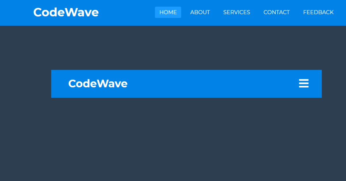
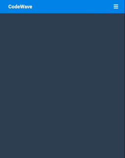
Let’s have a look at our project.
HTML Code Section
Here I’m not going to add a structure to the HTML file from scratch, I will just paste the body part, it is so because the body is the main part of our designing a browser.
We have the following part in the HTML section.
- First, we have a button toggle btn and with right-side logo text and some list items in un order list.
- Go through the below code and run it in your IDE or where you used to design just HTML without CSS styling.
<nav>
<input type="checkbox" id="check">
<label for="check" class="checkbtn">
<i class="fas fa-bars"></i>
</label>
<label for="" class="logo">CodeWave</label>
<ul>
<li><a href="#" class="active">Home</a></li>
<li><a href="#">About</a></li>
<li><a href="#">Services</a></li>
<li><a href="#">Contact</a></li>
<li><a href="#">Feedback</a></li>
</ul>
</nav>
<section>
</section>
CSS Code Section
- By CSS we will design our logo text and list item as it will get set on the left.
- with help of a media query, we will also set it for device adjustable.
Portfolio Website using HTML and CSS (Source Code)
The Below code will analyze you more. So just add in your HTML half-complete file and wait to watch some magic.
@import url("https://cdnjs.cloudflare.com/ajax/libs/font-awesome/5.15.3/css/all.min.css");
* {
margin:0;
padding:0;
box-sizing: border-box;
text-decoration:none;
list-style:none;
}
body {
font-family:montserrat;
}
nav {
height:80px;
background: #0082e6;
width:100%;
}
label.logo {
color:white;
line-height:80px;
font-size: 35px;
padding:0 100px;
font-weight:bold;
}
nav ul {
float: right;
margin-right:20px;
}
nav ul li {
line-height:80px;
display:inline-block;
margin:0 5px;
}
nav ul li a {
text-transform:uppercase;
font-size: 16px;
color: white;
padding:7px 13px;
border-radius:3px;
}
a.active,a:hover {
background: #1b9bff;
transition:0.5s;
}
.checkbtn {
font-size:30px;
color:white;
float:right;
line-height:80px;
margin-right:40px;
cursor:pointer;
display:none;
}
#check {
display:none;
}
@media (max-width:952px) {
label.logo {
font-size:30px;
padding-left:50px;
}
nav ul li a {
font-size:16px;
}
}
@media (max-width:858px) {
.checkbtn {
display:block;
}
ul {
position: fixed;
height:100vh;
width:100%;
background: #2c3e50;
top:80px;
left:-100%;
text-align:center;
transition: all .5s;
}
nav ul li {
display:block;
line-height:30px;
margin:50px 0;
}
nav ul li a {
font-size: 20px;
}
a.active,a:hover {
background:none;
color: #0082e6;
}
#check:checked ~ ul {
left:0;
}
}
section {
background:#2c3e50;
height:86vh;
}
100+ HTML,CSS and JavaScript Projects With Source Code ( Beginners to Advanced)
For a live preview, you can follow the below codepen:-
Final Output Of Responsive Navbar Design using CSS
By this blog… We have learned how we can Design a Responsive Navbar Using Html and Css Code.
Now I’m looking for your reviews.
So, How was the blog, Learners?
If you want a more crisp blog like this then please check our Blogs sites CodewithRandom. keep tuned with us because every day you will learn something new here.
Restaurant Website Using HTML and CSS
I hope I can make you understand this topic and you have learned something new from this blog. If you faced any difficulty feel free to drop a comment down your problems and if you liked it, please show your love in the comment section. This fills blogger hearts with enthusiasm for writing more and new blogs.
You can follow me on Instagram
Written by @Ankit Kumar


