Create CSS Link hover Effect Animation
Welcome to the Codewithrandom blog. In this blog, We learn how to create a Link hover animation using CSS. When you hover over a link there’s circle animation on the link so let’s create this amazing link hover effect.Live Preview Of Link hover Effect CSS
Hope you enjoy our blog so let’s start with a basic HTML structure for the Link hover animation.50+ HTML, CSS & JavaScript Projects With Source Code| Code by | Aaron Iker |
| Project Download | Link Available Below |
| Language used | HTML and CSS |
| External link / Dependencies | NO |
| Responsive | YES |
Html Code For Link Hover Effect
<html lang="en">
<head>
    <meta charset="UTF-8">
    <meta http-equiv="X-UA-Compatible" content="IE=edge">
    <meta name="viewport" content="width=device-width, initial-scale=1.0">
    <title>Link Hover Animation</title>
    <link rel="stylesheet" href="style.css">
</head>
<body>
    <p>
        Check out
        <a href="#">
            the link
            <svg viewBox="0 0 70 36">
                <path d="M6.9739 30.8153H63.0244C65.5269 30.8152 75.5358 -3.68471 35.4998 2.81531C-16.1598 11.2025 0.894099 33.9766 26.9922 34.3153C104.062 35.3153 54.5169 -6.68469 23.489 9.31527" />
            </svg>
        </a>
        here
    </p>
</body>
</html>
There is all the HTML code for the Link hover animation. Now, you can see output without CSS, then we write CSS for the Link hover Effect. animation.Portfolio Website using HTML and CSS (Source Code)Output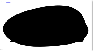
CSS Code For Link Hover Effect
:root {
  --text: #2B3044;
  --line: #BBC1E1;
  --line-active: #275EFE;
}
p {
  font-size: 18px;
  margin: 0;
  color: var(--text);
}
p a {
  display: inline-block;
  position: relative;
  text-decoration: none;
  color: inherit;
  margin: 0 var(--spacing, 0px);
  transition: margin 0.25s;
}
p a svg {
  width: 76px;
  height: 40px;
  position: absolute;
  left: 50%;
  bottom: 0;
  transform: translate(-50%, 7px) translateZ(0);
  fill: none;
  stroke: var(--stroke, var(--line));
  stroke-linecap: round;
  stroke-width: 2px;
  stroke-dasharray: var(--offset, 69px) 278px;
  stroke-dashoffset: 361px;
  transition: stroke 0.25s ease var(--stroke-delay, 0s), stroke-dasharray 0.35s;
}
p a:hover {
  --spacing: 4px;
  --stroke: var(--line-active);
  --stroke-delay: 0.1s;
  --offset: 180px;
}
html {
  box-sizing: border-box;
  -webkit-font-smoothing: antialiased;
}
* {
  box-sizing: inherit;
}
*:before, *:after {
  box-sizing: inherit;
}
body {
  min-height: 100vh;
  display: flex;
  font-family: 'Inter', Arial;
  justify-content: center;
  align-items: center;
  background: #F6F8FF;
}
We have completed our CSS Code for Link Hover Effect. Here is our final updated output HTML + CSS.100+ HTML,CSS and JavaScript Projects With Source Code ( Beginners to Advanced)Final Output Of CSS Link hover Effect

 I hope you like the Link hover animation, you can see the output project screenshots. See our other blogs and gain knowledge in front-end development.Thank you!Written by – Code With Random/Ankicode by – Aaron Iker
Which code editor do you use for this Indian Flag coding?
I personally recommend using VS Code Studio, it’s straightforward and easy to use.
is this project responsive or not?
Yes! this project is a responsive project.
Do you use any external links to create this project?
No!
