Hey active learners we’re glad you’re here to learn how to create a responsive text box for a website. The essential concepts of flexible design will be covered in this article, along with tips on how to create a text box that adapts easily to different screen sizes. This article will provide you with the skills you need to design text box that are easy for users to use and visually beautiful in your online projects, regardless of your level of coding experience.
What is a textbox?
In web development, a text box is a user interface component that is used to collect text input from visitors on a web page. It’s a typical form element used to gather short texts, like names, email addresses, passwords, search queries, and more. Input fields or text input fields are other names for text boxes.
In HTML, the element with the type=”text” attribute is used to create a text box. Here’s a simple example:
<input type="text" name="username" id="username" placeholder="Enter your username">
In this example:
The type=”text” attribute in this example indicates that the input field will only accept text input. When the form is submitted, the data is identified by the name provided by the name property for the input element. The input element can be targeted with JavaScript or CSS using the id attribute. To help users understand what kind of input is anticipated, the placeholder property offers a suggestion or sample text.
Text boxes can be further customized by developers by using JavaScript to add interaction, validation, and other behaviors, and CSS to modify its appearance and layout.
Web forms, which are used to gather different kinds of user input and communicate with web applications, are fundamentally incomplete without text boxes.
How textbox is important in creating responsive webpages?
By enabling users to enter data on a variety of devices and screen sizes, textboxes, also known as input fields, are crucial to the development of adaptable websites. Textboxes help to create responsive web design in the following ways:
- Textboxes are used for a variety of inputs, including text, numbers, email addresses, passwords, and more. This is known as flexible input. Users will be able to comfortably engage with your website on a variety of devices, including smartphones, tablets, laptops, and desktops if you make sure that these input fields are made to adjust to varied screen sizes.
- Viewport Adaptation: A goal of responsive design is to modify a webpage’s content and layout to match various screen sizes. Textboxes can alter their width to fit inside the confines of the screen. For smaller screens, the textbox’s width can be set to 100% to fill the full screen, making input easier for users.
- Media Queries: CSS media queries let you employ various stylings depending on the user’s device specifications, like screen width. To make textboxes easily legible and accessible on a variety of devices, you may use media queries to modify their padding, font size, and other stylistic attributes.
Textbox V/S Input element
In web development, the term “TEXTBOX” and “INPUT ELEMENT” can be somewhat synonymous, but “INPUT ELEMENT” is a broader term that encompasses various types of input fields, while “TEXTBOX” is a more specific term referring to a particular type of input field. Here’s a breakdown of the two terms:
- Input Element:
An “input element” is a generic term used to describe any form element that allows users to input data on a webpage. In HTML, the<input>element is used to create these input fields. The type of input field that is created depends on the “type” attribute of the<input>tag. Some common types of input fields created using the<input>element include:
- Text Input:
<input type="text"> - Email Input:
<input type="email"> - Password Input:
<input type="password"> - Number Input:
<input type="number"> - Checkbox Input:
<input type="checkbox"> - Radio Button Input:
<input type="radio"> - File Upload Input:
<input type="file"> - And many more… In essence, an “input element” refers to any kind of form element that allows users to provide data or make selections.
2. Textbox:
“Textbox” is a specific term often used to refer to the text input field created using the <input type="text"> element. This type of input field is commonly used to collect single-line text data from users, such as their name, username, or any other textual information. It’s a fundamental element in web forms.
In summary, while “textbox” specifically refers to the text input field created using the <input type="text"> element, “input element” is a broader term that encompasses various types of form input fields, each with different functionalities and purposes.
Now let us create a responsive and simple text box

.
Let us see the HTML structure
<div class="text-input">
  <input type="text" id="input1" placeholder="Try typing something in here!">
  <label for="input1">Name</label>
</div>
Here’s a brief explanation of the provided HTML code:
<div class="text-input">: This div element has “text-input” as its class property. In order to group the input field and label it for aesthetic or layout purposes, it serves as a container. Elements contained within this container may have CSS styles applied to them using the class name “text-input”.<input type="text" id="input1" placeholder="Try typing something in here!">: This is an<input>element with the following attributes:type="text": Specifies that this input field is a text input, which allows users to enter single-line text.id="input1": Sets the unique identifier for the input field. The label’sforattribute later associated with thisid.placeholder="Try typing something in here!": This is a placeholder text that appears inside the input field before the user enters any text. It provides a hint or example of the expected input.
<label for="input1">Name</label>: A descriptive description for the input field is provided via the element. Given that the for the property is set to “input1,” the label is connected to the input field with the relevant id. Users will find it simpler to grasp the purpose of the input area because of this association, which helps to increase accessibility and usability.
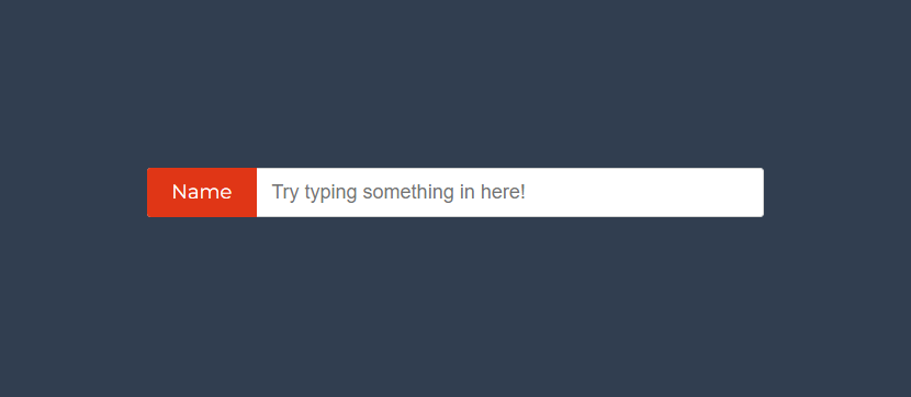
A text input form with a label and a placeholder will appear when this code is viewed in a web browser. The user can begin typing by clicking in the input field. The input area will have the label “Name” next to it, and clicking on the label will draw attention to it and allow user input. Additionally, the input field and label within the container could be customized using CSS to alter their appearance and layout.
Here is the output of the HTML code:

Let us see the CSS structure
@import  url(https://fonts.googleapis.com/css?family=Montserrat);

body{
  display: flex;
  flex-direction: column;
  align-items: center;
  justify-content: center;
  height: 100vh;
  font-family: Montserrat;
  background: #313E50;
}

.text-input{

  position: relative;
  margin-top: 50px;

  input[type="text"]{
    display: inline-block;
    width: 500px;
    height: 40px;
    box-sizing: border-box;
    outline: none;
    border: 1px solid lightgray;
    border-radius: 3px;
    padding: 10px 10px 10px 100px;
    transition: all 0.1s ease-out;
  }

  input[type="text"] + label{
    position: absolute;
    top: 0;
    left: 0;
    bottom: 0;
    height: 40px;
    line-height: 40px;
    color: white;
    border-radius: 3px 0 0 3px;
    padding: 0 20px;
    background: #E03616;
    transform: translateZ(0) translateX(0);
    transition: all 0.3s ease-in;
    transition-delay: 0.2s;
  }

  input[type="text"]:focus + label{
    transform: translateY(-120%) translateX(0%);
    border-radius: 3px;
    transition: all 0.1s ease-out;
  }

  input[type="text"]:focus{
    padding: 10px;
    transition: all 0.3s ease-out;
    transition-delay: 0.2s;
  }
}
Certainly! This CSS code snippet provides styling instructions for various elements on a webpage. Here’s a breakdown of what each part does:
Here’s a detailed explanation of the styles applied:
@import url(https://fonts.googleapis.com/css?family=Montserrat);: This imports the “Montserrat” font from Google Fonts, which will be used for the text elements on the page.body: This block applies styling to the entire body of the webpage. The properties included set the display mode, layout, font, and background color of the body..text-input: The container that houses the input field and label is styled by this class. The characteristics included controlling the container’s location and including a top margin.input[type="text"]: This styles the text input field. It sets its dimensions, appearance, border, padding, and transition effects.input[type="text"] + label: This styles the label associated with the input field. It sets the position, appearance, color, and transition effects. Thetransformproperty creates an animation effect that moves the label when the input is focused.input[type="text"]:focus + label: This styles the label when the input field is focused. It creates an animation effect that moves the label above the input field and modifies its appearance.input[type="text"]:focus: This styles the input field when it is focused. It modifies the padding and creates a transition effect to enhance the visual experience.
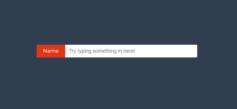
When these styles are combined, a text input field with an interactive label that changes and moves above the input when it is focused is created. For unified typography, the “Montserrat” typeface from Google Fonts is utilized. The algorithm generates a contemporary and user-friendly text input design overall.
ADVERTISEMENT
Here is the output After applying CSS
ADVERTISEMENT

Here is the video demonstration of the output, where you can enter the text.
ADVERTISEMENT
ADVERTISEMENT
Points to remember
There are a few important decisions to make to guarantee a user-friendly and accessible experience when building a text input field (textbox) for the web. To keep in mind, bear in mind the following:
ADVERTISEMENT
- Label Association:
Always use the<label>element with theforattribute that matches theidof the corresponding input element. This ensures proper labeling of the input field for better accessibility and user understanding. - Placeholder Text:
Use the placeholder attribute to give a description or an illustration of the desired input. Users should be able to grasp the purpose of the input with the help of clear, concise placeholder language. - Validation and Error Messages:
Implement suitable input field validation to make sure users are entering the right data or format. If the input does not fit the specified requirements, give unambiguous error messages. - Styling and Layout:
To maintain a consistent visual appearance across your website, style the input field and label using CSS. If you want to make sure the textbox looks excellent on various screen sizes, think about utilizing a responsive design. - Input Length and Size:
Set the input field’s dimensions appropriately while taking the predicted input length into account. The input field shouldn’t be made too small as this could irritate users. - Input Type:
Choose the appropriatetypeattribute for the input element based on the data you’re collecting. For example, usetype="email"for email addresses,type="number"for numeric input, and so on. - Autofocus:
If necessary, use theautofocusattribute to make the input field automatically receive focus when the page loads. This is useful for improving user experience, especially on forms. - Tab Order:
Ensure that the tab order of your input fields follows a logical sequence, allowing users to navigate through the form efficiently using the keyboard. - Keyboard Accessibility:
To make sure that people can readily interact with your input field using the Tab key, “Enter” key, and arrow keys, test it using keyboard navigation. - Aria-Label:
In cases where you can’t use a visible label, such as in more complex designs, use thearia-labelattribute to provide a screen reader-friendly label for the input field. - Focus States:
Create focus states for your input field that are obvious and unique aesthetically. This aids users in determining which element is active at any one time, especially when using a keyboard to navigate the page. - Browser Compatibility:
To ensure consistent use and appearance across browsers, test your input field in each one. - Security:
Make that the input field’s value is not visible in plain text when inputted for sensitive information, such as passwords. - Performance:
Keep your CSS and JavaScript usage to a minimum so as not to affect how well the input field or form functions.
You may design efficient and user-friendly text input fields that improve the overall user experience for visitors to your website by keeping these points in mind.
Here, we wrap up our blog for our portfolio webpage.
We appreciate your participation in this learning experience on codewithrandom. Your encouragement and excitement are greatly appreciated. Watch this space for more intriguing blogs and articles on codewithrandom.


