Let’s Make A Photo Gallery In HTML and CSS Code
Hello, Coders. In this article, we will make a Photo Gallery In HTML and CSS Code. This Photo Gallery will contain a number of images that would appear similar to a standard gallery. We will create a stunning responsive photo gallery website.
All of the images in this Photo Gallery will be displayed in a small size, and when you click on any of them, the full size of that image will be displayed, and you can zoom in and out of the picture using the mouse wheel.
50+ HTML, CSS & JavaScript Projects With Source Code
This project will teach you how to add multiple images to a webpage as well as how to make the page responsive.
| Code by | Ettrics |
| Project Download | Link Available Below |
| Language used | HTML and Css |
| External link / Dependencies | Yes |
| Responsive | Yes |
I hope you must have got an idea about the project.
Let’s have a look at our project Photo Gallery.👇

Before the code, you just need to add understand some of the concepts of Photo gallery.
what is a Photo Gallery?
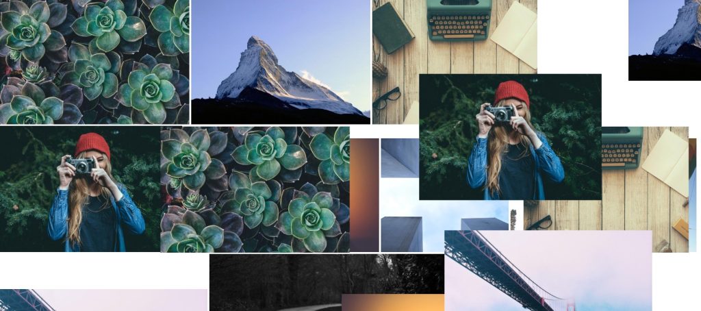
A photo gallery is a unique place where we add multiple images and videos that are stored in one place and can be used later on per the requirements. In the photo gallery, multiple images are displayed at the same time, and if we want to see a particular photo, we can just click on it, and the photo will be enlarged.
What is the use of Photo Gallery?
Photo galleries can be used to capture and store all the beautiful moments of our loved ones, and they also provide us with an interface through which we can see multiple images at the same time.
Keep note that you must add this link under the head tag .
Step1: Let’s Start with adding some Basic HTML Code for photo gallery:-
ADVERTISEMENT
HTML, or hypertext markup language, is the main structure of our webpage, which will help us display our content to the browser.
ADVERTISEMENT
ADVERTISEMENT
All the HTML documents must start with <!doctypehtml>. This helps the browser understand that the code written follows the latest HTML format.
ADVERTISEMENT
ADVERTISEMENT
The HTML document itself begins with <html> and ends with </html>.
The content that will be displayed in the browser comes under the body section, <body></body>. Inside the body tag, the main content lies.
Build your Own Tip Calculator in HTML, CSS, JAVASCRIPT
Here I will add the structure of the HTML code from scratch.
Our HTML contains the following part :
- The main content of our HTML code is present in the div tag which contain our image.
- The img tag with class(m-p-g_thumbs-img).
- We have another div tag, which helps to see the image in full size.
Go through the below 👇 code and paste in your IDE :
Html Photo Gallery Code:-
<!DOCTYPE html>
<html lang="en" >
<head>
  <meta charset="UTF-8">
  <title>Photos Material Gallery</title>
  <meta name="viewport" content="width=device-width, initial-scale=1">
  <link href='https://fonts.googleapis.com/css?family=Roboto+Mono:400,300' rel='stylesheet' type='text/css'><link rel="stylesheet" href="https://cdnjs.cloudflare.com/ajax/libs/normalize/5.0.0/normalize.min.css">
  <link rel="stylesheet" href="./style.css">

</head>
<body>
<div class="m-p-g">
    <div class="m-p-g__thumbs" data-google-image-layout data-max-height="350">
        <img src="http://unsplash.it/600/400?image=940" data-full="http://unsplash.it/1200/800?image=940" class="m-p-g__thumbs-img" />
        <img src="http://unsplash.it/640/450?image=906" data-full="http://unsplash.it/1280/900?image=906" class="m-p-g__thumbs-img" />
        <img src="http://unsplash.it/550/420?image=885" data-full="http://unsplash.it/1100/840?image=885" class="m-p-g__thumbs-img" />
        <img src="http://unsplash.it/650/450?image=823" data-full="http://unsplash.it/1300/900?image=823" class="m-p-g__thumbs-img" />
        <img src="http://unsplash.it/600/350?image=815" data-full="http://unsplash.it/1200/700?image=815" class="m-p-g__thumbs-img" />
        <img src="http://unsplash.it/560/500?image=677" data-full="http://unsplash.it/1120/1000?image=677" class="m-p-g__thumbs-img" />
        <img src="http://unsplash.it/670/410?image=401" data-full="http://unsplash.it/1340/820?image=401" class="m-p-g__thumbs-img" />
        <img src="http://unsplash.it/620/340?image=623" data-full="http://unsplash.it/1240/680?image=623" class="m-p-g__thumbs-img" />
        <img src="http://unsplash.it/790/390?image=339" data-full="http://unsplash.it/1580/780?image=339" class="m-p-g__thumbs-img" />
    </div>

    <div class="m-p-g__fullscreen"></div>
</div>

<script>
    var elem = document.querySelector('.m-p-g');

    document.addEventListener('DOMContentLoaded', function() {
        var gallery = new MaterialPhotoGallery(elem);
    });
</script>
<!-- partial -->
  <script src='https://s3-us-west-2.amazonaws.com/s.cdpn.io/45226/material-photo-gallery.min.js'></script>
</body>
</html>
Preview without Styling Photo Gallery:

Before the code, you just need to add the CSS link to our HTML file so that we add styling to our website:
<link rel="stylesheet" href="./style.css">
Keep note that you must add this link under the head tag .
Step2: Adding the CSS Code For Photo Gallery
/*------------------------------------*\
 MATERIAL PHOTO GALLERY
 \*------------------------------------*/
.m-p-g {
  max-width: 100%;
  margin: 0 auto;
}
.m-p-g__thumbs-img {
  margin: 0;
  float: left;
  vertical-align: bottom;
  cursor: pointer;
  z-index: 1;
  position: relative;
  opacity: 0;
  filter: brightness(100%);
  -webkit-tap-highlight-color: rgba(0, 0, 0, 0);
  will-change: opacity, transform;
  transition: all 0.5s cubic-bezier(0.23, 1, 0.32, 1);
}
.m-p-g__thumbs-img.active {
  z-index: 50;
}
.m-p-g__thumbs-img.layout-completed {
  opacity: 1;
}
.m-p-g__thumbs-img.hide {
  opacity: 0;
}
.m-p-g__thumbs-img:hover {
  filter: brightness(110%);
}
.m-p-g__fullscreen {
  position: fixed;
  z-index: 10;
  top: 0;
  left: 0;
  right: 0;
  bottom: 0;
  width: 100%;
  height: 100vh;
  background: rgba(0, 0, 0, 0);
  visibility: hidden;
  transition: background 0.25s ease-out, visibility 0.01s 0.5s linear;
  will-change: background, visibility;
  -webkit-backface-visibility: hidden;
          backface-visibility: hidden;
}
.m-p-g__fullscreen.active {
  transition: background 0.25s ease-out, visibility 0.01s 0s linear;
  visibility: visible;
  background: rgba(0, 0, 0, 0.95);
}
.m-p-g__fullscreen-img {
  pointer-events: none;
  position: absolute;
  transform-origin: left top;
  top: 50%;
  left: 50%;
  max-height: 100vh;
  max-width: 100%;
  visibility: hidden;
  will-change: visibility;
  transition: opacity 0.5s ease-out;
}
.m-p-g__fullscreen-img.active {
  visibility: visible;
  opacity: 1 !important;
  transition: transform 0.5s cubic-bezier(0.23, 1, 0.32, 1), opacity 0.5s ease-out;
}
.m-p-g__fullscreen-img.almost-active {
  opacity: 0;
  transform: translate3d(0, 0, 0) !important;
}
.m-p-g__controls {
  position: fixed;
  top: 0;
  left: 0;
  width: 100%;
  z-index: 200;
  height: 20vh;
  background: linear-gradient(to top, transparent 0%, rgba(0, 0, 0, 0.55) 100%);
  opacity: 0;
  visibility: hidden;
  transition: all 0.5s cubic-bezier(0.23, 1, 0.32, 1);
}
.m-p-g__controls.active {
  opacity: 1;
  visibility: visible;
}
.m-p-g__controls-close, .m-p-g__controls-arrow {
  -webkit-appearance: none;
     -moz-appearance: none;
          appearance: none;
  border: none;
  background: none;
}
.m-p-g__controls-close:focus, .m-p-g__controls-arrow:focus {
  outline: none;
}
.m-p-g__controls-arrow {
  position: absolute;
  z-index: 1;
  top: 0;
  width: 20%;
  height: 100vh;
  display: flex;
  align-items: center;
  cursor: pointer;
  -webkit-tap-highlight-color: rgba(0, 0, 0, 0);
  opacity: 0;
}
.m-p-g__controls-arrow:hover {
  opacity: 1;
}
.m-p-g__controls-arrow--prev {
  left: 0;
  padding-left: 3vw;
  justify-content: flex-start;
}
.m-p-g__controls-arrow--next {
  right: 0;
  padding-right: 3vw;
  justify-content: flex-end;
}
.m-p-g__controls-close {
  position: absolute;
  top: 3vh;
  left: 3vw;
  z-index: 5;
  cursor: pointer;
  -webkit-tap-highlight-color: rgba(0, 0, 0, 0);
}
.m-p-g__btn {
  display: inline-flex;
  align-items: center;
  justify-content: center;
  width: 50px;
  height: 50px;
  border-radius: 50%;
  background: rgba(255, 255, 255, 0.07);
  transition: all 0.25s ease-out;
}
.m-p-g__btn:hover {
  background: rgba(255, 255, 255, 0.15);
}
.m-p-g__alertBox {
  position: fixed;
  z-index: 999;
  max-width: 700px;
  top: 50%;
  left: 50%;
  transform: translate(-50%, -50%);
  background: white;
  padding: 25px;
  border-radius: 3px;
  text-align: center;
  box-shadow: 0 6px 12px rgba(0, 0, 0, 0.23), 0 10px 40px rgba(0, 0, 0, 0.19);
  color: grey;
}
.m-p-g__alertBox h2 {
  color: red;
}
/* DEMO */
body {
  background: #fefefe;
  color: white;
  -webkit-font-smoothing: antialiased;
  -moz-osx-font-smoothing: grayscale;
  text-align: center;
  font-family: 'Roboto Mono';
}
h2 {
  font-weight: 300;
  margin: 4vh 4vw;
  letter-spacing: 3px;
  color: grey;
  text-transform: uppercase;
}
.demo-btn {
  display: inline-block;
  margin: 0 2.5px 4vh 2.5px;
  text-decoration: none;
  color: grey;
  padding: 15px;
  line-height: 1;
  min-width: 140px;
  background: rgba(0, 0, 0, 0.07);
  border-radius: 6px;
}
.demo-btn:hover {
  background: rgba(0, 0, 0, 0.12);
}
@media (max-width: 640px) {
  .demo-btn {
    min-width: 0;
    font-size: 14px;
  }
}
Preview after adding the style Photo Gallery:

Step3: Adding the Javascript Code For Photo Gallery
We just used the script tag in our HTML file to add our javascript. In the javascript part, we just initialized a variable that selects our element with its class name, and then we just added an event listener domcontentloaded. As the content loads up, we callback a function that creates a variable.
A preview of our project is attached below 👇:
Final Output Of Photo Gallery Using Html and Css Code:-
Now, as you can see in the output, we have created an Photo gallery using HTML, CSS, and JavaScript which will help you to create some small website projects.
100+ JavaScript Projects With Source Code ( Beginners to Advanced)
Now I’m looking for your reviews.
Which code editor do you use for this Photo Gallery coding?
I personally recommend using VS Code Studio, it’s straightforward and easy to use.
what is a Photo Gallery?
A photo gallery is a unique place where we add multiple images and videos that are stored in one place and can be used later on per the requirements. In the photo gallery, multiple images are displayed at the same time, and if we want to see a particular photo, we can just click on it, and the photo will be enlarged.
What is the use of Photo Gallery?
Photo galleries can be used to capture and store all the beautiful moments of our loved ones, and they also provide us with an interface through which we can see multiple images at the same time.


The most crisp and precise article ,to the point& very helpful🌸Hope to see many such articles more😇