Creative Flip Image Animation Using HTML and CSS
Hello Coders! A very warm welcome to Codewithrandom’s Blog. In today’s blog, we’re going to create Flip Image Animation Using HTML and CSS. In This Project, we have an Image that can flip on hovering, So Let’s start how to create Flip Image Animation.
 Auto Flip Image Using HTML and CSS (Code Example)
What is a flip image?
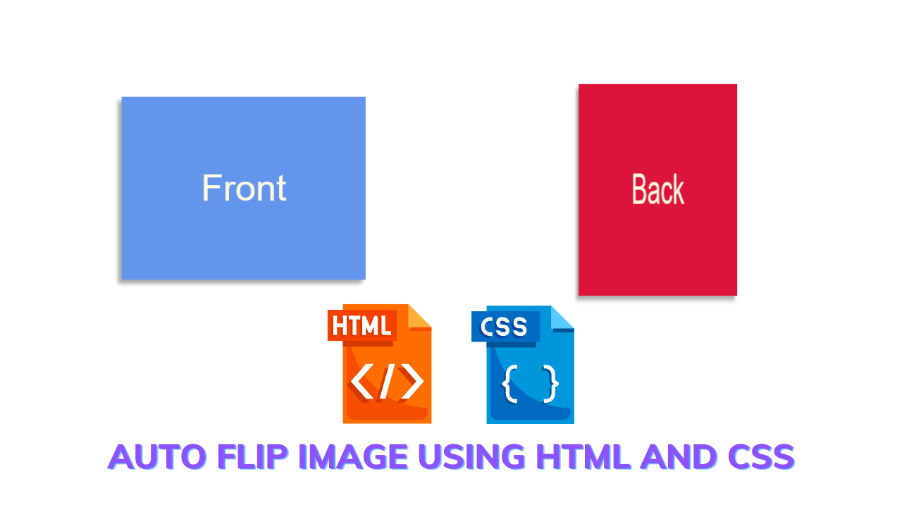
A flip image is a CSS effect that causes an image to flip 180 degrees to the left as the viewer hovers over it. We are creating a flip image for a beginner assignment. A large website, such as an e-commerce website, where we can add the picture on the front side and the information about the product on the back side, can later add this kind of effect.
50+ HTML, CSS & JavaScript Projects With Source Code
For better understanding, you can see the live server which is given here…..
Live Preview Of Flip Image Animation:-
| Code by | N/A |
| Project Download | Link Available Below |
| Language used | HTML and CSS |
| External link / Dependencies | No |
| Responsive | Yes |
HTML Code:-
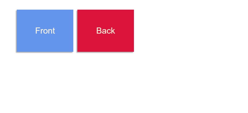
So as you have seen in the live server when we hover over the card it flips 180 3D. you have also seen that it has only two things in the Front part it is written Front and on the back, it is written Back.
So Layout is basically easy inside a container named Flipper we need to insert two div tags named front and back. If you want to insert any content like photos or anything else.
Simple Portfolio Website Using HTML and CSS with Source Code
So the content you want to display on the front side You just need to insert that content inside the front class named tag while for the content you want to display on the back side of the card you have to insert that content inside the back named class div tag.
In this, the div class will be front and back
<div class="flip-container" ontouchstart="this.classList.toggle('hover');">
    <div class="flipper">
        <div class="front">
            <!-- front content -->
            Front
        </div>
        <div class="back">
            <!-- back content -->
            Back
        </div>
    </div>
</div>
HTML Output Of Flip Image :-.

CSS Code:-
As you have seen in the HTML output for now the Front and Back content both are visible from the front side. For making it a flippable card we need to apply CSS.
But we are using Some CSS properties which usually we don’t use while styling so let’s first look at those concepts.
Gym Website Using HTML and CSS With Source Code
transform-styles:-
The transform-style property specifies how nested elements are rendered in 3D space.
Note: This property must be used together with the transform property.
| flat | Specifies that child elements will NOT preserve their 3D position. This is default |
| preserve-3d | Specifies that child elements will preserve their 3D position |
| initial | Sets this property to its default value. Read about initial |
| inherit | Inherits this property from its parent element. Read about inherit |
We don’t need to learn about all we are using Preserve -3d. as our Card is flipping in 3D. So we need to apply transform styles as preserve -3d.
Preserve-3d:-
With the CSS transform the property you can use the following 3D transformation methods:
rotateX()rotateY()rotateZ()
| transform | Applies a 2D or 3D transformation to an element |
| transform-origin | Allows you to change the position on transformed elements |
| transform-style | Specifies how nested elements are rendered in 3D space |
| perspective | Specifies the perspective on how 3D elements are viewed |
| perspective-origin | Specifies the bottom position of 3D elements |
| backface-visibility | Defines whether or not an element should be visible when not facing the screen |
So here we need to use the backface-visibility.
/* entire container, keeps perspective */
.flip-container {
    perspective: 1000;
} /* flip the pane when hovered */
.flip-container:hover .flipper,
.flip-container.hover .flipper {
    transform: rotateY(180deg);
}
.flip-container,
.front,
.back {
    width: 320px;
    height: 240px;
    margin: 1em auto;
} /* flip speed goes here */
.flipper {
    transition: 0.6s;
    transform-style: preserve-3d;
    position: relative;
} /* hide back of pane during swap */
.front,
.back {
    backface-visibility: hidden;
    position: absolute;
    top: 0;
    left: 0;
    color: cornSilk;
    text-align: center;
    font: 3em/240px "Helvetica Neue", Helvetica, sans-serif;
    box-shadow: -5px 5px 5px #aaa;
} /* front pane, placed above back */
.front {
    z-index: 2; /* for firefox 31 */
    transform: rotateY(0deg);
    background: cornflowerBlue;
} /* back, initially hidden pane */
.back {
    transform: rotateY(180deg);
    background: crimson;
}
Final Output Of Flip Image Animation Using Css:-


Video Output:
Finally, your FLIP IMAGE ANIMATION USING HTML AND CSS IS finished. You can see in css output that there is no button that switches to another animation it is an automatic animation using css.
Hope you may like the blog.If any doubt comments in the comment box.
ADVERTISEMENT
100+ JavaScript Projects With Source Code ( Beginners to Advanced)
ADVERTISEMENT
THANK YOU!
ADVERTISEMENT
Written by – Sayali Kharat & Himanshu Singh
ADVERTISEMENT
SOME FAQS RELATED TO FLIP IMAGE ANIMATION CSS.
Which code editor do you use for this Auto Flip Image coding?
I personally recommend using VS Code Studio, it’s straightforward and easy to use.
ADVERTISEMENT
is this project responsive or not?
Yes! this is a responsive project
Do you use any external links to create this project?
No!
What is the Flip Image project?
Flip images is a beginner project in which we take images and using the css concept we will add a hover property on the image.As the user hover over the image the image will automatically rotate 180 °.
