Create Coin Flip Animation CSS
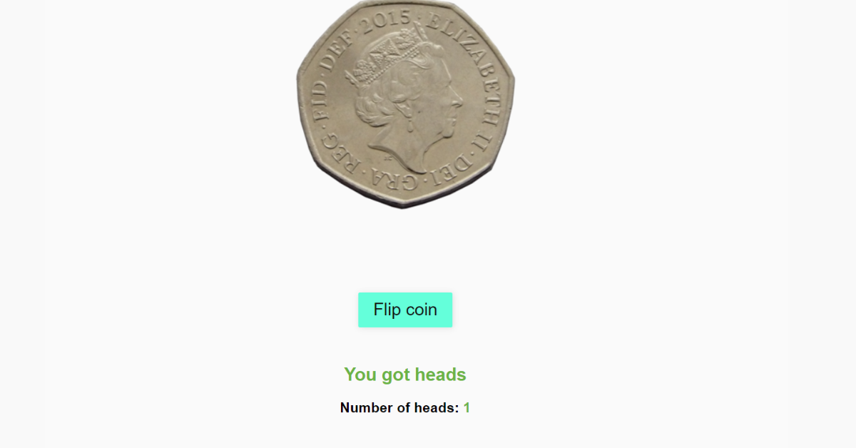
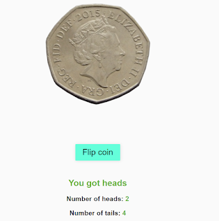
Hello Coder! Welcome to the Codewithrandom Blog. In this blog, We learn how we create a Create Coin Flip Animation Using Css. In this Project, we have a button to flip a coin, and there are 2 lines to show how much time heads and tails when we flip a coin. We add animation in Flip Coin Like Real Coin flipping With the help of Css.
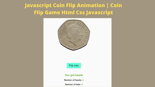
As much as you like my earlier instructions, I hope you enjoy this one too. Here is a comprehensive overview for newcomers. You must have participated in a lot of these games as a kid. Additionally, a similar toss is conducted in many cricket matches.
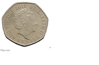
Here, I combined two photos to make a coin. This is the head side of the coin. for the direction of the upper tail. A button is present. The coin will rotate repeatedly along the x-axis each time you hit that button. then stop when you reach a specific direction.
| Code by | Harry Beckwith |
| Project Download | Link Available Below |
| Language used | HTML ,CSS and JavaScript |
| External link / Dependencies | No |
| Responsive | No |
HTML Code For Coin Flip Animation:-
<div class='container'>
  <img id="featureCoin" src="https://upload.wikimedia.org/wikipedia/en/5/52/British_fifty_pence_coin_2015_obverse.png"/>
  <div id='coin'>

  </div>
  <div id='button'>
    Flip coin
  </div>
  <div id='result'>

  </div>
  <div id='headsCounter'>

  </div>
  <div id='tailsCounter'>

    </div </div
Using the image tag, we will add an image using the url, and then using the div tag with the section for the button, we will construct a flip coin. Using the div tag with the class container, we will create the container for our coin flip project. In addition, we will include another area for showing the outcome.
There is all the HTML code for the Coin Flip. Now, you can see output without Css and Javascript. then we write Css for Animation and basic styling and use Javascript for the Coin Flip Functionality.
Ecommerce Website Using HTML, CSS, & JavaScript (Source Code)
Output
Coin Flip Animation Css Code:-
body {
  font-family: "Ubuntu", sans-serif;
  background: #fafafa;
}

#coin {
  margin-bottom: 100px;
}

#button {
  background: #64ffda;
  color: #111;
  padding: 10px 20px;
  border-radius: 2px;
  display: inline-block;
  transition: 0.5s;
  cursor: pointer;
  font-size: 23px;
  margin-bottom: 30px;
  box-shadow: 1px 1px 8px #DCDCDC;
}
#button:hover {
  opacity: 0.5;
}

.animate-coin {
  -webkit-animation: flip 1.4s 1;
          animation: flip 1.4s 1;
}

@-webkit-keyframes flip {
  0% {
    transform: scale3d(1, 1, 1) rotateX(0deg);
  }
  50% {
    transform: scale3d(2, 2, 2) rotateX(3600deg);
  }
  100% {
    transform: scale3d(1, 1, 1) rotateX(7200deg);
  }
}

@keyframes flip {
  0% {
    transform: scale3d(1, 1, 1) rotateX(0deg);
  }
  50% {
    transform: scale3d(2, 2, 2) rotateX(3600deg);
  }
  100% {
    transform: scale3d(1, 1, 1) rotateX(7200deg);
  }
}
/* Centralise content */
.container {
  width: 80%;
  margin: 200px auto;
  text-align: Center;
}

img {
  max-width: 100%;
}

#tailsCounter span, #headsCounter span {
  color: #6ab344;
}

#result {
  color: #6ab344;
}Step1:We’ll now select “Ubuntu” as the font family and “White” as the backdrop using the body tag selector.
Portfolio Website Using Html And Css (Source Code)
We will now add a 100px bottom margin using the id selector #coin. We will also style the button for our flip coin project using the id selector (#button). The background will be set to cyan using the background property, and the display will be set to block using the display property.
Additionally, the hover property will be added, causing the opacity of the button to change to 0.5 when the user hovers over it. The keyframes will be used to provide animation to our coin flip.
body {
  font-family: 'Ubuntu', sans-serif;
  background:#fafafa;
}
#coin {
  margin-bottom:100px;
}
#button {
  background:#64ffda;
  color:#111;
  padding:10px 20px;
  border-radius:2px;
  display:inline-block;
  transition:0.5s;
  cursor:pointer;
    font-size: 23px;
  margin-bottom: 30px;
  box-shadow: 1px 1px 8px #DCDCDC;
  &:hover {
    opacity:0.5;
  }
}


.animate-coin {
  animation: flip 1.4s 1;
}
@keyframes flip {
  0% {
    transform: scale3d(1,1,1) rotateX(0deg);
  }
  50% {
    transform: scale3d(2,2,2) rotateX(3600deg);
  }
  100% {
    transform: scale3d(1,1,1) rotateX(7200deg);
  }
}
Step2: We will set the width to 80% using the class selector (.container), and the margin to 200px using the margin property. Additionally, we will centre the text using the text align property. We shall change the colours in our heads-and-tails graphic.
.container {
  width:80%;
  margin:200px auto;
  text-align:Center;
}
img {
  max-width:100%;
}
#tailsCounter span, #headsCounter span {
  color:#6ab344;
}
#result {
  color:#6ab344;
}
Animated Login Form Using HTML and CSS (Source Code)
Html + Css Code Output

JavaScript Code For Coin Flip:-
var coin = document.getElementById('coin');
var button = document.getElementById('button');
var result = document.getElementById('result');
var headsCounter = document.getElementById('headsCounter');
var TailsCounter = document.getElementById('TailsCounter');
var featureCoin = document.getElementById('featureCoin');
var heads = 0;
var tails = 0;

/* On click of button spin coin ainamtion */
function coinToss() {
  /* Random number 0 or 1  */
  var x = Math.floor(Math.random() * 2);
  /* If x = 0 change coin html to image of heads along with animation for flipping effect */
  if (x === 0) {
    coin.innerHTML = '<img class="heads animate-coin" src="https://upload.wikimedia.org/wikipedia/en/5/52/British_fifty_pence_coin_2015_obverse.png"/>';
    /* Heads count increase by 1 */
    heads += 1;
    /* Display result of flip */
    result.innerHTML = '<h2>You got heads</h2>';
    /* Display number of heads */
    headsCounter.innerHTML = '<h3> Number of heads:<span> ' + heads + '</span></h3>';
    /* Else x =  change coin html to image of tails along with animation for flipping effect */
  } else {
    coin.innerHTML = '<img class="tails animate-coin" src="https://upload.wikimedia.org/wikipedia/en/d/d8/British_fifty_pence_coin_2015_reverse.png"/>';
    /* Tails count increase by 1 */
    tails += 1;
    /* Display result of flip */
    result.innerHTML = '<h2>You got tails</h2>';
    /* Display number of tails */
    tailsCounter.innerHTML = '<h3> Number of tails:<span> ' + tails + '</span></h3>';

  }

}
/* Add the coin toss function to the button using on click */
button.onclick = function() {
  coinToss();
  featureCoin.remove();
}
We’ll use the document after first utilising the var keyword to create some variables. We will use the function getElementById (), choose the html elements, and then construct two variables—one for the head and one for the tail.
ADVERTISEMENT
Next, we’ll develop the coinToss function.(). We will use math to construct a coin-toss function. We’ll determine whether the result of the random function is 0 or 1. We shall show the tail side of the coin if the value is zero, and the head side if the value is one. The on-click function on the button will be used to invoke this function.
ADVERTISEMENT
Final Output Of Coin Flip Animation Using CSS:-
100+ JavaScript Projects With Source Code ( Beginners to Advanced)
ADVERTISEMENT
ADVERTISEMENT
ADVERTISEMENT
Video Output of Css Coin flip animation:-
I hope you like the Coin Flip Animation. you can see the output video and project screenshots. See our other blogs and gain knowledge in front-end development.
Which code editor do you use for this Coin Flip Animation?
is this project responsive or not?
Do you use any external links to create this project?
What is the use of flip Coin Animation?
What are the important properties required to create Coin Flip animation?
1. Importing images using the background property
2. Using Keyframes property to change the background at every frame.
3. Using Animation and transform property to add the flip animation in our project.
