Responsive Contact Us Page Design In Html And Css With Source Code
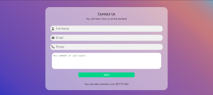
Let’s Make a Simple and Easy Contact Us Page Using Html and Css:-
Hello, again. Web Dev Warriors. This is Aneesh Malapaka and today I brought you an interesting and necessary piece for any portfolio or any website which depends on user reviews. Today, we will learn about making a Responsive Contact Us Page Design In Html And Css. But wait, The bonus is that it is completely responsive and we will not use a lot of media queries either. If you are thinking about how then let’s get started.
Every Webpage in existence that depends on users’ feedback or needs to hear the views will require a medium or a way to connect with them to achieve it. So, a simple solution is a contact us page which is available in different templates. Let’s learn about that clearly.
50+ HTML, CSS & JavaScript Projects With Source Code
Different Versions of the Contact Us Page:-
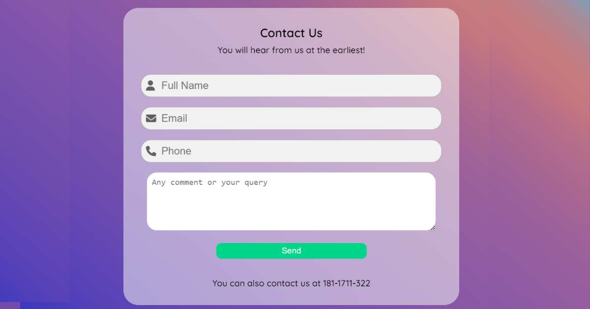
So, the one you can see above in the main picture is one of the simplest and most basic contacts on our pages that can be made. Let’s discuss some variants of it.
- Contact Us Page with an email link
- Contact Us Page with multiple options
- Contact Us page for E-Commerce Stores
Now, let’s see how and why it matters to have different contact us page or section on a website. Let’s start from the larger scope such as the E-commerce stores or large companies that either consider clients or want a review from their clients. So, one such way is dividing it into either by connection to a sales team or customer care or taking the necessary information from the clients.
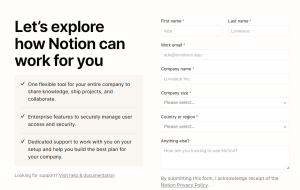
Like, if we look at the contact page of notion, they have a lot of fields and each has its own importance. They are looking for potential clients so, they would like such information. In another way, as I said, we could divide into sales teams and etc..

So, in such a way depending on the project we work on, we have to construct a unique and consumer-justifying contact us page. We now have an idea of how a contact us page should be. It’s time to move to the main thing i.e, our article’s end result.
Create A Travel/Tourism Website Using HTML and CSS
If u look at it, the contact us page looks simple and doesn’t take much information from the user. Now, when do we need such? Kudos! if u guessed it right, These types of simple contact us sections can be used in our personal portfolios or small projects where we want user feedback. In the end, I will also show another such contact us page. But, now let’s begin working on the main thing.
Responsive Contact Us Page Html Code:-
When I say responsive I don’t always mean media queries. This is one such project. You will know why as we progress. Let’s see the HTML part now.
<head>
        <meta charset="UTF-8">
        <meta http-equiv="X-UA-Compatible" content="IE=edge">
        <meta name="viewport" content="width=device-width, initial-scale=1.0">
        <title>Document</title>
        <link rel="stylesheet" href="https://cdnjs.cloudflare.com/ajax/libs/font-awesome/6.2.0/css/all.min.css"
            integrity="sha512-xh6O/CkQoPOWDdYTDqeRdPCVd1SpvCA9XXcUnZS2FmJNp1coAFzvtCN9BmamE+4aHK8yyUHUSCcJHgXloTyT2A=="
            crossorigin="anonymous" referrerpolicy="no-referrer" />
</head>
<body>
        <div class="formBox">
            <h2>Contact Us</h2>
            <p>You will hear from us at the earliest!</p>
            <form action="#">
                <div class="nameInp">
                    <i class="fa fa-user icon"></i>
                    <input type="text" placeholder="Full Name" name="name" id="name">

                </div>
                <div class="mailInp">
                    <i class="fa fa-envelope"></i>
                    <input type="email" name="mail" id="mail" placeholder="Email">
                </div>
                <div class="phoneInp">
                    <i class="fa-solid fa-phone"></i>
                    <input type="number" name="phone" id="phone" placeholder="Phone" min="100000" max="9999999999">
                </div>
                <div class="queryInp">
                    <textarea name="query" id="query" cols="30" rows="5"
                        placeholder="Any comment or your query"></textarea>
                </div>
                <div class="submitBtn">
                    <button id="btn" onclick="notif()">Send</button>
                </div>
            </form>
            <p class="extra">You can also contact us at 181-1711-322</p>
        </div>

    </body>
To add the structure, use the div tag with the class “formbox” and the <h2> tag selector to add the heading for our “contact us” section. Then, using the form, create a form for the contact using the input tag with type text; add a placeholder to the form; similarly, create a form for the phone using the input tag with type email; and similarly, create one for the textarea.
100+ HTML,CSS and JavaScript Projects With Source Code ( Beginners to Advanced)
Now, we made a simple form with the needed inputs. Nothing much complexity in the HTML part. When I say simple, It will be simple yet note-worthy. So, now the CSS part.
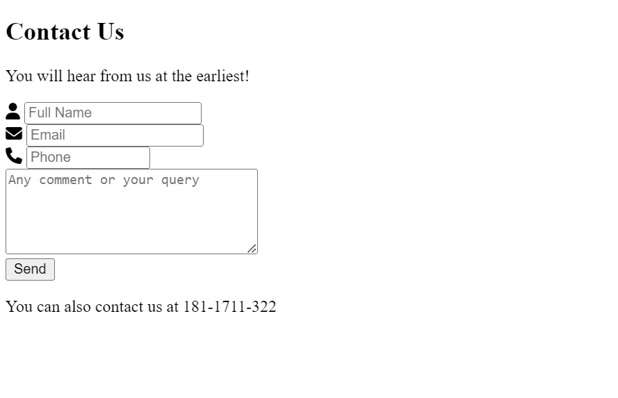
HTML Code Output:
Rock Paper Scissors Game using HTML, CSS & JavaScript
CSS Code for Contact Us Page:-
Now, I will divide the CSS into two parts just for the sake of simplicity. The first part will be the styling of the background, and the layout of the form i.e styling the class form box. The second part will be focused on the form design and media query.
@import url('https://fonts.googleapis.com/css2?family=Quicksand:wght@300;400;500;600&display=swap');

            body {
                background-image: linear-gradient(40deg,
                        hsl(240deg 56% 48%) 0%,
                        hsl(250deg 48% 49%) 10%,
                        hsl(260deg 40% 49%) 24%,
                        hsl(271deg 34% 50%) 42%,
                        hsl(285deg 28% 50%) 57%,
                        hsl(305deg 24% 50%) 68%,
                        hsl(325deg 29% 54%) 75%,
                        hsl(340deg 34% 58%) 81%,
                        hsl(354deg 40% 62%) 85%,
                        hsl(358deg 39% 63%) 89%,
                        hsl(353deg 31% 62%) 92%,
                        hsl(345deg 22% 61%) 94%,
                        hsl(330deg 14% 60%) 96%,
                        hsl(284deg 9% 60%) 97%,
                        hsl(232deg 12% 62%) 98%,
                        hsl(212deg 22% 61%) 99%,
                        hsl(204deg 32% 60%) 100%,
                        hsl(200deg 41% 58%) 100%);
                background-repeat: no-repeat;
                height: 99vh;
                overflow-y: hidden;
                display: flex;
                justify-content: center;
                align-items: center;
                font-family: 'Quicksand', sans-serif;
            }

            .formBox {
                padding: 15px;
                text-align: center;
                min-height: 50vh;
                min-width: 50vw;
                display: flex;
                flex-direction: column;
                background: #f8f8f885;
                border-radius: 30px;
                backdrop-filter: blur(10px);

            }

            h2 {
                margin-bottom: -10px;
            }

            p {
                font-weight: 500;
                font-size: 1.1em;
            }
The background is generated using this website. The layout we used is the flexbox and a backdrop filter blur because, we used a gradient, the blur effect adds beauty to the form.
Portfolio Website using HTML and CSS (Source Code)
form {
                padding: 10px;
            }

            form>div {
                padding: 10px;
                position: relative;
                font-size: 1.3em;
            }

            form>div i {
                position: absolute;
                top: 22px;
                margin-left: 10px;
                opacity: 0.6;
            }

            form>div input {
                height: 2em;
                width: 70vw;
                padding-left: 40px;
                font-size: 1em;
                border-radius: 20px;
                outline: none;
                border: 1px solid #b5adad;
                background-color: #f1f1f1;
            }

            div>input:focus {
                border: 1px solid #6f6a6a;

            }

            form>div:hover>i {

                opacity: 1;
                transition: opacity 1s;
            }

            textarea {
                border: none;
                width: 70vw;
                border-radius: 20px;
                padding: 10px;
                outline: none;
                font-size: 1em;
            }

            button {
                width: 50%;
                height: 5vh;
                color: #ffffff;
                background: #00d689;
                outline: none;
                border: none;
                border-radius: 10px;
                cursor: pointer;
                font-size: 0.8em;
            }

            @media screen and (min-width:900px) {
                form>div input {
                    width: 50vw;
                }

                textarea {
                    width: 50vw;
                }
}
Now, this is the main CSS code that gives the form the look and the responsiveness. So, as I said earlier, we are not using any specific responsive code but, we are using a CSS unit of measurement called VW or also called the viewport width. This unit works in such a way that the width will be based on the device’s width. Another such practice is using min- and max- prefixes before the width and height units.
Gym Website Using HTML and CSS With Source Code
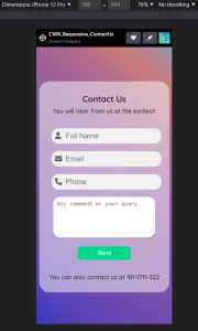
So, after adding the small media query to fix the width using VW, we will have the following look on a mobile device.
ADVERTISEMENT
10+ HTML CSS Projects For Beginners (Source Code)
ADVERTISEMENT
Conclusion:-
So, this looks perfect in a way that it satisfies the needs of a simple responsive contact us page. But, now let’s discuss how to integrate into the project. I will fill in the blanks of what to do and how to do but if you really want to know in detail, comment below. So, we got the UI for contacting you. Now, we need a file that would handle the data. In general, we use PHP in addition to MYSQL to store the data. We can also use JS and maybe combine it with any library to send us notifications.
ADVERTISEMENT
Now, as I promised here is another type of contact us that is much simpler to add to a portfolio. This is an extract from my portfolio. I used a simple link to my mail because the main goal is to get connected with potential recruiters or collaborators.
ADVERTISEMENT

ADVERTISEMENT
In the codepen that I will attach there is also the JavaScript part which is just a user interactivity option. It is optional and it is okay if not used. Hope you all liked this article. See you again with another interesting topic.
Final Output Of Contact Us Page Design In Html And Css:-
Live Preview Of Responsive Contact Us Page using Html and Css:-
In this blog post, we will discuss the Responsive Contact Us Page In HTML & CSS with complete source code so you can just copy and paste them into your own project.
Thank You And Happy Learning!!!
What is a Contact Us page?
A contact page is included on a website to give visitors a method to get in touch with the site’s creator.
How to create a form?
A form is made by using the <form> tag, and inside of it, we add the input for the user’s name, email, phone, and textarea by using the input tag.
