How to Create Animated Border Gradient Effect CSS Button
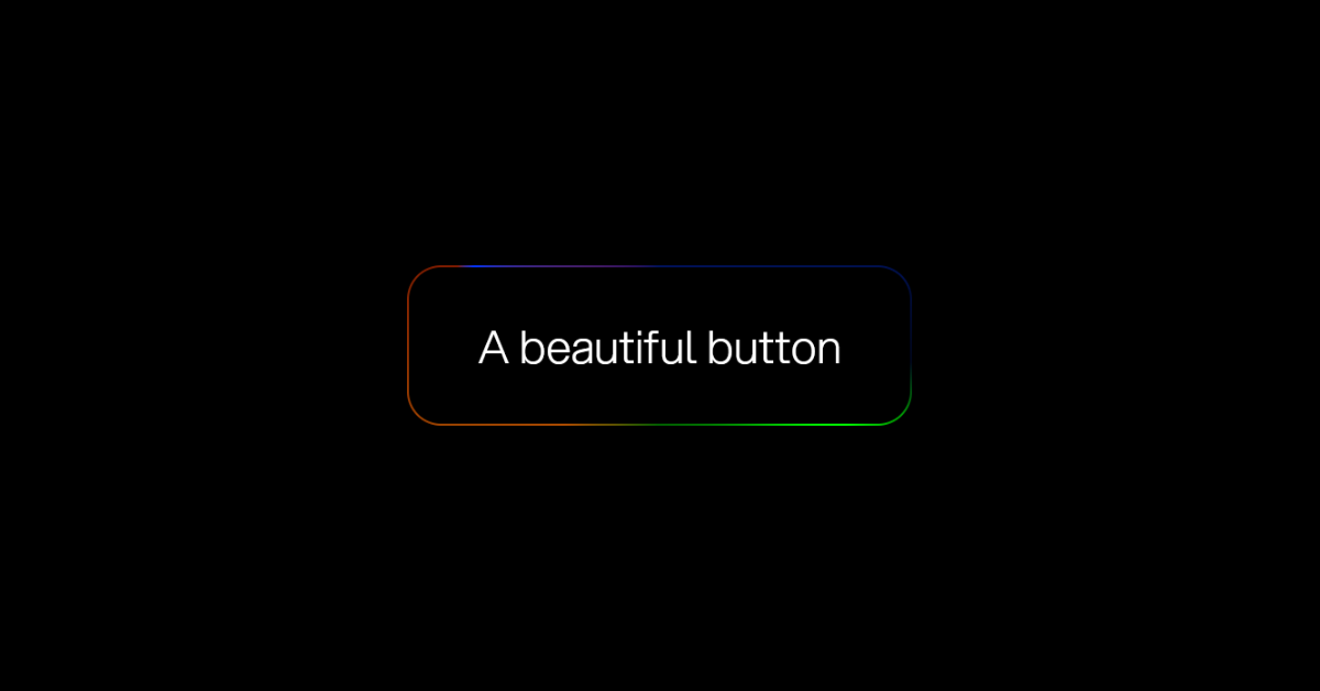
In this post, We will learn how to Create an Animated Border Gradient Effect Button Using HTML and CSS. we’ll keep the background transparent and focus on using CSS Gradient Borders to add a touch of elegance.
However, in this project, we will use only three bright colors red, green, and blue to make a border gradient effect Button in CSS, and three colors will be used as background colors.

We will add color rotation to animate the border so, we can provide a better glowing border gradient look in this button. Believe me, this will enhance the beauty and quality of your website or your portfolio and project building and frontend skills.
Preview of animated gradient border css button Code:-
Even if you have basic knowledge of HTML code then you will able to create this gradient border animation using html and css, in this article, I will provide a live demo of this gradient border animation button also.
I provided a live demo of the gradient border animation button, you can see I used only three colors as background colors in this project with the background color rotating 360-degree animation. So you can call him the animated gradient css button, also as I told you at the start of this article
- Follow the steps below to create this CSS Button Gradient Border. I have given below all the code and step-by-step information.
HTML Code Of Gradient Effect CSS Button:-
the basic structure of HTML code of this project has been created using the following HTML5, I used conic-gradient color in the gradient background of the button. Here I have used 3 colors from left to right with 75 deg of angle. and here I also used the two animations of three seconds and eight seconds. That means a color can be seen again after 3 and 8 seconds in our animated border gradient effect button.
<!DOCTYPE html>
<html lang="en">
<head>
    <meta charset="UTF-8">
    <meta name="viewport" content="width=device-width, initial-scale=1.0">
    <title>animated border gradient effect Button</title>
</head>
<body>
    <button>
        <div>
            A beautiful button
        </div>
    </button>
</body>
</html>
CSS Code Gradient Effect Button:-
Adding CSS into our animated border gradient effect Button HTML code
after the first step we have to link or add CSS in this file. you can link css by two methods. I prefer internal css linking for this project you can go with external css also so, if you want to link external css you have to use “<link rel=’stylesheet’ href=’you_css_file_path.css’/>”
@property --border-angle-1 {
    syntax: "<angle>";
    inherits: true;
    initial-value: 0deg;
}

@property --border-angle-2 {
    syntax: "<angle>";
    inherits: true;
    initial-value: 90deg;
}

@property --border-angle-3 {
    syntax: "<angle>";
    inherits: true;
    initial-value: 180deg;
}

/* sRGB color. */
:root {
    --bright-blue: rgb(0, 100, 255);
    --bright-green: rgb(0, 255, 0);
    --bright-red: rgb(255, 0, 0);
    --background: black;
    --foreground: white;
    --border-size: 2px;
    --border-radius: 0.75em;
}

/* Display-P3 color, when supported. */
@supports (color: color(display-p3 1 1 1)) {
    :root {
        --bright-blue: color(display-p3 0 0.2 1);
        --bright-green: color(display-p3 0.4 1 0);
        --bright-red: color(display-p3 1 0 0);
    }
}

@keyframes rotateBackground {
    to {
        --border-angle-1: 360deg;
    }
}

@keyframes rotateBackground2 {
    to {
        --border-angle-2: -270deg;
    }
}

@keyframes rotateBackground3 {
    to {
        --border-angle-3: 540deg;
    }
}

body {
    background: var(--background);
    color: var(--foreground);
    min-height: 100dvh;
    display: grid;
    place-content: center;
    margin: 0;
    font-family: "Aspekta";
}

button {
    --border-angle-1: 0deg;
    --border-angle-2: 90deg;
    --border-angle-3: 180deg;
    color: inherit;
    font-size: calc(0.8rem + 4vmin);
    font-family: inherit;
    border: 0;
    padding: var(--border-size);
    display: flex;
    width: max-content;
    border-radius: var(--border-radius);
    background-color: transparent;
    background-image: conic-gradient(
            from var(--border-angle-1) at 10% 15%,
            transparent,
            var(--bright-blue) 10%,
            transparent 30%,
            transparent
        ),
        conic-gradient(
            from var(--border-angle-2) at 70% 60%,
            transparent,
            var(--bright-green) 10%,
            transparent 60%,
            transparent
        ),
        conic-gradient(
            from var(--border-angle-3) at 50% 20%,
            transparent,
            var(--bright-red) 10%,
            transparent 50%,
            transparent
        );
    animation: rotateBackground 3s linear infinite,
        rotateBackground2 8s linear infinite, rotateBackground3 13s linear infinite;
}

/* Change this background to transparent to see how the gradient works */
button div {
    background: var(--background);
    padding: 1em 1.5em;
    border-radius: calc(var(--border-radius) - var(--border-size));
    color: var(--foreground);
}

@font-face {
    font-family: "Aspekta";
    font-weight: normal;
    src: url("https://assets.codepen.io/240751/Aspekta-300.woff2") format("woff2");
}
I used Custom Properties in this gradient border animated button like:
`--border-angle-1`,
 `--border-angle-2`,
`--border-angle-3`:
These are custom properties representing angles (in degrees) for use in rotations.
2. I added Some Colors for the gradient border:
1. Custom color variables defined in `:root`:
`--bright-blue`: RGB color (0, 100, 255) or Display-P3 color (0, 0.2, 1).
`--bright-green`: RGB color (0, 255, 0) or Display-P3 color (0.4, 1, 0).
-`--bright-red`: RGB color (255, 0, 0) or Display-P3 color (1, 0, 0).
`--background`: Black.
`--foreground`: White.
3. I added some rotating animations for rotating the background color :
1. `@keyframes rotateBackground`: Rotates `–border-angle-1` property from 0deg to 360deg.2. `@keyframes rotateBackground2`: Rotates `–border-angle-2` property from 90deg to -270deg.3. `@keyframes rotateBackground3`: Rotates `–border-angle-3` property from 180deg to 540deg.
conclusion
In this article, we’ve created step-by-step Animated border gradients with Html and css, and its structure, and learned some new skills.


